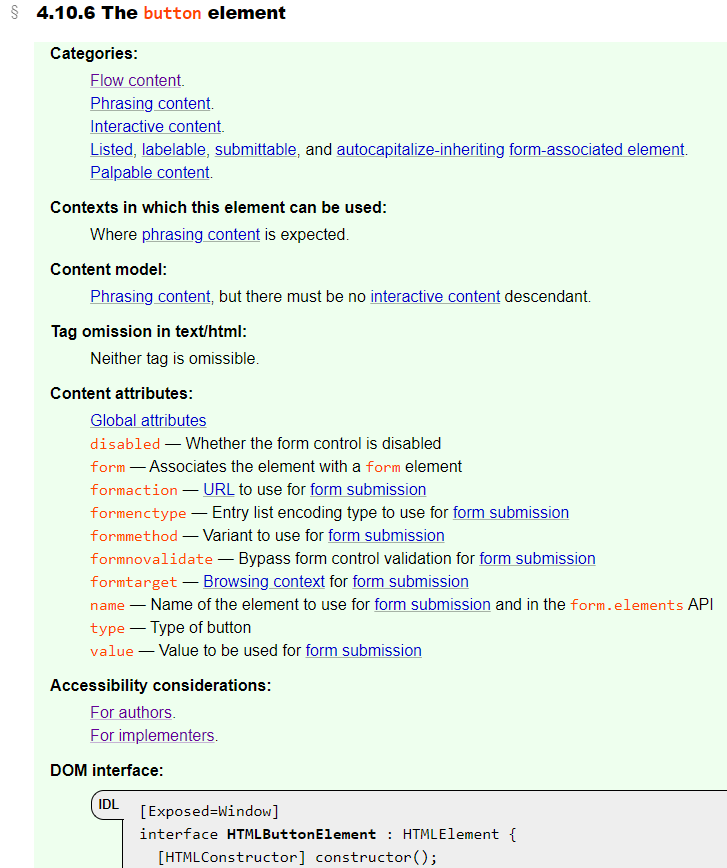
If you’re a web developer, or if you develop browsers or assistive technologies (AT), the following screenshot is probably familiar to you. It’s the first part of the definition of the button element in the HTML specification.
But wait… what’s that new section called “Accessibility considerations” doing there?
There’s a link “For authors” and a link “For implementers.” Where do they lead?
To find out, we need to extend the adventure that Melanie Richards took us on in An adventurer’s guide to W3C specs.
A quick refresher
The ARIA in HTML spec tells authors (of web pages and applications) which ARIA roles and aria-* attributes can be used on each HTML element.
The HTML Accessibility API Mappings (or HTML AAM) spec tells implementers of user agents (browsers) and assistive technologies (screen readers, magnifiers, speech recognition systems…) how HTML elements are mapped to the platform’s accessibility API.
Button element
So where do those new button accessibility considerations links lead?
For authors
Following the For authors link takes us to the HTML button entry in the “Rules of ARIA attribute usage by HTML feature” table in the ARIA in HTML spec.
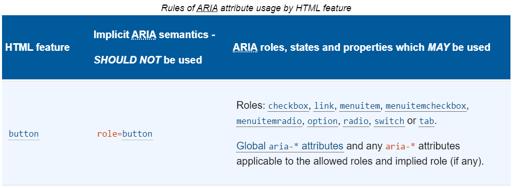
The rules tell us that HTML <button> has an implied ARIA role of button (makes sense), which we don’t need to set because it’s the default. We can use any of the following roles on a <button> element: checkbox, link, menuitem, menuitemcheckbox, menuitemradio, option, radio, switch or tab, and we can use any aria-* attributes that apply to the implicit or explicit role — as long as we adhere to their proper usage. For instance, role=menuitem is only valid on a <button> if it is descended from or owned by an element with role=menu or menubar. For example:
<div role=menu>
  <button role=menuitem>
  Undo
  </button>
</div>
Looking more closely at the table entry for <button>, we see that there are a lot of links: one for <button> (which goes back to the HTML spec), and one for each of <button>’s possible roles and global aria-* attributes, which take us deeper into the ARIA in HTML spec.
Consider this example: say you are authoring a Tab component (because there isn’t one in HTML), and you’d like to use a <button> to represent each Tab. (Of course, if there was a Tab component in HTML, you would use that instead of rolling your own, in order to get all of the semantic goodness, robustness and consistency of a native control… right?) Following the tab link takes you to the rules specific to the tab role in the “ARIA Roles, States and Properties” table.
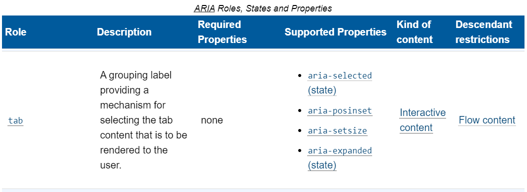
From here, you can see which ARIA states (aria-selected, aria-expanded) and properties (aria-setsize, aria-posinset) are supported on the tab role, and whether any are required; in addition to what kind of content a tab is, and whether it has any descendant restrictions. The roles, states and properties all link to their respective definitions in the ARIA spec, where authors can find most of the remaining information they need in order to create an accessible Tab component. Further guidance on recommended implementation patterns can be found in the WAI-ARIA Authoring Practices.
For implementers
Implementers of browsers and AT can now take a shortcut directly from an element’s spec to its platform accessibility mappings. For example, following the For implementers link in the button element’s accessibility considerations section takes us to HTML button in the “HTML Element Role Mappings” table in the HTML AAM spec.
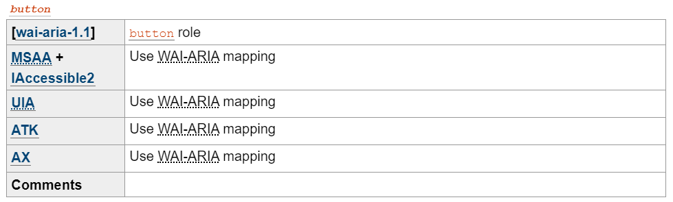
For HTML button, all platforms map to the WAI-ARIA button role, but what does that map to? Following the button role link takes us to the Core Accessibility API Mappings for button.
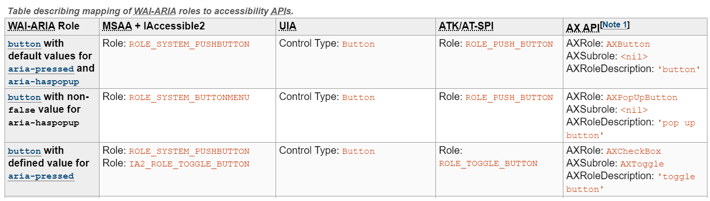
Interesting! There are three different mappings for ARIA button role. If it has aria-pressed, some platforms can map to a more specific “toggle button” platform role. Alternatively, if it has a non-false value for aria-haspopup, then some platforms can map to a “menu button” platform role. If it doesn’t have either of those, then it’s mapped as a platform “push button.”
As with the links in the “ARIA Roles, States and Properties” table for authors, the role and aria-* attribute links in the Core AAM tables for implementers link to their respective definitions in the ARIA spec. This is the end of the role journey for button authors and implementers, and it’s a decent place to move on to some other elements.
Anchor element
Let’s take a quick look at the Accessibility considerations for the anchor (a) element.
Woah, an a with an hrefis mapped differently than an a with no href? It’s true. If an anchor doesn’t have an href, then it’s defined as a placeholder for a link, which is not semantically a link and doesn’t have implicit role=link.
Input element and its types
Moving over to Accessibility considerations for the input element, we find another surprise: each input type has its own unique accessibility considerations!
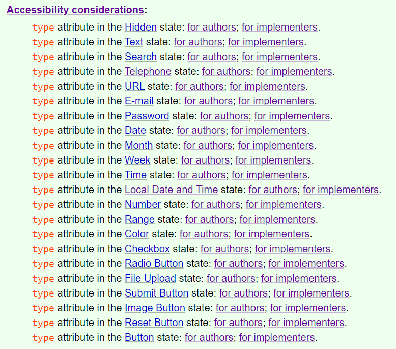
Following just a couple of the “for authors” or “for implementers” links to get a taste of the variety of mappings, we can see that <input type=text> is implicitly mapped to either role=textbox or role=combobox depending on whether it has a list attribute; and <input type=checkbox> is implicitly mapped to role=checkbox but it’s ok to override that with role=switch if you’re authoring something that is semantically more like a switch.
In summary
Having accessibility considerations where authors are most likely to see them — at point of reference — helps to raise awareness of accessibility and build technical expertise among newer authors, and to provide convenience and serve as a gentle reminder for experienced authors. It can be enlightening to see the direct relationship of ARIA to the element you are planning to use.
For implementers, the convenience of being able to jump into the accessibility API mapping tables and then back to the element spec will save round-trip time. Authors are encouraged to occasionally take a peek at the implementation specs as well, because there can be some very useful information in there for debugging.
People who are familiar with the HTML elements but less familiar with accessibility, or unsure of where to get more information on accessibility and ARIA, will be able to find help.
Now that you know where to look, you can answer questions like:
- Can I use an anchor as a treeitem? (yes)
- Which explicit roles can I set on
radioinputs? (only menuitemradio) - What role does
<input type=number>map to? (spinbutton) - Can I give a canvas a role? (yep – any role)
- How does the platform map footer? (it depends!)
- What role can I give my form-associated custom element? (over a dozen possible roles)
You can now begin your accessibility journey in the HTML spec.
Appreciation
‘Tis the season for expressing gratitude, and I have a lot of people to thank for helping me get this new concept section in.
- Special thanks to Léonie Watson for opening issue #3282, and to Anne van Kesteren and Domenic Denicola, for agreeing that this was needed, and helping with the design.
- Thanks to Scott O’Hara for working with me on the ARIA in HTML and HTML AAM specs in preparation for all those links, and Marcos Cáceres for fixing a ReSpec issue on short notice!
- Thanks also to Simon Pieters, for suggesting a way to streamline the input element types, and to everyone who voiced an opinion in the github issue.
- Lastly, thank-you to Steve Faulkner for maintaining the Allowed ARIA role, state and property attributes in the W3C HTML spec all those years. 🙂
This was truly a community effort.
Eric Bednarz says:
Reading this made for a good start of the day here, thanks for the effort 😊 🙏 🎉
Carolyn MacLeod says:
Thanks so much for the kind words, Eric! 😊
Alan Bristow says:
THANK you for writing this up and drawing attention to this new rich ‘junction box’ for cross-checking HTML and ARIA. I am sure this is going to help when researching a11y ^_^
Carolyn MacLeod says:
You are very welcome, Alan! Thank-you for your great analogy of a ‘junction box’! 🙂