We often come across forms that have multiple fields for what is, in essence, a single piece of data, like a phone number or credit card number. Creating forms like that can pose some usability issues if they aren’t marked up in the right way. Would it be better to ask for these chunks of data with single text fields instead?
Phone numbers and credit card numbers
You may have come across fields for phone numbers and credit card numbers that look something like this:


An issue can crop up with this design style when not all fields are properly labelled. The code for a phone-number field might look something like this:
<label for="phone">Phone number</label>
<input type="text" id="phone">
<input type="text">
<input type="text">
Screen readers will announce the first field in that example as something like “phone number, edit text”, but the next two fields will be announced as “blank, edit text” because there’s no label associated with either of them. One way that you could fix that would be to add labels for the other two fields along with a
legend and
fieldset:
<fieldset>
    <legend>Phone number </legend>

    <label for="area">Area code </label>
    <input type="text" id="area">

    <label for="phone-first">Middle three digits </label>
    <input type="text" id="phone-first">

    <label for="phone-last">Last four digits </label>
    <input type="text" id="phone-last">
</fieldset>
But that’s quite a bit of code for a simple phone number. Code aside, there’s also a lot of information for users to take in and process. You could visually hide the labels, but it’d be a lot simpler — in both code and user interface — if there were only one field to fill in. There are other benefits to using a single field, and we’ll discuss those later on.
Let’s go through an example with a single form field. In that case, you can tell browsers that the field is for entering a phone number by
setting the input’s type to tel. The result is something like:
<label for="phone">Phone number</label>
<input type="tel" id="phone">

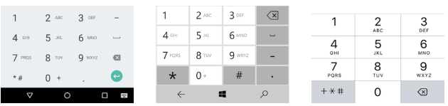
On devices with a virtual keyboard, like a smartphone, focusing that field brings up the phone-number keyboard, like so:
Another benefit to using a single continuous field is that it’s better suited for international phone numbers, like the many telephone-numbering plans in the world that are different from the American system. For example: Dutch mobile phone numbers start with “06” followed by eight digits; UK mobile phone numbers can be up to eleven digits; and landlines in Kota Kinabalu, Malaysia, start with “088” followed by six digits.
Credit card numbers
Credit card numbers are also often subjected to the multiple-text-field treatment. Perhaps this is because they’re visually separated on most credit cards or because it may be easier for humans to enter long numbers in chunks.
Such a form might look something like this:
<fieldset>
  <legend>Credit card number</legend>

  <label>
    First four digits
    <input type="number" maxlength="4">
  </label>

  <label>
    Second set of four digits
    <input type="number" maxlength="4">
  </label>

  <label>
    Third set of four digits
    <input type="number" maxlength="4">
  </label>

  <label>
    Last four digits
    <input type="number" maxlength="4">
  </label>
</fieldset>
That code is not unlike if someone were to ask for your credit card number like this:
“Please give me the first four numbers of your credit card.”
“Okay, and now the next four numbers.”
“Thank you, and now the four numbers after that.”
“Right, and now the last four numbers.”
That’s cumbersome. It would be a lot easier if someone were to ask, “Hey, what’s your credit card number?” and you could respond with the number. The code that maps to that question is very similar to that of the last phone-number example:
<label for="credit-card">Credit card number</label>
<input type="number" id="credit-card">
This again results in far less code than the multi-field version. As for a visual separation of the numbers, there are a few ways to solve that. One would be to let users add their own separators — be they dashes, slashes, dots, spaces, or something else. Those are all easy enough to filter out of the string on the back-end. Karl Groves put it this way:
While it may very well be necessary that your field use only numeric data, you don’t have to offload that requirement to the user.
That method is used by companies like Stripe, Amazon, and PayPal.
Dates
There’re many ways to let users choose a date: select boxes, an
input with a type of
date, three separate fields, or a calendar (among others).
We often see the same labelling issue regardless of whether
select elements or
input fields are used. Let’s look at an example with three separate fields. This code is very similar to the other iffy phone-number code from earlier:
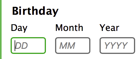
<label for="birthday">Birthday</label>
<input type="number" placeholder="DD" id="birthday">
<input type="number" placeholder="MM">
<input type="number" placeholder="YYY">
In this example, the
placeholder attribute tells users which field holds each part of the date—but
placeholder attributes have a couple of accessibility-related issues like not having enough colour contrast and disappearing when users enter text. You can read more about the placeholder attribute in
HTML5 Accessibility Chops: the placeholder attribute.
A better way to go about labelling the fields would be to use a
fieldset, a
legend, and a
label for each field, like with the phone-number example:
<fieldset>
    <legend>Birthday</legend>

    <label for="day">Day</label>
    <input type="number" placeholder="DD" id="day">

    <label for="month">Month</label>
    <input type="number" placeholder="MM" id="month">

    <label for="year">Year
    <input type="number" placeholder="YYYY" id="year">
</fieldset>
The
placeholder now provides the expected format for each field while the labels tell users which piece of data is requested.
It’s worth mentioning that placeholders aren’t available to all users; for example:
they don’t show up in really old versions of Internet Explorer like IE8 and IE9. Placeholders also disappear whenever users enter data—this leaves them without a way to check the format. So it might be better to include the format in plain text if it’s really important:
<fieldset>
    <legend>Birthday</legend>
    <p>The format for these fields is two digits for day,
    two digits for month, and four digits for year.</p>

    <label for="day">Day</label>
    …
</fieldset>
Date formats
Different date formats are used in different parts of the world. Rabid Puffin goes into more detail about these differences in their excellent
video on designing a date input for a global audience. But the most common date formats can be summarised as:
- from most to least specific: from day to month to year.
- starting with the month followed by the day and ending with the year.
- from least to most specific: from year to month to day.
Because of these varying formats, it would be rather difficult to ask for a date in a single text field if you need to support multiple locales. In the future, you’ll be able to solve this by setting the
input element’s
type attribute to
date. When this
type is implemented, browsers will be able to solve these issues by presenting users with the date format that their system uses.
Sometimes you may have to support browsers or operating systems that don’t support the input type of
date — in those cases, it’s probably better to ask for dates in separate input fields. If you have to ask for the date in a single input field, include instructions about the requested format.
Validation
Validation is an important part of online forms — we need to make sure we can use the entered data in the back-end of our applications. But we offload this burden onto users all too often. We ask them to use certain separators, formats, and characters. This doesn’t make filling a form easier for users; that merely makes it easier for developers to handle the entered data.
For certain things—like dates—there’s no getting around this. In other cases, though, there’s no need to offload this burden to the user. Karl Groves wrote an article on
how to filter non-numerical characters from strings. This is very helpful for things like credit card validation — we know that most of them are sixteen numbers. So we can filter out everything that’s not a numeric character.
With such a system in place, it doesn’t matter if users add in separators to help them keep their place while entering the data — we can simply strip those. If someone wants to add spaces between digits in a phone number — because they have dyslexia, for example—they should be free to do so.
Conclusion
In most cases, it’s easier for users to enter a phone number or a credit card number into a single field. But if you need to have multiple fields, make sure they’re correctly labelled. Yes, that might mean having labels along the lines of “Third set of four digits” and that sort of thing.
Forms are a hassle even under the best of circumstances — so we should strive to make them as easy to use as possible. Ultimately, our goal is to make it as easy as possible for users to complete the tasks in front of them. Or as Alice Bartlett put it:
Do the hard thing to make it simple.
Thanks
First off, I’d like to thank the 24 Accessibility team for this opportunity and their dedication to accessibility as a whole. I’d also like to thank the people that have proofread my article and provided me with feedback. Special thanks go out to Ashley Bischoff, my editor pal, who has done an amazing job of making this article readable.
Adrian A Roselli says:
Credit cards should not use a number field. They are not strictly numbers and the spec suggests avoiding the number type for credit cards and zip codes.
Browsers are not required to accept only numeric characters. However, a mobile keyboard may not provide the option to add an asterisk (per your suggestion above). For users who want to space out credit card numbers by blocks (think dyscalculia), the space character is not allowed in Chrome. For letters that are allowed (such as e), accidentally arrowing up cannot increase nor decrease the value by 1 (the default) so the entire field is cleared.
There is also the challenge of how the browser implements and provides the input type through the accessibility API. NVDA, JAWS, TalkBack (at least) announce the field has having a spin button by default. Less skilled screen reader users can become confused as a spin button is not a common pattern (yet). This can increase the risk of an errant arrow key press corrupting the information.
Using a number field for date parts is less concerning to me, but I would still be wary and run it through testing with users before making it a default choice.
Zoë says:
You missed the pasting part
1. many CC fields in groups of 4 do not handle pasting well
2. Many one field CC AND IBAN also do not handle pasting of groups with spaces (from a form fill app or cut&paste from a bank site) – for example the field is not long enough to paste with spaces and chops the end – also the IBAN is not necessarily the same order of letters and numbers in my country compared to your country
suvo.net says:
Good Post its Very help full for me. i Read your Blog every day.Please write more about this topics.
More