It sometimes seems very difficult to create a good user experience in iOS for VoiceOver users, especially without changing the current experience for sighted users. Some of iOS’s accessibility properties may be confusing, due to a lack of extensive documentation. But did you know that some iOS accessibility properties directly relate to WCAG 4.1.2: Name, Role, Value? You can use WCAG 4.1.2 guidelines to help create a fully accessible app. This article intends to explain the connection between iOS accessibility properties and WCAG 4.1.2, including:
- comparing iOS accessibility properties to WCAG 4.1.2
- using WCAG 4.1.2 to show how to achieve accessible content in a maintainable way
- demonstrating how to properly use the Adjustable Accessibility Trait
- explaining how (and when) to use the underutilized Accessibility Value property
- showing how to easily create accessible UISliders and UISteppers
I created some code examples available on GitHub that I will mention throughout the article. You can clone this repository to follow along; however, it is not essential to do so. Feel free to browse the examples and reuse the code in your apps if you find them useful!
Without further ado, let’s start off with WCAG 4.1.2!
WCAG 4.1.2: Name, Role, Value
WCAG 4.1.2 states “For all user interface components (including but not limited to: form elements, links, and components generated by scripts), the name and role can be programmatically determined; states, properties, and values that can be set by the user can be programmatically set; and notification of changes to these items is available to user agents, including assistive technologies.”
Other articles provide further detail about this success criteria, so I will summarize here: The WCAG 4.1.2 success criteria ensures that an element’s name, role, states, properties, and values can be accessed by and relayed to users of assistive technologies. Further, any element states, properties, and values are available to user change, and any programmatic changes are announced to users.
iOS and WCAG 4.1.2
Fortunately, iOS takes care of the majority of WCAG 4.1.2’s concerns for us. Four iOS accessibility properties are available to make sure that all of these attributes are shared with a VoiceOver user.

When a VoiceOver user focuses on an element, VoiceOver will announce the element’s name, role, states, properties and value. VoiceOver receives this information from three iOS accessibility properties that are available on every control:
- Accessibility Label acts as an element’s name. VoiceOver reads its text directly to the user, and many default elements are given a name if the developer does not provide one. Developers should ensure that a Control’s Accessibility Label is an appropriate name that does not include state, role, or value. Developers should not change the Accessibility Label for other elements, such as Labels.
- Accessibility Traits are the element’s role, state, and properties. VoiceOver interacts with Accessibility Traits differently, depending on what the trait is.
- Roles: VoiceOver will directly state the element’s role to a user. Many common controls have preset roles; however, developers can easily change role values. An element’s default roles are usually all that is needed; a developer should only change it when implementing a custom control or if repurposing an element (such as changing a button to a link).
- States: VoiceOver will directly inform a user of an element’s state, if necessary. It will also control an element’s state for certain elements and will ensure the user is informed of any changes to it. All elements have default states that can be easily changed by the developer. VoiceOver will automatically update an element’s state.
- Properties: Rather than a visual property that can be announced by VoiceOver, an element’s property will change how VoiceOver interacts with the element. For example, an element marked with a certain property may cause VoiceOver to not interact with it at all. Developers should manually add properties as needed.
- Accessibility Value acts as the element’s value and is the most underutilized accessibility property in iOS. Not all controls have a value; however, some controls have a default value (usually 0). VoiceOver will state a change in value as soon as it occurs.
Users cannot directly access the Accessibility Value. Instead, when a user Gestures to change the value of an element, these Gestures are converted into Accessibility Actions (see the chart above). Accessibility Actions are special actions that only occur when VoiceOver is active and certain Gestures are recognized. They are typically used to update the state and value of a control.
Now, let’s dive deeper into each of these accessibility properties and see how they work! If you would like to follow along with the examples, you can find them on GitHub. First, let’s go over Name (Accessibility Label).
Name
According to WCAG 1.1.1, each control or user input must have a name that describes its purpose. As previously mentioned, a control’s name in iOS is its Accessibility Label. An Accessibility Label is merely off-screen text that is read off by VoiceOver when the element is focused. The Accessibility Label ensures that the control’s name can be programmatically determined by VoiceOver since the Accessibility Label directly interacts with VoiceOver.
A control with text, such as a button or link, will automatically set its name (Accessibility Label) to be its text; however, other controls without text, such as Switches, do not have a default name.
Sometimes, adding a name to a control is as easy as updating its Accessibility Label. Other times, though, even more is needed. The question becomes when is creating an accessible control as easy as adding an Accessibility Label? Below we consider a few examples.
Example 1: Image Link
In an app, you have a link directing users to your Twitter page. This link is a UIButton implemented with an image. No Accessibility Label exists for this link.
Because of the Twitter icon, sighted users can infer that this control is a link going to Twitter (and should determine that you are sharing your Twitter handle). Non-sighted users, however, cannot use this visual clue.
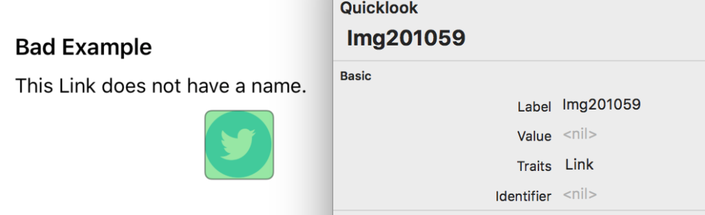
When using VoiceOver, non-sighted users will only hear “Link” because no Accessibility Label is present. Notice in the image above that the Accessibility Inspector claims that the link’s label is “Img201059.” The link’s Label is the image’s title, smartly ignored by VoiceOver since it provides no additional information to the user. To make this link clear for VoiceOver users, we can add an Accessibility Label: “Deque Systems Twitter Page.”
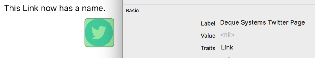
Now, because we added an Accessibility Label, VoiceOver users can understand the link target. In this case, where a sighted user could infer where this link goes, but non-sighted users cannot, adding an Accessibility Label was all that was needed.
Example 2: Switch
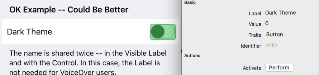
In an app, you have a Switch that allows the user to select between a light theme and a dark theme. Next to the Switch is the text “Dark Theme.” This text serves as the name of the control. An Accessibility Label is added to the Switch that matches the visible text next to the Switch: “Dark Theme.”
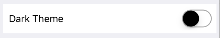
While this is an acceptable layout for a sighted user, a non-sighted user will receive repeated information! First, VoiceOver will focus on the text “Dark Theme,” then if the user swipes to the next element, VoiceOver will focus on the Switch and say vDark Theme, Switch Button, Off. Double Tap to Toggle Switch.” They receive the same “Dark Theme” statement twice!
One fix for this could be to make the text not focusable by VoiceOver. But wait! If we do this, then sighted VoiceOver users will be confused regarding the text value and wonder why it cannot be focused!
Instead, it is best practice to group the control’s name in a focusable container including the control itself. The view’s Accessibility Label can be the visible text, and when VoiceOver activates the view, you can use an Accessibility Action to update the Switch.
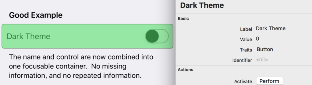
Notice how, in the image above, VoiceOver focuses the entire view and contains the same Accessibility Traits, Accessibility Label, and Accessibility Value as the control itself. It also has the same Accessibility Action available called “Activate,” which, when used, will toggle the Switch and enable Dark Theme.
So, in this case, a simple Accessibility Label for the Switch was not enough; we also had to wrap the name and control together in a VoiceOver-focusable container. What we can say about this is, if sighted users can determine a control’s name without visible text labeling the control (such as an image), then only an Accessibility Label is needed. Otherwise, any control with a visible label next to it should be wrapped in a VoiceOver-focusable container, easily associating the name with the control.
Role, State, and Properties
As mentioned earlier, iOS’s Accessibility Traits interact with VoiceOver in various ways. There are three main ways in which this can occur. Instead of detailing how each Accessibility Trait works with VoiceOver, I will instead go into greater detail about how role, state, and properties in general work with VoiceOver. If you are interested in learning more about each Accessibility Trait, you can find out more in this blog post.
Role
Basing the iOS role definition on the corresponding WCAG definition, a role is a way in which software can identify the function of a component. For iOS, an element can have an Accessibility Trait that will help VoiceOver identify what it does. These Accessibility Traits are Button, Link, Adjustable, Image, Search Field, Keyboard Key, Static Text, and Header.
For most of these Accessibility Traits, VoiceOver will announce directly to the user what they are. For example, VoiceOver will tell users that an element is an image if the focused element has the Accessibility Trait Image. Some roles let users know that they can use additional Gestures to alter the control in some way. These Accessibility Traits (such as Button, Link, and Adjustable) usually require Accessibility Actions to be set so that the control’s value or state can change. I’ll revisit Accessibility Actions in greater detail later.
It is highly recommended to have a maximum of one role per element.
State
The Accessibility Traits that portray state to VoiceOver are Enabled and Selected. When focused, VoiceOver will announce the element’s state to the user only if it is disabled or selected. Further, these Accessibility Traits will give the element different visual appearances if the element is disabled or selected.
Property
The rest of the Accessibility Traits are categorized as properties of the element. These Accessibility Traits are Plays Sound, Updates Frequently, Starts Media Session, Allows Direct Interaction, Summary Element, and Causes Page Turn. Rather than being properties of elements themselves, these Accessibility Traits tell VoiceOver how to interact with the elements and how the user is expected to interact with them.
Value
In iOS, not all elements will have a value associated with them. The ones that do, however, will have a matching Accessibility Value. The default value for most of these controls will be 0. Accessibility Value is one of the few accessibility properties that can be actively changed by user interaction. Unfortunately, this is the most underutilized iOS accessibility property. Most people want to put the element’s value into the element’s Accessibility Label; however, there is no guarantee that the Accessibility Label is read every time the value changes.
What does Accessibility Value Do?
When VoiceOver’s focus is initially set on a control, VoiceOver will announce the control’s name, role, and its value. If a user changes the control’s value, VoiceOver will immediately announce the new value and nothing else. Announcing the new value is especially useful for elements such as Sliders and Steppers, which may have many potential values. Accessibility Value also benefits Switches and other binary controls.
An important thing to note with Accessibility Value – if you are working with a control that can have multiple values, it is preferred to use the Adjustable Accessibility Trait. Adjustable allows a VoiceOver user to increment and decrement the value with a simple upward or downward swipe. Below, I have outlined some examples using the Adjustable Accessibility Trait to show how VoiceOver can interact with an element’s value. Feel free to clone this Github repository if you’d like to follow along directly.
Example 3: Sliders
By default, a Slider uses the Accessibility Value attribute to convey when its value changes, which will occur when a VoiceOver user swipes up or down while focused on the control. Similar to previous examples, Sliders do not have names attached to them automatically; a Slider’s name will need to be conveyed to VoiceOver users. Many times, developers will add visible text next to the Slider and make the Slider’s Accessibility Label match the visible text next to it, like the image below.
This solution, again, results in repeated information. While this isn’t necessarily bad (it is better than a VoiceOver user missing information), it does cause the user to swipe extra times to get past the unnecessary duplicated information.
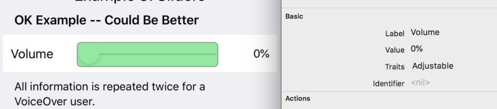
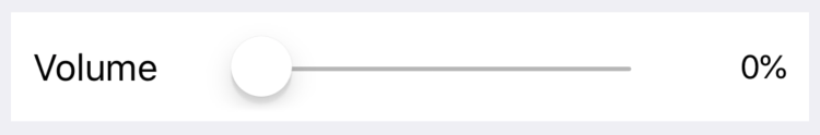
In the image above, we see that the Volume Slider, next to visible text “Volume” and “0%,” also has the Accessibility Label “Volume” and an Accessibility Value of “0%.”
As before, we can group the visible text with the Slider in a view and make that view focusable to VoiceOver.
But wait! Sliders have unique Gestures that it recognizes to change its value. We need to make sure that encapsulating everything in one focusable view will not force VoiceOver users to lose control of the Slider.
Sliders are a perfect example of when you can use the Adjustable Accessibility Trait. This Accessibility Trait allows any view to act like a Slider. When using this Accessibility Trait, it is required to use the Accessibility Actions accessibilityIncrement and accessibilityDecrement to ensure that VoiceOver can programmatically set the element’s value. It also makes sure that VoiceOver users can swipe up or down on the view to change the slidervs value.
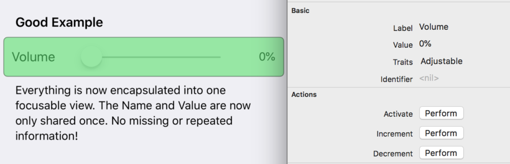
Now, when you focus over this grouped view with VoiceOver (as shown in the image above), you will find that it acts exactly like a Slider, without any repeated information. It can recognize the swipe up/down Gestures that a VoiceOver user would use to adjust the Slider’s value. The Accessibility Actions mentioned earlier ensure that this is possible.
Example 4: Steppers
By default, a Stepper is far more inaccessible than a Slider. Not only is there no visible label automatically associated with the Stepper, but also VoiceOver does not state the control’s Accessibility Value when it changes! So, when a VoiceOver user double taps the “Increment” or “Decrement” buttons, they will just hear “Increment, button” or “Decrement, button.” They will have to switch back and forth between the visible counter and the Stepper’s buttons to figure out the Stepper’s value. What a poor user experience!
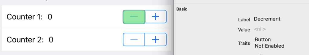
In the image above, the Stepper doesn’t even have an Accessibility Value listed. The value is only available through the visible text next to it.
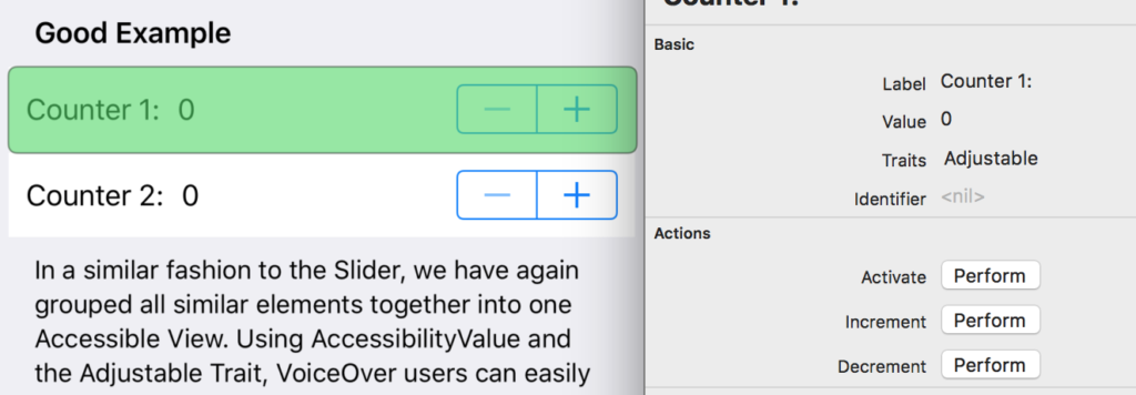
Instead, we can do the same thing that we did with the Slider: create a group view with the Stepper, its visible name, and its visible value. This view’s Accessibility Value should match the Stepper’s value, and the Accessibility Label should be set to the Stepper’s name. We also should use the Adjustable Accessibility Trait and corresponding Accessibility Actions as well. This way, the Stepper acts like a Slider, but will physically look like a Stepper.
Conclusion
WCAG 4.1.2 stresses the importance of accessibility technologies being able to access and update valuable information about elements. Luckily, Apple makes this easy by giving developers Accessibility Label, Accessibility Traits, and Accessibility Value. Each of these attributes has a specific purpose. By using the examples provided and exploring more, Accessibility in iOS apps should be easier to achieve!
Christian Cousquer says:
Hello Jennifer,
Many Thanks for this article. a great resource… Do you have any document or insights about IOS voiceOver focus-ring (or visible-focus) ? this related with WCAG 2.1 Success Criterion 2.4.7: Focus Visible
Again Many thanks for the article.
Jennifer Dailey says:
Hi Christian,
I’m glad that you found this article useful! 🙂 Could you clarify what you’re asking regarding VoiceOver focus-ring? Using a keyboard for navigation in iOS requires VoiceOver to be on. VoiceOver always has its own visible focus-ring, so an iOS developer would not have to worry about creating a visible focus for any element.