I reference the Web Content Accessibility Guidelines (WCAG) 2.1 Success Criteria in my daily work. Recently, I looked back at how I have applied my interpretation to several success criteria and how I either misinterpreted them or was too aggressive in my interpretation. I’ve since studied the success criteria further and have discussed my interpretations with others in the field.
After the solidification of my understanding, I was still left shaking my head, wanting the guidance up to Level AA to extend beyond that level of compliance, and towards improved accessibility. And in some cases, the existing success criteria simply doesn’t address the issues.
What follows are just a few of the issues I often see where the existing WCAG guidance falls short or does not address and provide guidance on select issues. While some of you may think these foundational issues have been covered ad nauseam, based on The WebAIM Million report that came out earlier this year, it would appear there are plenty of developers, designers and content editors that are either not aware of these issues, or not sure what to do.
Headings
Headings help set the overall theme for a web page or sections within a page. A visible page heading placed prominently near the top of a page lets users know what the page is about. Subheadings help group sections of content within the page. All headings should be descriptive and clear, void of marketese.
Headings (<h1>-<h6> ) provide important semantics which allow assistive technologies to understand the structure of a page, and allow their users to quickly navigate to the different sections of the page they introduce.
WCAG 2.1 success criteria provides the following guidance on headings for compliance:
- 1.3.1 Info and Relationships Level A: ensure that existing visible headings are marked up correctly and that their level reflects their relative order in the heading hierarchy.
- 2.4.6 Headings and Labels Level AA: ensure the quality of the descriptive text of the heading, not the existence of headings.
- 2.4.10 Section Headings Level AAA: ensure that sections of a web page have headings when the page is organized into sections.
So if we work only to be compliant with WCAG 2.1 Level AA, if there is existing text that visually acts as headings, we should mark them up as headings and make sure the heading text is descriptive.
Taking headings from compliant to improved accessibility
Headings need to be marked up using HTML <h1>-<h6> elements to ensure the proper structure of page content. If it looks like a heading, it should be marked up with a heading element. Each page should have one page heading (<h1>), with all subsequent subheadings used to group chunks of related sub-content. Do not skip heading levels in descending order (e.g. <h2>…<h4>).
I feel there’s a lot of room to improve the level of accessibility here. Here’s the thinking I would evangelize for.
- Every page should have a visible page heading, marked up as a
<h1>heading element. - Sections of the page that contain subtopics of the page’s overall topic should be grouped with a subheading (
<h2>-<h6>). This touches upon the Level AAA success criteria of 2.4.10 Section Headings, however, I feel that where it makes sense, this level should be strived for by default. - Heading text should be descriptive of the content; no marketese allowed.
Link Text
Links are the foundation of the web. And yet, one of the more challenging issues around the accessibility of links is the link text itself. Good link text helps individuals understand the purpose of each link so they can decide whether they want to follow it. This is not simply an accessibility issue, but an overall usability issue. And yet, I frequently run across “click here” and “learn more” link text without additional programmatic context.
WCAG 2.1 success criteria provide the following guidance on link text for compliance:
- 2.4.4 Link Purpose (In Context) Level A: the purpose of each link can be determined from the link text alone from the link text together with its programmatically determined link context, except where the purpose of the link would be ambiguous to users in general.
- 2.4.9 Link Purpose (Link Only) Level AAA: the purpose of each link can be identified solely from its link text, so links can be understood when they are out of context.
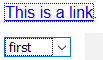
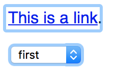
In my mind, the Level A success criteria does not go far enough to ensure that a link’s context can be effectively formulated for proper understanding. Here’s an example where the adjacent heading provides the additional link context without any programmatic association.
See the Pen Section with non-programmatically determine link context by deconspray (@deconspray) on CodePen.
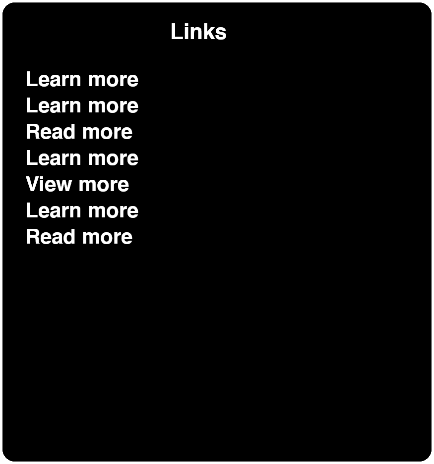
When an individual with no vision using a screen reader comes across the link without the proper context, they will need to navigate and read the surrounding text, or in this case, navigate to the prior heading to determine the context of this “Learn more” link. If this pattern is repeated multiple times in a page, it can become quite frustrating for the individual using a screen reader. A method used to locate and navigate links in a page is via a links list. The three major screen readers all provide similar features:
- JAWS (Links List): Insert + F7
- NVDA (Elements List): Insert + F7
- Voiceover (macOS) (Rotor): Control + Option + U
VoiceOver for iOS and TalkBack for Android does not provide a similar feature.
It should quickly become apparent the impact this link labeling method has on individuals. Without the context included as part of the link text, no-sighted individuals using a screen reader will have to work to obtain the same context that sighted individuals can obtain with less effort.
Taking link text from compliant to improved accessibility
I believe we need to strive to extend past basic WCAG 2.1 Level AA for compliance. To truly make links accessible, let’s provide the necessary context by default within the link. The simplest method is to add the context to the text within the <a> element. While this is the preferred method, in some situations, this can become visually overwhelming. In those cases, you can simply wrap the contextual text in an <span> element with a CSS class for visually hidden, or “screen reader text.”
See the Pen Link Text with Visually Hidden Contextual Text by deconspray (@deconspray) on CodePen.
Revisiting our example above with the heading preceding the link, we can associate the link with the heading using the aria-labelledby attribute. As you are using existing text to craft the contextual link text, you will want to consider the quality of phrasing. In the following example, an id has been added to both the heading’s <h2> element and the link itself. Then these ids are both referenced by the aria-labelledby attribute on the link. I encourage you to not only view the code but also test this with your preferred screen reader.
See the Pen Section with programmatically determine link context by deconspray (@deconspray) on CodePen.
Note
Ensure that the visible text is included in the computed name using aria-labelledby to comply with 2.5.3 Label in Name Level A.
Focus Indication
Speaking of links, by default, browsers provide focus indication for links and other interactive controls. This focus indication is presented as a one pixel dotted or blue border.
WCAG 2.1 provides the following guidance around focus indication.
- 2.4.7 Focus Visible Level AA: all focusable components have a visible focus indication when focused.
The purpose of this success criterion is to help a person know which element has the keyboard focus. The person referenced is partially or completely sighted. However, the key here is “all focusable components have a visible focus indication when focused.” Visible is a relative term. What might pass the success criteria of WCAG may very well still be difficult for people to see. The success criteria provides some examples of default “visible” focus indication, and guides that the default focus indication suffices. Default focus indication, per the success criteria, includes a text field caret and a border around the interactive element.
a caret within the text field
I don’t know about you, but I frequently have difficulty seeing this insertion point in a text field. How is this sufficient for compliance with this success criteria?
a visible border is displayed around the control
Ah yes, that default styling that most designers throw away like the holiday cards from the previous year because they are ugly or don’t support their design. But let me get off designer’s backs for a moment (promise, I’ll return). The default focus indication is not consistent across browsers and is not sufficiently accessible.
Chrome (v78)

Chrome’s default focus indication, a blue border against a white background, has a sampled color contrast ratio of 2.0:1, which is insufficient for non-text controls.
Firefox (v70)
Firefox’s default focus indication is a dotted border difficult to see; blue border color to the background is 4.5:1, which is sufficient for non-text controls.
Internet Explorer (v11)

Internet Explorer’s default focus indication is a dotted border difficult to see; the inverted color on select box interior at a sampled color contrast ratio of 2.9:1, which is insufficient for non-text controls.
Safari (v12)
The light blue border on both links and controls, with a sampled color contrast ratio of 1.7:1, which is insufficient for non-text controls.
As these browser defaults are compliant with Level AA, there seems to be a major gap here regarding visibility.
Taking focus indication from compliant to improved accessibility
The first step is not to remove default browser focus indication (yes designer’s back to you, and including developers, too!). If the default browser focus indication has been removed from the design, and developers have implemented this via the CSS outline:none, or inherit this via an adopted framework, you are preventing everyone from understanding where they are on a page when using a keyboard. If you need further information, view this site dedicated to outline:none.
With the default focus indication intact yet insufficient (but we’re compliant), let’s look at how we might enhance the focus indication. The focus indication should be thick enough and with enough color contrast against whatever background color it resides on.
Abbreviations and Acronyms
Modern-day content and applications are littered with abbreviations or acronyms. Individuals that use a screen reader by default, or for testing will note that they are not announced, spelled out, there is not a widely supported method for spelling out abbreviations or acronyms.
WCAG 2.1 provides the following guidance around abbreviations and acronyms.
- 3.1.4 – Abbreviations Level AAA: provide a mechanism to identify the expanded form or meaning of the abbreviations or acronyms.
The techniques provided by this success criteria guide us to use the <abbr> element, which would wrap around the abbreviation or acronym. The title attribute is then used on the <abbr> element to provide the expanded version.
See the Pen Abbreviations with abbr and title by deconspray (@deconspray) on CodePen.
Simple and straightforward. Except for one problem … this method is not supported by most screen readers, by default. When an individual using a screen reader and using the virtual cursor (reading) comes across the abbreviation or acronym, only the text of the abbreviation or acronym will be announced. Here’s a list of screen readers that offer some level of accommodation using this method.
| Screen reader | Setting | Comments |
| JAWS | JAWS Settings Center > Web / HTML / PDFs > Reading | When “Expand Abbreviations” and/or “Expand Acronyms” is checked, if a title attribute is present for an <abbr> element, JAWS announces the title text instead of the on-screen text. |
| NVDA | Use the up/down arrow keys to navigate to the abbreviation or acronym. Use the right arrow key repeatedly to move to virtual cursor within the abbreviation. Press the NVDA key + Num Pad 5. | This trick is more Easter Eggs rather than setting or keyboard shortcut, and is difficult to create. Therefore, NVDA is considered to have poor support for the <abbr> element. |
| VoiceOver (macOS) | Does not support. | VoiceOver does provide the ability to add common acronyms to a user managed list in the VoiceOver Utility Option > Speech category > Pronunciation pane. |
| VoiceOver (iOS) | Does not support. | |
| TalkBack (Android) | Supports. On by default. |
Taking abbreviations and acronyms from compliant to improved accessibility
Until there is an improved, more widely supported method to address this scenario, Content Editors should simply ensure that the first instance of an abbreviation and acronym is spelled out, followed by the abbreviation or acronym. Developers should then wrap the abbreviation or acronym with an <abbr> element, and the expanded version provided as the value of the <abbr> element’s title attribute. This will comply with the Level AAA success criteria and allow for those individuals using a screen reader that supports methods or settings to obtain the expanded version based on their needs. Lastly, it will future proof abbreviations and acronyms for improvements to come.
Summary
I have to wrap up my article, as I think my mincemeat cookies are ready to come out of the oven. I hope one or more of these topics resonated with you and caused you to rethink your approach to compliant accessibility.
The impetus for this article was my experience with referencing WCAG 2.1 success criteria. Additional inspiration came from a quote from a presentation at the CSUN Assistive Technology Conference by Billy Gregory and Karl Groves. During their presentation, a slide displayed the quote “You will never be compliant when you focus on compliance.” Compliance is good. However, it focuses on rules and laws, not the individuals most impacted by the degree of accessibility we achieve. I suggest not resting on one’s laurels because you are viewed as compliant to WCAG 2.1 Level AA. Default compliance does not necessarily equate to accessibility. However, accessible designs, code and content will always be compliant, while serving the greatest number of people with varying abilities.
"You'll never be compliant when you focus on compliance." #CSUNATC17 #a11y pic.twitter.com/H7jZ7CA77x
— William Emery (@testingsage) March 2, 2017
Michael Spellacy (Spell) says:
Hi Dennis! Great article! Thank you so much! In the above example of tying the “Learn More” link to it’s contextual heading, could you not also use aria-describedby with just the ID of the heading? I typically do this and it produces the following in NVDA: Learn More Link, Savings. This also only requires one less ID to worry about, which makes entry for the novice developer a tad easier. Or is it indeed better to use aria-labeledby with the two IDs, which produces the following in NVDA: Learn More Savings Link. Or are both right? I want to get this right! Thanks again!
deconspray says:
Michael, thanks for the kind words about the article.
The announcements tip off the difference.
Using
aria-labelledbyincludes the referenced text as part of the link’s or control’s accessible name.Using
aria-describedbyadds the referenced text as a supportive description (which is announced), but not part of the accessible name.For example, if you use
aria-labelledbyto reference theidof contextul text, this text will appear in screen reader link lists, while references witharia-describedby(which does not contribute to the label or accessible name) will not. Therefore;Use
aria-labelledbyto add contextual meaning to the label or accessible name of links or controls.Use
aria-describedbyto added a description or additional information to a control (ex. proactive information to properly input data into a text field).Hope this helps.
Michael Spellacy (Spell) says:
Thank you! That helps SO much.The important lesson here, for me, is to remember to look at the accessible name being generated. Taking a peek at the name via DevTools does indeed convey the difference between `aria-describedby` and `aria-labeledby`. So clear now!
J Hogue says:
The acronym problem has plagued my thoughts for some time. There is a blind developer on my team that I have consulted with as well. He said that for him, if a page uses some common acronym a number of times, like HTML or CSS or USA, he would rather not have
<abbr>title be read out loud, as it would make a well understood term more verbose than he would prefer. So in some cases, it is a matter of knowing your audience. Maybe you do define it and write it out once, but perhaps in the rest of the article, you do not use the<abbr>element at all. It is going to depend on the term and the audience for your content.On the other hand, I can see an argument for giving the
<abbr>element title text always, and allow the user to decide if they want the verbosity or not.And on a third hand, most content editor software does not include an Abbr element and WYSIWYG interface for adding the proper HTML and title content. I see that as a challenge for non-technical writers. Many things to consider and think about for one simple element.
deconspray says:
Totally agree with you. Ideally, you would offer the expansion, then let the user control the level of verbosity in their screen reader settings.
Šime Vidas says:
On an article page (like this one), H1 should be the name of the entire website, and H2 should be the title of the article. Does that sound right? If now, how would you do it?
deconspray says:
Actually, no. On an article page, the title of the article is the best description of the article page, therefore the article title would be the H1.
A blog site like 24a11y.com actually makes for a perfect scenario for headings. On a blog’s home page, the best descriptor of a particular page, therefore the preferred H1, would be the title of the site, name of the blog, etc. Then, any subsequent headings, say the list of blog posts, the title of each blog post are the next level heading (H2). If you follow a blog post link, on the resulting post page, the blog post heading is the H1.
Hope this helps.
Šime Vidas says:
But on this particular page, the article is only a part of the page, the other parts being the website’s header, footer, and sidebar. How can the title of the article, “Taking Accessibility Beyond Compliance,” be an H1 heading when the other parts of the page are not part of the article?
For example, the headings in the sidebar (Archive, Accessibility, Testing, etc.) are not part of the article, but if they were to be implemented as H2 elements, would that not make them sub-sections of the article (which they’re not).
I hope you understand my confusion.
deconspray says:
Šime, I totally understand your confusion.
In an attempt to find the most effective way to address your inquiry, I referred back to the W3C WAI Web Accessibility Tutorials and their tutorial on headings. Under “Headings that reflect the page organization,” example 2 is the best visual example. As you see, while the H1 page heading and H2 subheadings that relate to the topic are present, other H2s that are related to the site are present before and after. While the H1 page heading is reflective of the topic of the page, and the H2s that are direct children of the page heading group supportive content of that page heading, other H2s on the page group “page” content, such as “Navigation menu,” “Sidebar” and “Footer.” These H2 headings that are not directly related to the topic of the page, still group other site-related content, making the structure of the “page” easier to understand.
(h2) Navigation Menu
(h2) Sidebar
(h3) More news
(h3) What our client says
(h3) Ratings
(h1) Space Teddy
(h2) Cotton Fur
(h2) Sapphire Eyes
(h3) How they are produced
(h2) Footer
About the company
Our retail stores
Now … this exposes an opportunity for 24a11y.com’s heading structure, one that, when headings are used at all, is common throughout the web. On this site, the structure is flat, without subheadings that mark the sections of the page.
(h1) Article Heading
(h2) Article Subheading
…
(h2) Archive
(h2) Accessibility
(h2) Books
…
An improvement would be to add sectioning headings (h2) and lower the existing heading levels to h3s.
(h1) Article Heading
(h2) Article Subheading
…
(h2) Other 24 Accessibility Resources
(h3) Archive
(h3) Accessibility
(h3) Books
…
As it stands today, and an unplanned example that supports this article, the site’s headings are compliant. However, it can be taken further, adding additional sectioning subheadings to better highlight the structure of the page. This also proves, again, that accessibility is never a “set it and forget it” activity.