If the web accessibility community were to somehow collectively agree on a single rallying cry, it could easily be “use native, semantic HTML elements.” This, like most things in accessibility, is an oversimplification, but it is a helpful one. As 2019 draws to a close, many of the popular component libraries (see: Material UI and Bootstrap) do provide styled versions of native elements for their basic form controls. However, there remains but one common form control that continues to be torn apart, re-imagined, and remade from scratch in a dozen different ways. Today, it’s time to take a closer look at the <select> element.
When people choose to roll their own custom UI component to handle selection, it is usually for one of four reasons:
- More control over styling
- Filtering or autocomplete behavior
- Multi-selection
- “But my use case is special”: i.e. the weird stuff, like grid or tree dropdowns
We’re going on a two-part deep dive into what happens when you try to remake the <select> element, editable and multi-select variants, their comparative usability (with data!), why it’s so difficult to create a custom accessible select component, and finally come up with some concrete recommendations.
A little background
Why is a custom <select> alternative so difficult? Why is this one pattern worth two full articles? The story begins with the problem child of native browser styles, winds its way through two different operating system philosophies, and then hops over to a changing ARIA specification.
Styling the options menu
Nearly all native HTML elements can be given custom styles nowadays, with the exception of a few holdouts. Those include form fields with complex UI such as <input type=”date”> or <input type=”color”>, and more notably the <select> and <datalist> dropdowns. While the wrapper around the collapsed <select> box can be styled, the options menu remains largely impossible to customize.
While pure aesthetic preference is a common reason to roll a custom select component, it is not a good reason. Accessibility and usability should drive aesthetic choices, not the reverse. So many accessibility tradeoffs are involved in a custom solution that there must be a correspondingly strong reason to need one; “it should look prettier” just ain’t it.
Windows vs. macOS
One of the largest roadblocks in creating an accessible cross-platform select component is that different platforms have fundamental disagreements on what a select component actually is. If you inspect the underlying Accessibility API mappings on Windows and macOS for a <select> element, you’ll notice that it maps to a combobox on Windows and a popup button (which opens a menu) on macOS.
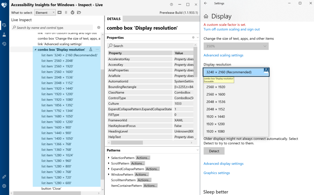
Windows accessibility mappings
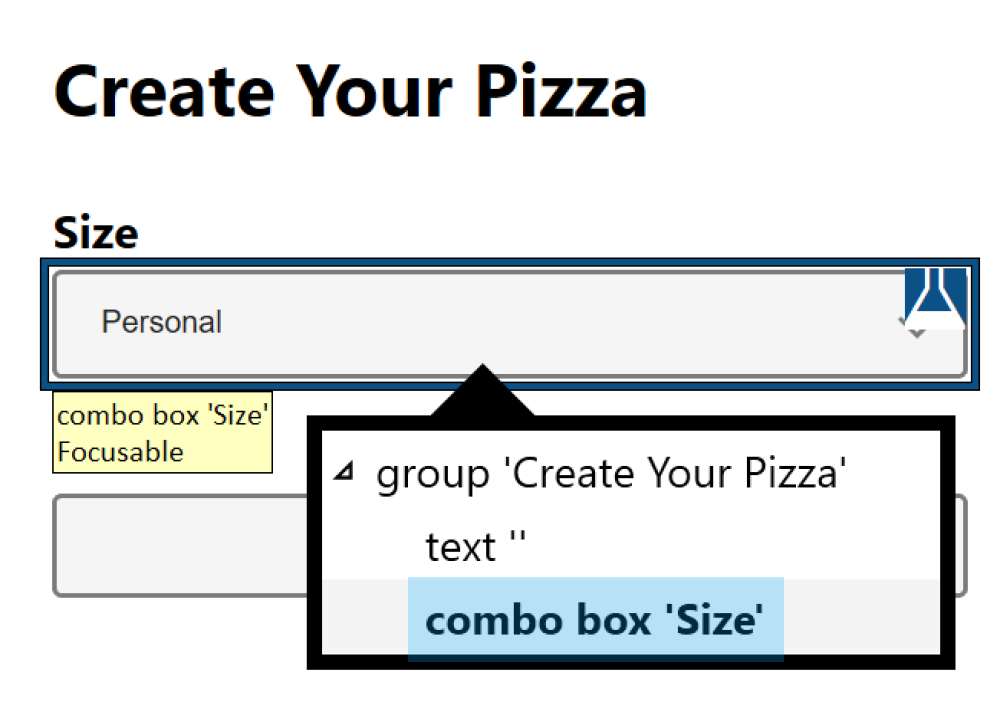
<select> element as a combo box in the UI Automation API.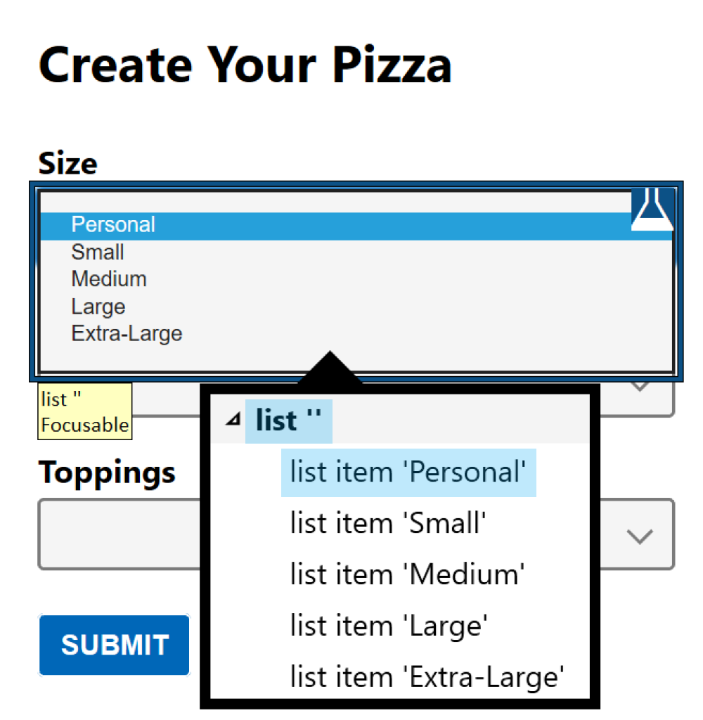
<option> elements are exposed as list items in a list in UIA.
macOS accessibility mappings
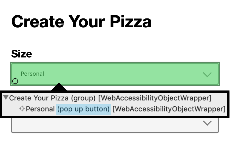
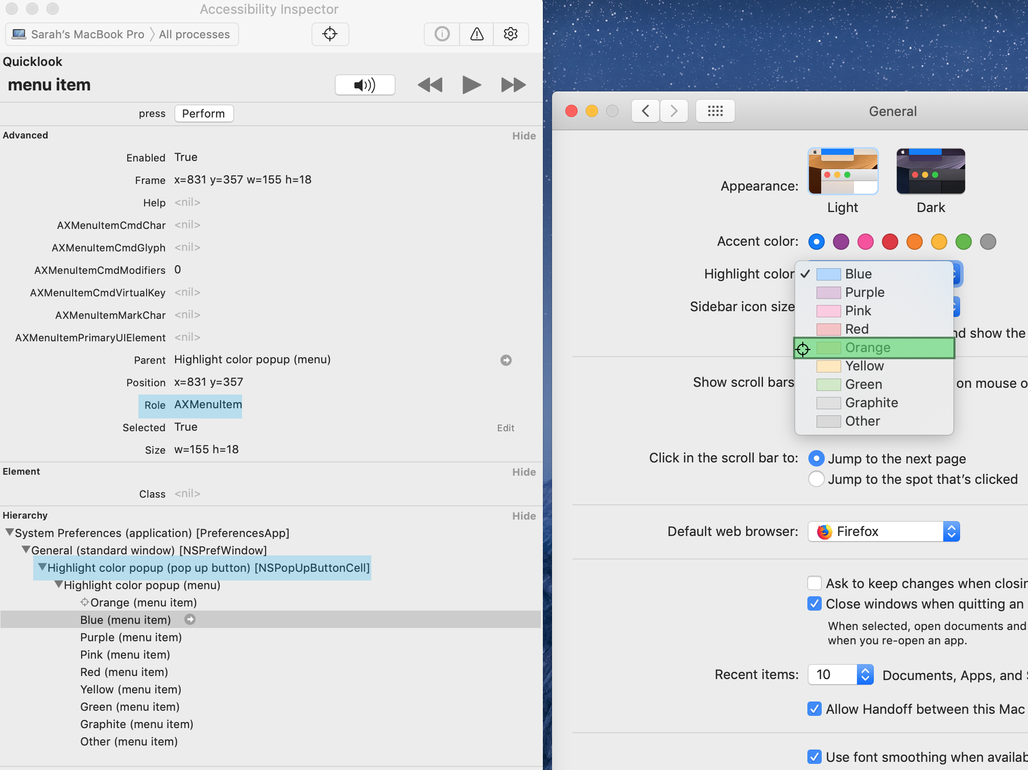
<select> element as a popup button in AX API.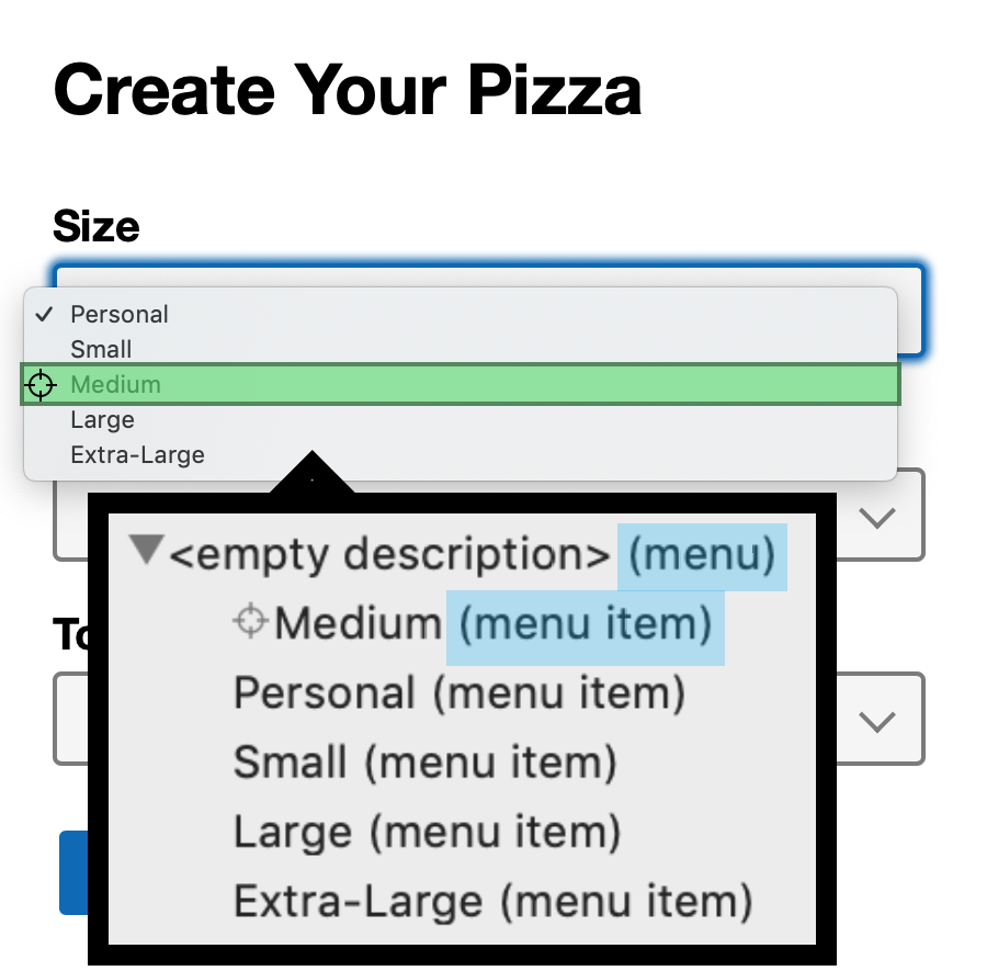
<option> elements are exposed as menu items within a menu.
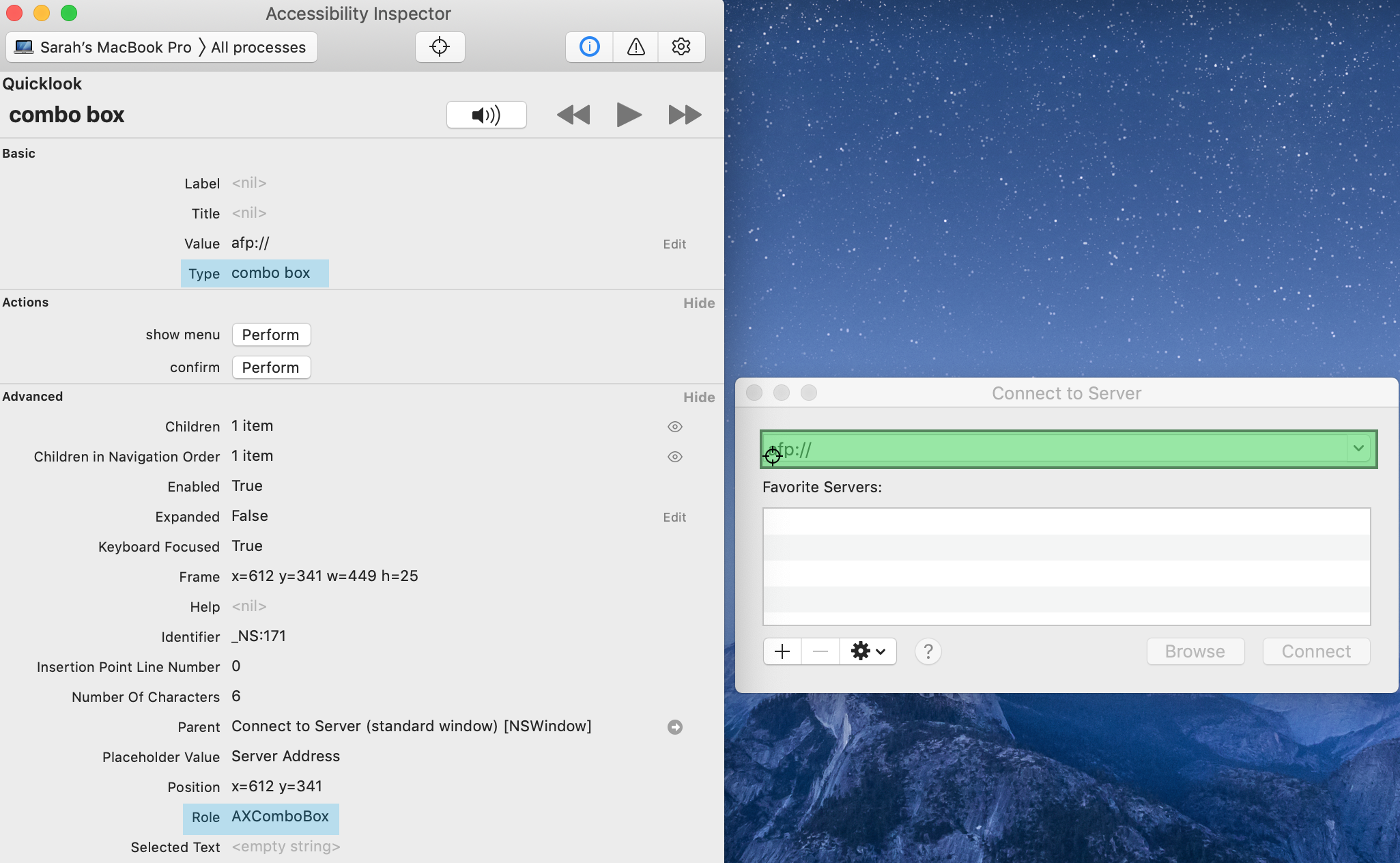
The differences actually run deeper than just the HTML <select> element. Select components found in desktop apps shipped with Windows are also defined as comboboxes. Windows also has many editable comboboxes (select components that include a text field and display a list of options based on user input) scattered throughout its core UI. A good example of a simple editable combobox example can be found in the Run app, and multiple readonly comboboxes (i.e. comboboxes that accept selection but not text input) live in the Display tab of the Settings app.
The macOS system UI, on the other hand, does none of this. It largely avoids editable comboboxes, though a couple rare combos can be seen in the “go to folder” and “connect to server” features of Finder. Single-select components without text inputs are more common, and are invariably defined as popup buttons that expand menus. The “General” section of System Preferences has quite a few that can be inspected.


This presents a problem for anyone trying to design a custom select control: while browsers have the freedom to map native HTML elements based on operating system (OS) conventions, a custom component author must define one single semantic structure to apply across all devices and OS’s. Screen reader users primarily using macOS (or iOS or Android, since those also adopt the button-listbox structure) may be confused by comboboxes, and Windows screen reader users will be less familiar with popup buttons used for selection. Put a pin in that thought, since it will come up again later.
Combobox and listbox in ARIA
Another contributing factor in the confusion of custom select semantics is that the ARIA specification itself has not been consistent in its guidance on the combobox role. Each minor version update to the ARIA spec to date has included a breaking change to the combobox pattern. The changes have been necessary to solve insurmountable browser and platform implementation challenges, but the end result has been a widening array of competing patterns to sort through.
To help make sense of the noise, here’s a field guide to the various combobox and listbox ARIA patterns out there in the wild:
- The ARIA 1.0 combobox
This version is the original ARIA recommendation, and ran into trouble with
aria-ownswhen it turned out a textbox element cannot always be easily mapped as the parent of another element on all platforms.<label for="combobox">Filtered Combobox v1.0</label> <input type="text" id="combobox" role="combobox" aria-owns="list" aria-haspopup="listbox" aria-expanded="true" aria-activedescendant="option1" aria-autocomplete="list"> <div id="list" role="listbox"> <div id="option1" role="option">option 1</div> <!-- more options --> </div> - The ARIA 1.1 combobox
This solved the
<input>-parent problem by wrapping both the textbox and listbox inside a separate combobox parent, but introduced other problems along the way.<label for="input">Filtered Combobox v1.1</label> <div role="combobox" aria-owns="list" aria-expanded="true" aria-haspopup="listbox"> <input type="text" id="input" aria-activedescendant="option1" aria-autocomplete="list"> </div> <div id="list" role="listbox"> <div id="option1" role="option">option 1</div> <!-- more options --> </div> - The draft ARIA 1.2 combobox
The newest revision to the combobox pattern is almost identical to the ARIA 1.0 pattern, but uses
aria-controlsinstead ofaria-ownson the<input>. An example implementation can be tested in the editor’s draft of the ARIA Practices Guide (APG). As of writing, this version is still a working draft, and not yet a W3C recommendation; keep an eye on the status of the ARIA 1.2 spec to follow when it becomes official.<label for="combobox">Filtered Combobox v1.2</label> <input type="text" id="combobox" role="combobox" aria-controls="list" aria-haspopup="listbox" aria-expanded="true" aria-activedescendant="option1" aria-autocomplete="list"> <div id="list" role="listbox"> <div id="option1" role="option">option 1</div> <!-- more options --> </div> - The popup button
This is the pattern that most closely resembles the native
<select>on macOS, iOS, and Android. There are some unique challenges with this pattern, since it uses a<button>element as a form input: it cannot separately expose both a label and value; the selected value will not natively be submitted as part of a<form>element; it also cannot be marked readonly, required, or invalid.<label id="label">Dropdown select without text input</label> <button id="button" type="button" aria-haspopup="listbox" aria-expanded="true" aria-labelledby="label button"> Option 1 </button> <div id="list" role="listbox" aria-activedescendant="option1" tabindex="-1"> <div id="option1" role="option">option 1</div> <!-- more options --> </div> - The expanding listbox
This pattern is not explicitly mentioned anywhere in the ARIA spec or ARIA Practices Guide. Despite this, it has popped up in numerous component libraries, such as Kendo UI and Office Fabric. It does not seem to have roots in any native OS patterns, though ARIA 1.1 did add aria-expanded as a supported state on the listbox role, partly to provide an alternative to the shortcomings of the 1.1 combobox pattern.
<label id="label">Listbox-only version</label>

<div role="listbox"
  aria-labelledby="label"
  aria-expanded="true"
  aria-activedescendant="option1"
  tabindex="0">
  <div id="option1" role="option">option 1</div>
  <!-- more options -->
</div>
Some people painstakingly teach themselves to identify birds on sight, and others do the same for combobox and listbox patterns on the web. Everyone needs a hobby. Unfortunately, the high rate of change for these patterns means that much of the specific advice out there on how to build a custom select is already outdated. Proceed with caution, and always check the date of an article before using it as a reference.
Behavioral options
So far we’ve covered styling and semantic challenges to creating a custom select component, but not the possibilities for different behavior. Keyboard interaction, selection, and auto completion can all be implemented in a number of ways. Much like the variety of semantic structures available, there is no One True Path for select component UX, only shades of grey and contextually dependent usability.
This section concentrates on desktop interaction patterns, but it’s worth noting that both iOS and Android have widely divergent visual presentations and interaction patterns for their native <select> options UI and work relatively poorly with the conventional desktop-like dropdown, particularly on smaller-screen devices. However, it is not currently possible to recreate their native implementations on the web today, so some level of UX degradation for mobile and tablet users is a given with a custom <select> or combobox.
Basic keyboard behavior
All major browsers on Windows 10 — tested with Chrome (version 78), Firefox (version 70), Edge (version 44, pre-Chromium), and Internet Explorer 11 — implement the following keyboard behavior on a collapsed <select>:
- Up and Down arrows change the selected option, but do not expand the options menu
- Alt + Up or Alt + Down opens the options menu and highlights the current option
- Enter does nothing, including not submitting a parent form, when applicable. (Chrome has a slight variation here: Enter opens the options menu.)
- Space opens the options menu and highlights the current option
- Printable characters: select any matching options without expanding the options menu
And this behavior when the options menu is expanded:
- Up and Down arrows move through options, changing selection at the same time
- Space does nothing
- Enter closes the menu, keeping the currently highlighted option selected
- Escape closes the menu, keeping the currently highlighted option selected
Chrome (version 78) and Safari on macOS Catalina do not depart as fundamentally on keyboard implementation as they do on semantics, but still have the following differences:
- Up and Down arrow keys expand the options menu and highlight the current option
- Chrome on macOS does not open the options menu with Enter
- When expanded, Up and Down arrow keys change the highlighted option, but do not change selection
- Both Enter and Space select the currently highlighted option and collapse the options menu
- Escape collapses the options menu and returns to the previously selected option
The most relevant differences are centered around which keys should expand the options menu, which keys should select the current option and close the dropdown, and whether pressing escape should revert selection to the previously selected option. Spacebar behavior is also particularly interesting when transitioning to editable comboboxes since it is a printable key in that context, but still carries learned behavior from the <select> implementation.
Selection
There are essentially two different ways to handle changing selection with the keyboard: either selection changes as focus does with the arrow keys, or it only updates when the user hits enter (or sometimes space) and collapses the dropdown. Windows and macOS take opposite approaches to this, so there is no single choice that all users will find familiar. Many users will hit enter or space to select an option regardless of whether selection has already followed focus, rendering the platform differences irrelevant. However, selection behavior becomes very relevant when users instead hit escape (as mentioned earlier), or tab away from an expanded options menu. Tab and escape selection behavior is especially important when you consider the following points:
- Enter will usually submit a form when invoked on a form input. Even though this does not happen with
<select>, users have learned this behavior and may avoid hitting enter on any form element as a result. - Space only selects the current option in macOS, and potentially cannot be used as a selection key within an editable combobox, since the user may need to be able to type a space into the input.
Some users may have developed the habit of finishing a selection by hitting escape or tab instead of enter or space because of those two reasons. Put a pin in that thought as well, as it will come up again when this whole mess is run through some usability tests.
Multi-select
So far, the discussion of semantic structure and keyboard behavior has centered around a dropdown single-select component, and breezed right past <select multiple> and custom multi-selects. Now let’s circle back around and take a quick look at how these can work:
The native <select multiple> is semantically mapped to a listbox on both Windows and macOS, and selection follows focus in both operating systems. (Side note: the lesser-known <select size="any number greater than 1"> shares the same visual presentation, semantics, and selection behavior as <select multiple>, but only allows single selection.) Selecting multiple options in a row is accomplished by holding down the shift key while using arrow keys, and selecting multiple non-contiguous options is done by setting your computer on fire and throwing it out a window (disclaimer: do not try this at home).
Despite the agreement across platforms on how to define semantics and keyboard behavior for <select multiple>, the fact that most users don’t know how to select multiple options with the keyboard (and sometimes even the pointer) means that a group of checkboxes is nearly always a better solution. To this day, I have no idea how to operate this control on a desktop touchscreen, or with something like eye control or a switch device.
By making a custom multi-select, we can fix some of these problems with a couple simple adjustments:
- Selection never follows focus; it must be independently toggled with enter or space.
- A pointer click toggles the selection of only that option, without affecting the selected state of any other option.
Autocomplete and filtering
Both autocomplete and filtering only apply to comboboxes, since they involve reacting to a user’s text entry. There are a few different ways to filter or autocomplete based on user input, also listed in the ARIA Practices Guide combobox pattern:
- The first option matching the text string is automatically scrolled into view and highlighted or selected
- The list of options is filtered based on the text string (
aria-autocomplete="list") - The remaining text of the first matching option is automatically inserted into the text input, following the user-typed string (
aria-autocomplete="inline")
Any of these three behaviors could be combined together: for example, a combobox could both filter suggestions based on user input and also insert the text of the first matching option into the text input (aria-autocomplete="both"). The benefit of filtering and autocomplete behavior is most pronounced when dealing with many potential choices, such as when selecting a country or suggesting search queries.
Making sense of the options
Hopefully it is now thoroughly clear that recreating the native behavior of a <select> element is impossible: its underlying semantics differ across platforms; its keyboard behavior is inconsistent; its mobile presentation and behavior is entirely different from desktop. In making a custom UI control, we take upon ourselves what was the browser’s responsibility to define semantics, presentation, and behavior, and this means we must choose one single implementation to serve to everyone.
With such a varied and complex landscape of select behavior and so many potential paths through it, choosing that single ideal implementation can seem like an impossible task. There are really only two ways to approach a challenge such as this:
- Follow your gut, make something up, and then write an opinionated internet thinkpiece about it
- Test the hell out of all of them

The ultimate measure of the accessibility of a user interface is how it performs with real people, so next we’re going to look at exactly that. Place your bets now, because part 2 will dive into how these variations stack up when run through a usability study.
Graham Armfield says:
This article, and part 2, are superb pieces of work, and they are a great resource to help devs understand the difficulties of just throwing some elements together to replace the [select] element, or build a combobox. Thank you.
I have one small issue to point out. In your ‘Basic keyboard behaviour’ section for the native [select] component on Windows machines when the options menu is open, you have missed out the Tab key. In this situation the options menu is closed and the currently highlighted option is selected. So basically the same functionality as Enter and Esc.
I can’t speak to what the Tab key does on Mac machines as I don’t currently have access to one.
You do refer to this behaviour later in part 2 when you noticed that people used the tab key without Enter or Space in the Combobox section. So I think this is fairly common behaviour amongst keyboard users.
Sarah Higley says:
Hi Graham, thanks for bringing that up! I tried to cover that under the “Selection” heading — selection follows focus on Windows but not macOS, so (as you mentioned) tabbing away from an open options menu or hitting escape will leave the currently highlighted option selected in Windows, but revert to the last selected option on Mac.
Great clarification!