There are no definites with color. Sure, you have your red, your green, and so on — but even that is relative. Try to describe a specific red color to a friend. Chances are the description will settle on, for example, is the color more of a brick-red or a fire truck-red?
Describing a color that looks similar to another color is a natural way to discuss or express color. But when getting into specifics — accurately defining what a certain color is — it’s almost impossible. Color, at its core, is a relative and personal experience.
Where does color come from
Electromagnetic radiation (EMR) contains radio waves, microwaves, ultraviolet, X-rays, and much more including a subset of what we call “visible light.” These visible-light wavelengths contain all the colors that humans can observe without any additional tools. For each color, there is a unique light wavelength. When we see color, our eyes are receiving and processing those wavelengths and converting them to colors.
Rods and cones
As wavelengths process through the iris of our eyes, rods, and cones are receptors of wavelengths. They become activated.
Rods determine brightness, while cones determine the hues of red, yellow or blue. Most people have about 100 million rods and 6 million cones.
Cones are where we perceive color — and in our mental processes — we start to interpret what the different types of colors are.
How many colors can the human eye differentiate? Under good lighting or viewing conditions, people could determine up to 10 million different colors.
Color Theory
While color is relative, there has been a great deal of research and practice into organizing colors. There are several models for how to perceive colors — let’s start with some definitions:
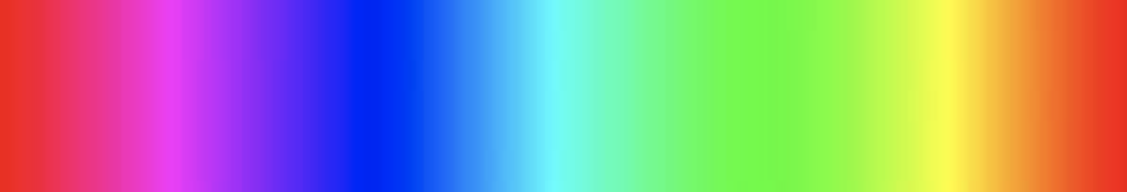
Color is also known as hue. Each hue is a specific spot on the color spectrum. A spectrum can be as simple as a band or wound up in a color wheel.
To work with color, there are different attributes you should know about:

The range from black to white is called value.

Contrast is the degree of separation between values.

Brightness adds white to an image, the lack of brightness tones the image.
Saturation is the measurement of color intensity. The lack of saturation becomes more like greyscale.
Mixing Colors
We can mix colors depending on the method or medium we are receiving color. There are two ways: subtractive primaries and additive primaries.
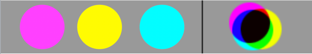
The subtractive colors are cyan, magenta, and yellow—mixing these colors, you get a color that closely resembles black. This is because this method uses reflective colors. The colors are using a physical substance like pigments in paint that reflect the wavelengths to the eyes. Take away these colors or their absence, and you are left with white (or whatever color the canvas is).
This is the primary system used in printing, commonly referred to as CYMK (with the “K” representing black ink, the key). The fourth ink is needed to produce a “true” dark black unlike the muddy black that the colors cyan, yellow, and magenta produce on their own.
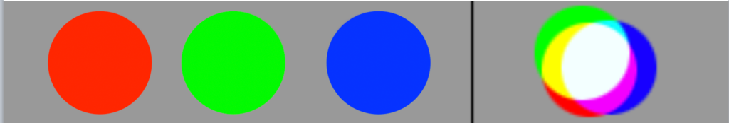
The three additive primary colors of red, green, blue were determined in 1861 by Scottish physicist Sir James Clerk Maxwell. When the colors come together in various combinations, they produce other colors — with all three combining to produce white light. This, in short, is how color on your smart device or computer monitor right now is achieved.
Coding Color
Browsers allow us to select the colors we want to use in our designs in different ways from color keywords like “red” to hexadecimal values (#FF0000). One of the different ways is with the rgb() syntax.
The rgb() syntax is a set of three values representing red, green, and blue — which are the same values as the additive primary colors. Each value is represented as a number that can range in value from 0 to 255. A value of 0 means that the color should not be present. A value of 255, on the other hand, means the full weight of the color should be present and mixed in with the other colors.
For the color red, this is how the CSS looks like:
/* red = 0 -> 255 */
/* green = 0 -> 255 */
/* blue = 0 -> 255 */

.alert {
  color: rgb(255, 0, 0);
}
While a light green color would be
/* red = 0 -> 255 */
/* green = 0 -> 255 */
/* blue = 0 -> 255 */

.alert {
  color: rgb(128, 255, 128);
}
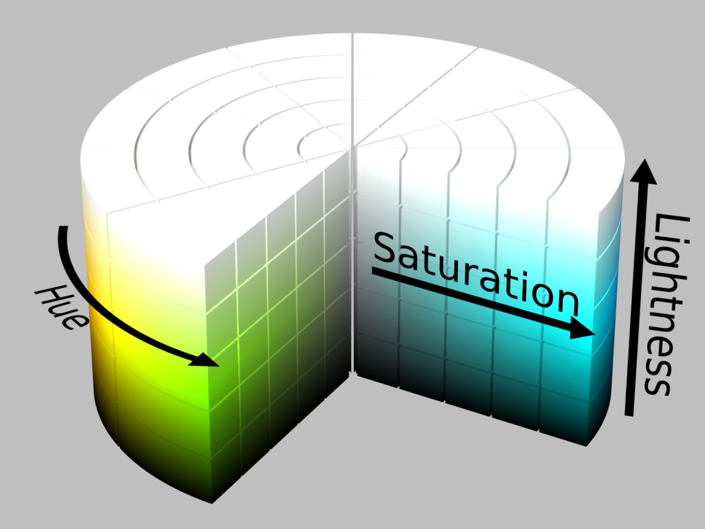
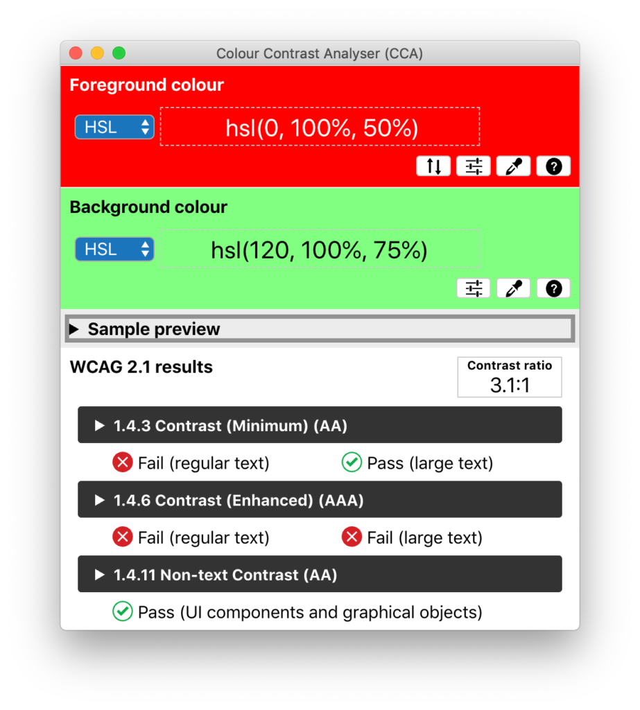
The HSL model is another digital color system based within the RGB system. But instead of using red, green, and blue as the way to pinpoint a particular color, it goes about defining color through a different method — hue, saturation, and lightness. HSL places the hues in a full circle from 0 to 360 degrees; while percentages — 0% to 100% — are used for saturation and lightness. For example, the following code signifies the color red:
/* h = hue = 0 -> 360 */
/* s = saturation = 0% -> 100% */
/* l = lightness = 0% -> 100% */

.alert {
  color: hsl(0, 100%, 50%)
}
And a light green color is written out such as:
/* h = hue = 0 -> 360 */
/* s = saturation = 0% -> 100% */
/* l = lightness = 0% -> 100% */

.good {
  color: hsl(120, 100%, 75%)
}
Low Vision and Color Blindness
One person in twelve has some sort of color deficiency—about 8% of men and 0.4% of women in the U.S. A person with low vision or color blindness will not be able to distinguish text against a background without sufficient contrast.
Types of Color Blindness
- Deuteranomaly – red-green color blindness is found in about 6% of the male population.
- Protanomaly – another form of red-green color blindness, affects about 1% of males.
- Deuteranopia – a form of color blindness where it is hard to tell apart red and green colors.
- Protanopia – people are unable to perceive any red light.
- Tritanopia – people are unable to perceive blue light.
- Achromatopsia – people cannot see any color.
Also, don’t forget that perceiving color is very much a process that includes the mind. So people might have cognitive issues that could affect their perception of color.
Color Accessibility
In the Web Content Accessibility Guidelines (WCAG), there are a number of guidelines that address the use of color. They are 1.4.1, 1.4.3, 1.4.6 and 1.4.11:
1.4.1 Use of color (A)
This guideline talks about using color alone to address or convey meaning. An example is to use color for depicting the bars in a line graph.
In short, we want to make sure we add a design or code treatment that aids in providing the appropriate context to the site visitor.
1.4.3 Contrast minimum (AA)
When providing text to people, we want to ensure that the text can be perceived. We need to make sure the text has enough contrast to come away from the background for legibility.
1.4.6 Contrast enhanced (AAA)
This success guideline is similar to 1.4.3 but is more rigorous.
1.4.11 Non-text Contrast (AA)
For UI components and graphic objects — such as buttons and icons — we need to provide enough contrast on essential items for navigating a web site.
Checking for Color Contrast
In WCAG 1.4.3 and 1.4.11, one of the approaches, if you will, for helping to make sure colors are accessible is to make sure there is enough contrast between them. Knowing that there are so many millions of colors and knowing people have issues in viewing colors, what could be a way to calculate the contrast between two colors?
It’s hard to pick a path that would remediate issues for color blindness. So, WCAG uses the relative luminance of the colors to help determine contrast in a (somewhat) simple mathematical formula.
The Color Contrast ratio
Relative luminance is the value of luminance but expressed as values normalized from a value of 0 for the darkest black to a value of 1 for the lightest white.
The equation to convert RGB values to relative luminance can be found at WCAG:
For the sRGB colorspace, the relative luminance of a color is defined as
L = 0.2126 * R + 0.7152 * G + 0.0722 * B
where R, G and B are defined as:

* if RsRGB <= 0.03928 then R = RsRGB/12.92 else R = ((RsRGB+0.055)/1.055) ^ 2.4
* if GsRGB <= 0.03928 then G = GsRGB/12.92 else G = ((GsRGB+0.055)/1.055) ^ 2.4
* if BsRGB <= 0.03928 then B = BsRGB/12.92 else B = ((BsRGB+0.055)/1.055) ^ 2.4
and RsRGB, GsRGB, and BsRGB are defined as:

* RsRGB = R8bit/255
* GsRGB = G8bit/255
* BsRGB = B8bit/255
The “^” character is the exponentiation operator. (Formula taken from [sRGB] and [IEC-4WD].
With a method for determining a color’s relative luminance, it’s, therefore, possible to compare them in what is called a color contrast ratio.
L1 = Relative luminance of the lighter of the colors
L2 = Relative luminance of the darker of the colors

(L1 + 0.05) / (L2 + 0.05)
Now with the ability to determine the contrast ratio between two colors, we can use this formula to then set a standard or indication for what’s a poor or good contrast for text and graphics.
And with formulas, it’s easy to create tools and apps to determine color accessibility, such as the Colour Contrast Analyzer (CCA) from The Paciello Group.
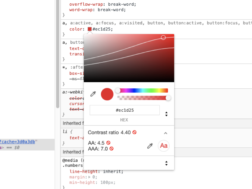
If you use DevTools, you can visually check and adjust colors to see if they pass color contrast:
There appear to be hundreds of online color contrast checkers. Here are just a few:
- Lea Verou’s Contrast Ratio
- WebAIM’s Contrast Checker
- Deque University’s Color Contrast Analyzer
- Adobe’s Leonardo
- Corey Ginnivan’s Who Can Use
Future of Checking Color Contrast
Through research and practice, it’s been found that the algorithm provides false results, as noted by Andrew Somers’ research.
Currently, a new model for detecting contrast is being worked on by the Silver Task Force, which is working on a new version of Accessibility Guidelines as the current contrast ratio is not an ideal algorithm.
In Conclusion
Color is amazingly complex. It is both conveyed and perceived in a myriad of ways. While the color contrast ratio is a simple aid to determine contrast, it is vital to go beyond just stating basic color contrast ratios when working towards accessible and inclusive designs. We need to convey all of the colors’ complexity in our designs so we can address the visual needs of a variety of people.
Neil says:
The article is the best overview of color and how it works on the web, that I have seen in a long time.And gave me some additional insight to color blindness.
Thank You,
Neil
Maggie Maggio says:
You wrote – “Rods determine brightness, while cones determine the hues of red, yellow or blue. Most people have about 100 million rods and 6 million cones.”
I am sure you meant to say – In trichromats, the cones determine the range of hues in long (red), medium (green), or short (blue) wavelengths.
Shay says:
I’m developing an AAC software, I need to change colors dynamically based on text/bg color contrast.
Is there a recommended NPM package?
I’ll give it two colors, it’ll either pass or provide and alternative color with good contrast.
Wan M. Wimberly says:
Dope article. Very nicely written with great insight and detail. All aspects of nature have innate, organic color.
Natural beauty – #hue