It started the way a lot of side projects these days seem to, with a “What if…” sent absent-mindedly over Slack. My teammates and I were about to attend a large meeting and were guessing at which common phrases would come up: words like “roadmap,” “innovation,” and the noun form of “ask.” What if we turned this into a bingo game?
Itching to write some code, I began designing a multiplayer bingo web app, using React for my components and Firebase for storing game metadata. The app would pull from a lexicon of phrases, generate a randomized NxN grid of said phrases, and keep track of players’ current board states. The app would be dynamic, mobile-friendly, and, most importantly, accessible. I wanted it to be a seamless experience for all players, whether they play with mouse, touchscreen, keyboard, and/or screen reader.
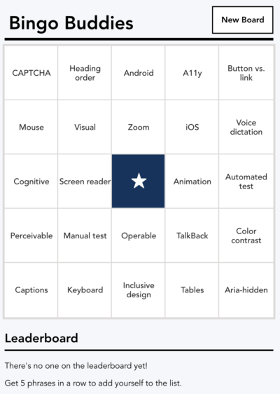
It’s still a work in progress, but I invite you to try out the web app: here’s a game board featuring words from this article, which you can check off while reading, and you can also check out the source code.
Today I’d like to share how I’ve approached its implementation with accessibility in mind.
Building the grid
 For a totally static bingo board, I would use a
 <table>, but an interactive bingo game turns out to be the perfect use case for the ARIA grid role. ARIA grids are super cool because of the clean keyboard navigation they introduce for two-dimensional containers. In a properly implemented ARIA grid, users can navigate easily between cells with their arrow keys.
I start my board with a <table> element assigned an explicit role of grid, containing rows of cells with explicit gridcell roles:
<table role='grid'>
  <tbody>
    <tr role='row'>
      <td role='gridcell'>...</td>
      <!--- 4 more grid cells --->
    </tr>
    <!--- 4 more rows --->
  </tbody>
</table>
As I’m using explicit ARIA roles, I could implement this as a bunch of nested <div>s rather than using an HTML table, table rows, and table cells. I prefer to use these table elements as it makes the code easier to read, provides built-in table styling, and sets up my bingo board code to more easily support the traditional American bingo board, where the letters B-I-N-G-O are presented as column headers.
We’ll dig into the keyboard navigation of the grid in a moment, but first let’s explore the markup for each of the cells:
Each phrase on our bingo board starts out untouched. As phrases come up, players check them off on their boards. There are many ways one could build a stateful interactive component; I chose to use a toggle button using aria-pressed. The aria-pressed stateful attribute succinctly communicates whether a phrase has been checked. Additionally, a toggle button provides the user the flexibility to uncheck a phrase if they made a mistake – no false bingos here!
My initial markup for each cell looks something like this:
<td role='gridcell'>
  <button aria-pressed={true if checked, otherwise false}>
    {phrase}
  </button>
</td>
Adding interactivity
With the grid markup in place, I can now implement the keyboard navigation and selection logic for the bingo board. I start by creating a variable to keep track of the mostly recently active cell, which I’ll initialize as the first cell in the grid.
Since each cell contains a single interactive button, it makes sense to manage all the interactions, including arrow key navigation, on the buttons themselves rather than the cells. So on each of the toggle buttons, I add:
- If it’s in the most recently active cell,
tabindex=“0”otherwisetabindex=”-1”. Now, only the most recently active toggle button is part of the tab order of the page. That way, keyboard users don’t have to navigate through every single toggle in the grid to get to focusable elements outside the grid. When they navigate back into the grid, their focus will return to whichever toggle they were last interacting with. - An
onClick event listenerthat toggles thearia-pressedattribute on the button and sets this as the most recently active cell. - An
onKeyDown event listenerthat updates the most recently active cell and moves focus to the appropriate adjacent toggle button when the user presses an arrow key. Note that we don’t have to worry about setting key listener events for the Enter or Space keys, as HTML buttons automatically trigger theironClickevents when one of these keys is pressed.
Now is a great time for us to check in on the clarity of visual states. When it comes to selectable items – toggle buttons, checkboxes, tabs, and the like – there are at least 4 distinct states to consider:
- The default state: not focused, not selected.
- Focused, not selected.
- Focused, selected.
- Not focused, selected.
Each of these needs to be visually distinct from the others so sighted users are aware of where they are and the current state of the board.
In the latest iteration of the bingo app, I’ve assigned a thick blue border for the focus state, and a dark blue background with italicized white font for the selected state. These styles can layer on top of each other, so a cell that is both focused and selected has a dark blue background, italicized text, and a thick blue border:
| Visual state |  |
 |
 |
 |
|---|---|---|---|---|
| Keyboard and selected state | (default) Focused: False Selected: False |
Focused: True Selected: False |
Focused: True Selected: True |
Focused: False Selected: True |
| Styling of state | White background. | White background with thick light blue border. | Dark blue background with thick light blue border and italicized text. | Dark blue background with italicized text. |
I think the light blue border and dark blue background combination needs some iteration to improve contrast; I’ll be tackling that soon!
What about that free cell?


The cell at the center of a bingo board is always a free cell, permanently selected so you’re never starting from zero. I considered making this cell plain text, as the button’s main toggle action is not applicable. However, I wanted to keep this element in the arrow key navigation of the overall grid component and convey its selected state in a way that is consistent with that of other cells.
I decided to use the same aria-pressed button pattern and add aria-disabled=”true” to the button. Why aria-disabled and not just plain old disabled? Buttons disabled with the native HTML disabled attribute are unfocusable and their click events are ignored, meaning I wouldn’t be able to focus this button for keyboard navigation. Using aria-disabled=“true” allows the component to preserve its navigational interactivity while also communicating to assistive technology users that it cannot be toggled.
<td role="gridcell">
  <div class="cell-contents">
<button
aria-disabled="true"
      aria-pressed="true"
      tabindex="-1"
      class="cell-toggle"
    >
      <svg
        role="img"
              aria-labelledby="star-tile"
        xmlns="http://www.w3.org/2000/svg" viewBox="0 0 24 24"
      >
        <title id="star-tile">Star (free tile)</title>
        ...
      </svg>
    </button>
   </div>
</td>
Announcing your (and others’) success
The primary users of this bingo web app are people who are following an event in real time, whether that be a meeting, a political debate, or the finale of their favorite television show. It’s hard enough to actively listen and check things off on a board at the same time, so I figured I could reduce cognitive load by not requiring the player to discover on their own that they completed a bingo row. The app could do that discovery for you.
I include the following logic in the componentDidUpdate function (in React, this is called after each change to the component’s DOM) of my game board React component:
// if selection has changed in some way, check for bingo
if (prevState.selection !== this.state.selection) {
  if (
    this.checkRow(this.state.activeRow) ||
    this.checkCol(this.state.activeCol) ||
    this.checkDiagonalA(this.state.activeRow, this.state.activeCol) ||
    this.checkDiagonalB(this.state.activeRow, this.state.activeCol)
  ) {
    if (!this.state.bingo) {
      this.setState({
        bingo: true,
        endTime: Date.now(),
      });
    }
  }
}
Whenever the selection changes, I check the column, row, and diagonals (if applicable) containing the active cell to see if any of these sets have been completely selected. If so, I update the component’s state to indicate the player has successfully gotten a bingo.
When my component’s bingo state updates to true, I render a success banner with a call to action for the player to add their name to the leaderboard:
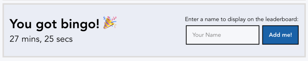
I’ve wrapped the “You got bingo!” text and total time in an element with role=“alert” and aria-live=“assertive” so that it will read aloud immediately to screen reader users. The aria-live attribute is technically redundant to the role, but historically I’ve encountered screen reader inconsistencies around live regions and now err on the side of caution with redundant attributes.
<div role="alert" aria-live="assertive">
  <span>
    You got bingo!
    <span role="img" aria-label="Hurray!">🎉</span>
  </span>
  <div>6 hrs, 54 mins, 59 secs</div>
</div>
I’ve gone back and forth on whether this banner should have role=“alert” or role=“status” – the former always strikes me as aggressive, while the latter doesn’t quite get at the immediacy of the excitement of completing the challenge. I’ve settled on role=“alert” for now because I’m just so gosh darn excited for the player and want them to know about their success immediately. However, this is easy enough to change.
When they’ve gotten bingo, players can optionally add themselves to the leaderboard. Using Firebase’s realtime database, I’m able to update every player’s screen immediately whenever a new person is added to the leaderboard:
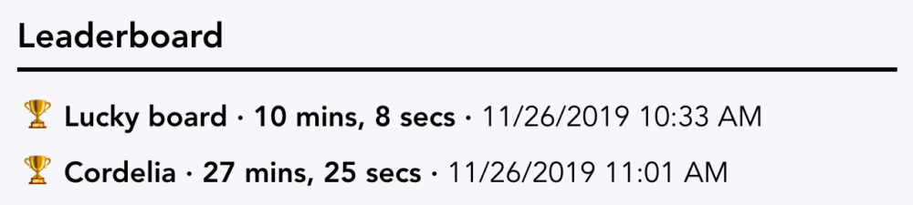
For the leaderboard, I use another live region role – log – to wrap the leader list. Log live regions have an implicit aria-live setting of “polite,” meaning they won’t interrupt what the screen reader is currently reading out. However, as with our other live region, I explicitly add aria-live=“polite” to ensure screen readers announce this correctly.
<aside aria-label="Leaderboard">
  <h2>Leaderboard</h2>
  <div role="log" aria-live="polite">
    <ol>
      <li>
        <span aria-hidden="true">🏆 </span>
        <strong>Lucky board · 10 mins, 8 secs · </strong>
        11/26/2019 10:33 AM
      </li>
      <li>
        <span aria-hidden="true">🏆 </span>
        <strong>Cordelia · 27 mins, 25 secs · </strong>
        11/26/2019 11:01 AM
      </li>
    </ol>
  </div>
</aside>
Using two different live region roles – alert and log – the app can update screen reader users appropriately about when they and other players complete bingo rows.
Putting it all together
Here’s how the markup for the page body generally looks with all these components in place:
<header>
  <h1>Bingo Buddies</h1>
  <button>New board</button>
</header>
<main>
  <table role="grid">
    // grid here
  </table>
  <section>
    <div role="alert" aria-live="assertive">
      You got bingo!
    </div>
    <form>
      <label for="leader">
        Enter a name to display on the leaderboard
      </label>
      <input type="text" id="leader" placeholder="Your Name"/>
      <input type="submit" value="Add me!"/>
    </form>
  </section>
</main>
<aside>
  <h2>Leaderboard</h2>
  <div role="log" aria-live="polite" aria-atomic="false">
    <ol>
     // leaders here
    </ol>
  </div>
</aside>
You can find the full code on GitHub and see it live in this a11y bingo game.
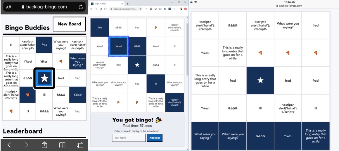
Playing bingo with real people
After hacking together the first version of the bingo app and doing some manual testing on the devices I had handy, I started sharing games with friends and colleagues and iterating on their feedback.
When a friend mentioned it’d be nice if the whole bingo board fit on one page, I realized I’d been making assumptions about the user’s viewport. The initial bingo board grid stretched the full width of the window, as I figured players would most often be on their phones in portrait orientation or on desktop with resizable browser windows. But this friend was playing bingo with VoiceOver on an iPad in landscape orientation. With a good third of the board out of the viewport, he had to keep scrolling the page back and forth or use VoiceOver swipe to navigate between cells, rather than being able to quickly tap on any cell to have it read out. I modified the CSS to make the whole board visible in landscape mode and now remember to test each new version in multiple viewport sizes and orientations.
Play testing has also offered an opportunity to explore cognitive diversity. One colleague praised the bingo app as a concentration and learning aid, helping her pay more attention to the content of presentations that had a related bingo board. Another colleague expressed the exact opposite: with a bingo game open during a presentation, he found himself focusing only on the vocabulary of the presenter and missing the overall message they were delivering.
What’s next?
Fittingly named Backlog Bingo, this side project has a long backlog of things to adjust and features to add, such as the ability for anyone other than me to create their own lexicons and bingo games.
But the next step I’m most excited about is extending the flexibility of the ARIA grid to even more online games. Building out this proof of concept bingo app has made me realize that many of my favorite table-top and pen-and-paper games could easily be translated into accessible ARIA grid-based web games: Chess, Checkers, Connect Four, Battleship, Minesweeper (I see you, Chrome team!), Codenames, Guess Who… the possibilities are limitless!