The landscape of web development has changed a lot since I first started in the industry. We still have the traditional method of rendering all the HTML for a web page on the server and sending it to the browser. But we can now send a minimal amount of HTML (a single div tag for example) to the browser and use client-side JavaScript to populate the rest of the content.
Regardless of whether you render your HTML on the server or on the client, the end result is the same: the Document Object Model (DOM) is populated with those HTML elements. It’s within the DOM acronym that we find one of the keys to building accessible things for the web: the document.
It doesn’t matter whether you call the thing you are building a “web app” or a “web site”. It doesn’t matter if it allows people to read articles, buy things, or apply for a passport. If you are providing HTML to the browser, you are working with a document.
Let’s look at the title and the h1 to h6 HTML elements, and see how developing with the document in mind can help the people that use what you create.
Please note: Although this article is designed to get us thinking of the things we create as documents, we will still refer to them as “pages” or “web pages”. This is because people are more familiar with this terminology, especially as browsers have options like “Save Page As…” or “Bookmark This Page”.
Document titles
With a physical document, a concise title on the front or the top can help you understand what the document is about, without having to read further. This is especially useful if you haven’t seen the document before, or if you are trying to find a specific document.
In the United Kingdom you can ask your local Post Office for certain documents like a form for applying for a passport. When the clerk hands you the form, the title reassures you that you have been given the document you asked for.
How is the title set on a web page?
To set the title for a web page, place opening and closing title tags inside the head of the web page, and put your title text in between those tags.
<head>
    ...
    <title>The "D" in the DOM - 24 Accessibility</title>
    ...
</head>
How does the title element contribute to the accessibility of our web pages?
For someone using assistive technology, such as a screen reader, the title is one of the first things read out when the page loads. So, similar to a physical document, well written text for the title of your web page would tell them what it is about without having to read through it.
It also provides the same reassuring experience as asking for a document at the Post Office. When we enter a URL in the address bar or click a link to another page, we are requesting a document. If you’re using a screen reader, when the title is read out and it matches up to the link you clicked on or the URL you entered, you’re reassured that the content will match your expectations. For someone who may not be able to see, or fully see, the content the browser is rendering, that’s a good and expected start to their experience of visiting the pages you develop. This also relies on good link text that clearly and concisely tells you what web page it will take you to.
It’s not just screen reader users that benefit from good use of the title element. For sighted users, the title appears in the title bar of the browser window — or if using tabbed browsing, it appears on the tab for that page. A bit like someone trying to find a specific document, this is great for people like myself who have multiple tabs open in a browser. When I want to go back to a page I had opened in another tab, I can just look at the different tabs on display and click the one with the title that matches the page I want.
Now that we know how beneficial the title element is, what can we do to make sure that it is helpful to the people using what we create?
Clearly state what the page is about
When writing the text for your title element, try to describe what the content is in a few words. Make it clear what someone will read on that page, or what they will be expected to do on that page.
Gov.uk do a lovely job of telling you what each page is, right in the title element. This is especially evident in parts of the site that involve completing forms, such as their passport application/renewal pages. Owing to their “one thing per page” design principle, they state simply what question you will need to answer on that page. For example, their page for finding out if you have had a UK passport before starts with the text “Have you had a UK passport before?” in the title element. Thanks to this, if you’re using a screen reader, that text should leave little doubt about what you’ll have to do on that page.
Put the brand or name of the site at the end
It makes sense to include the brand or the name of the site in the title of your pages. For someone who cannot see the icons displayed in the browser tabs and relies on a screen reader, it helps them identify which tabs belong to your site and which belong to a different web site.
However, it’s a good idea to place the brand at the end of your page title. If you had the site name at the beginning of the page title, someone using a screen reader would have to wait for the site name to be read out before they get to hear what the page is about. This could be quite annoying if they navigate through multiple pages on your site.
It can also pose a problem for sighted users, as it would make it difficult to differentiate between multiple pages from the same site when opened in multiple browser tabs. To illustrate, here’s an example of what it would look like to have multiple pages open on the Sainsbury’s site, but with the site name at the beginning:

There’s only enough room for “Sainsbury’s” in the tab, so there’s no quick way to figure out which one is the product page for my favourite rum. Wah!
Fortunately we got this bit right when we developed the Sainsbury’s site, so let’s see how it should look:

By specifying the purpose of the page first and then the site name, it makes it easier to find a specific tab, such as the one that contains my favourite rum. Yay!
Make the text unique
Since a website can be made up of lots of different pages, it’s important to make sure each page has a unique page title to allow people using a screen reader to differentiate between them and avoid confusion.
This is a problem that tedbaker.com suffers from on its checkout pages. Once you move on from the page where you check the contents of your basket and into the checkout flow, each page in the process has the exact same title, “Ted Baker UK”.
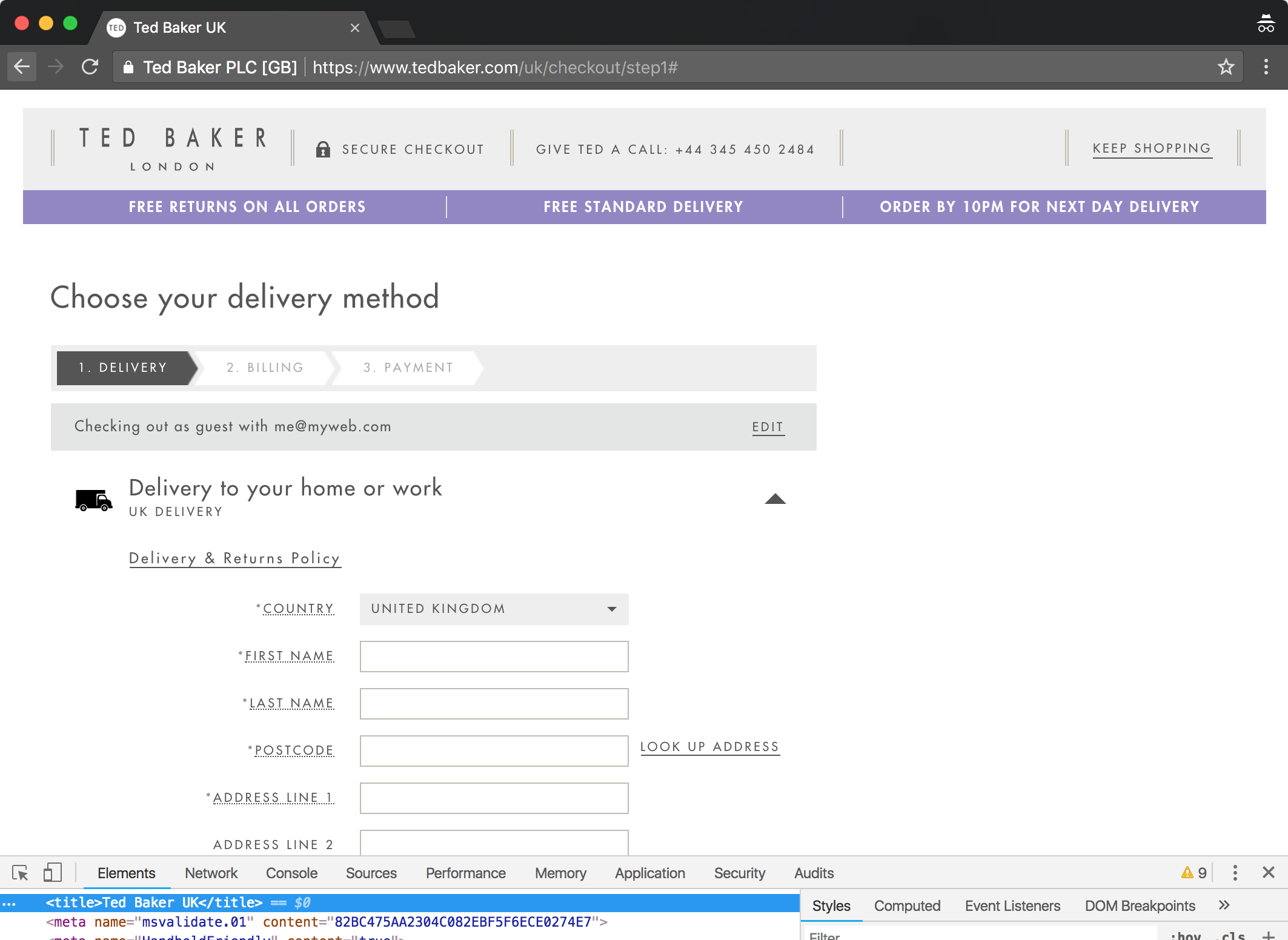
That doesn’t tell someone using a screen reader what the page is about, and the fact that each subsequent page has the same title poses even further problems.
Considering checkout flows tend to involve forms that have the potential to be incorrectly filled in, this could make the journey frustrating if you’re navigating the site using a screen reader. To illustrate, let’s imagine you’re using a screen reader and have managed to get as far as the page for entering your delivery details:
- The page loads and the title is announced, “Ted Baker UK”.
- You read through the page to find out what it contains and what you need to do. You realise this is where you enter your delivery details.
- You enter your delivery details and submit the form.
- The next page loads and the title is announced, “Ted Baker UK”.
Now what could be going through your mind at this point? Given that it seems like that you haven’t moved on to another page, you may wonder if you filled the form in incorrectly and have been returned to the same page to correct your mistake. The only way you can know for certain is to read through the page.
That’s quite an ordeal to put someone through, especially when they are trying to spend money with you.
By starting the title text for these pages with something like “Enter your delivery details” and “Enter your billing details” respectively, it would take the detective work out of the checkout process.
Include context when needed
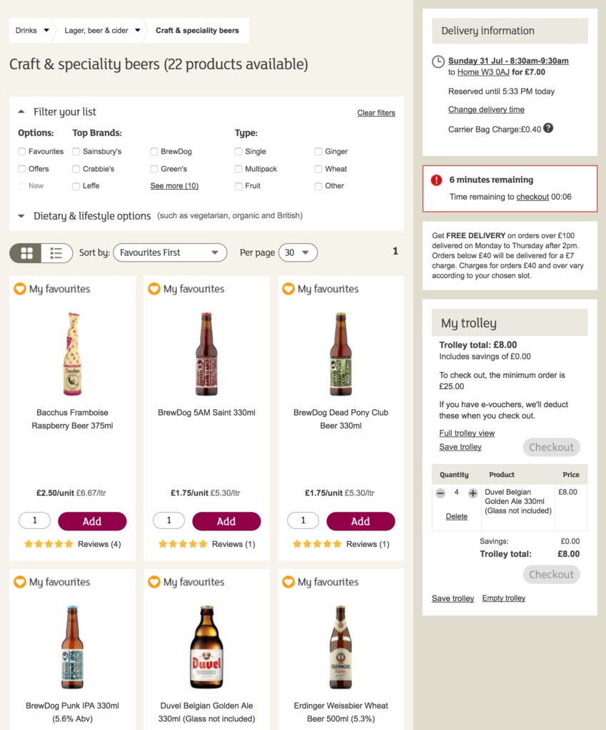
What about when you are navigating to the same type of page, but there is a change in context? This is something we initially overlooked when building the page for booking a delivery slot on the Sainsbury’s Groceries site.
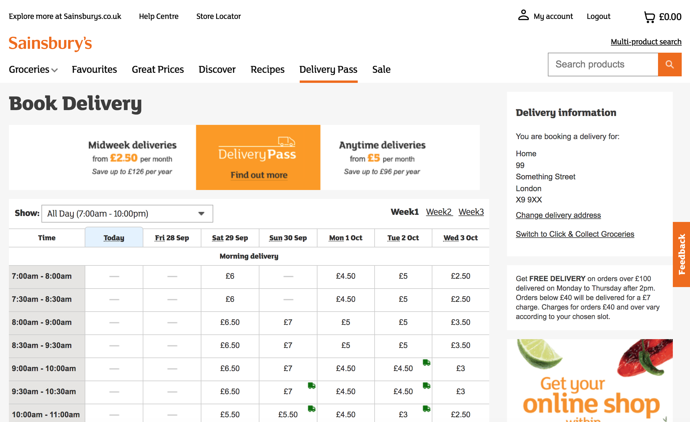
The page shows a weeks worth of delivery slots, their availability and their price. You can book a delivery slot up to three weeks in advance, so there are links that allow you to navigate to the same page but showing delivery slots for a different week.
We set the title for the page to be “Book Delivery” and left it at that, regardless of what week they were viewing. How does this affect the usability of the page if you’re using a screen reader? Let’s go through the steps:
- You go to the page and the title of the page is announced, “Book Delivery”.
- You find the table containing the delivery slots.
- You read the table headings to find out which dates are being displayed.
- Those are not the dates you want to book a slot for, so you find the link for the following week.
- You activate the link.
- The page loads and the title of the page is announced, “Book Delivery”.
- You find the table containing the delivery slots.
- You read the table headings to find out which dates are being displayed.
- The table contains the date you want to book for, and so you find the slot you want to book.
- You book the slot.
Considering these steps, there’s nothing stopping you from picking a delivery slot, but then there’s nothing to make it any easier either. When you initially land on the page it doesn’t tell you what dates are being displayed, and so you have to dig a bit to find that out. Also, when you navigate to the page containing the following week’s slots, the fact that the title of the page is unchanged does nothing to reassure you that you have indeed moved on to a page showing the following week’s slots. Again, you have to find your way to the table to see which dates are being displayed.
The way we fixed this was to include the date range for the week being displayed in the title of the page.
<title>Book Delivery between Sunday 2 December 2018
and Saturday 8 December 2018</title>
What does this mean for your journey when using a screen reader? Now that the title element tells you early on which dates slots are being displayed for, you only need to navigate to the table containing the delivery slots when they are on the page for the week you want to book slots for.
This seems like a lot to read (and write!) about for just one element in a web page, but when used correctly, a good title element benefits all those that use what you have built.
Headings
In a physical document, headings help break up content into logical sections. In a book made up of chapters, you would have a heading for each chapter. There can also be different levels of headings. Each chapter could be broken down into sections, each with its own heading, and some broken down even further with subheadings.
Visually, headings are usually differentiated from other text by being on their own line, and by using a larger font size, a different font family, a heavier weight, or a combination of the three. When you have different levels of headings, you differentiate between them by making them slightly less prominent than their parent heading. A chapter heading may be displayed in a large, bold font, whereas the subheadings in the chapter could be the same size as the body text, but displayed in bold.
When headings stand out from the rest of the text, they make it easier for you to find a particular section within a document: in a long document such as a contract of employment, well designed headings would allow you to quickly scan the document to find information such as what day you get paid or how long your notice period is.
How are headings included in a web page?
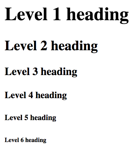
We can add headings to our web pages using the h1, h2, h3, h4, h5 and h6 tags. The numbers represent the heading level, with 1 being the highest heading level and 6 the lowest.
<h1>Level 1 heading</h1>
<h2>Level 2 heading</h2>
<h3>Level 3 heading</h3>
<h4>Level 4 heading</h4>
<h5>Level 5 heading</h5>
<h6>Level 6 heading</h6>
Without any of our own CSS on a page, we can see that each of these headings are styled by the browser with a level of prominence that corresponds to their heading level.
How do headings contribute to the accessibility of our web pages?
When we use headings in our pages, we start to provide structure to our content, and it’s that structure that can help those that rely on assistive technology such as screen readers.
Screen readers allow you to access a list of all the headings in a web page, essentially giving you a table of contents. Just like reviewing the table of contents in a book can help you understand whether it contains the information you are looking for, this list of headings provides an overview of the content, helping you understand whether the page contains the information you are after.
When you think about a table of contents in a book, it doesn’t just provide you with an overview of the content, it also gives you the page number for each piece of content listed. This helps you to jump to specific content in the book.
The same is true if you were using a screen reader. As well as being able to access a list of the headings on the page, screen readers allow you to jump to a specific heading and start reading the content from there. In the JAWS and NVDA screen readers, you can also choose to navigate to headings of a specific level by pressing the number key that corresponds with the required level. This can also be done in VoiceOver if you enable single-key webpage navigation when using Quick Nav mode.
When you consider how useful headings can be if you’re using a screen reader, it should come as no surprise that for the majority of screen reader users this is the primary way of finding information in a web page. The WebAIM Screen Reader User Survey #7, conducted in October 2017, reported that of the 1,747 that answered the question “When trying to find information on a lengthy web page, which of the following are you most likely to do first?” 1,180 (65.5%) said that they navigate through the headings on the page.
Given their usefulness and how well used they are, what can we do to make sure that the heading structure on our web pages help rather that hinder screen reader users?
Only use one h1 per page
While the latest specification of HTML allows more than one h1 on a page, as a general rule it is best to only use one per page and place it at the beginning of the main content. If you do this, and the text for the h1 is similar to the title of the document, it can provide screen readers users a quick way to skip past any headers or navigation links and go straight to the main content.
Should be well structured, without gaps
When there is a gap between heading levels (e.g. jumping from a h1 to a h3), you create a gap in the structure of the content. Such gaps can annoy screen reader users and cause them to wonder about whether content is missing.
Keep your heading structure consistent
A consistent visual style across the pages of a web site makes it easier for sighted users to become familiar with the site. In the same way, a consistent heading structure across the pages of a web site allows those using a screen reader to become familiar with your site and navigate it more easily.
Choose a level appropriate to the content, not the style
Sometimes, problems arise when the developer has referred to a style guide and used the typography styles defined there to determine what heading level to use.
We got caught out by this when we initially developed the product list pages on Sainsbury’s. When looking at a list of products under a specific category, such as “White wines”, we had some products at the beginning of the list that were highlighted as promoted products. Visually, this was done using a banner at the top of the product with the words “Why not try”. The text for this banner had the same properties as a h2 in our style guide, and so we coded this as a h2.
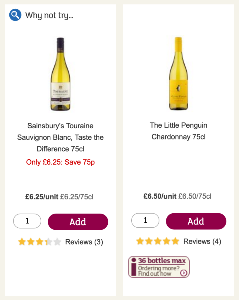
When we received feedback from people who were navigating those pages using a screen reader, they reported that this was confusing. They initially thought that all the products after that h2 were promoted products, and wondered where the regular products were. Once they had navigated the rest of the page, most managed to figure out that there must have been a mistake, and were still able to carry on shopping. However, this journey was confusing, so we had to do something about it.
Upon review, we decided that the “Why not try” text wasn’t really a heading, but something we should put before the name of the product in the h3 for the product. That way, someone using a screen reader could easily navigate through the list of the products using headings, because they could hear which ones were being promoted and which were regular products.
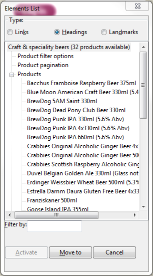
Use visually hidden headings to fill in any gaps
The product list pages on the Sainsbury’s Groceries site were very long. Visually, but without the use of headings, the page was broken up into the key areas of the filtering options, pagination controls, and the product list. The lack of headings for these sections in the design meant we hadn’t included any in our HTML, and even created gaps in our heading structure.
We rectified this by including some visually hidden headings for these sections. This was done by creating a CSS class that contained properties which, when applied to an element, would visually hide it, but make it available for screen readers. There are a few different ways of doing this, but here is an example of a helper class taken from the HTML5 Boilerplate:
.visuallyhidden {
    border: 0;
    clip: rect(0 0 0 0);
    height: 1px;
    margin: -1px;
    overflow: hidden;
    padding: 0;
    position: absolute;
    width: 1px;
    white-space: nowrap;
}
To visually hide an element using this, you would add the class name to it.
<h2 class="visuallyhidden">Products</h2>
If you’re not a fan of using helper classes like this and you are using a CSS pre-processor such as Sass, you could always create a mixin for the same purpose.
It should be noted that using visually hidden headings should be considered a hack to make inaccessible design practices more accessible. If headings are useful to someone using a screen reader, they are probably useful to everyone and should be made available to everyone.
Content displayed after a heading must relate to that heading
You’d think this is pretty obvious, and if you are building something like an article or a brochure site you probably won’t have any problems doing this. This can be more of a challenge when you are working with more complex designs. This was the case when we were developing the product list pages on Sainsbury’s — and for one scenario we got it horribly wrong.
In the design for each product in the list, the product name appeared before things like the price and the “Add to basket” button. So for the most part, we could write the HTML in the order we saw it, and with the product name as a h3.
We had other products in the list that shared their space with a recommended product. For example, a red wine might be paired with a red meat. The design for this scenario presented a challenge because the price and “Add to basket” buttons, for both products, were displayed above the product name.
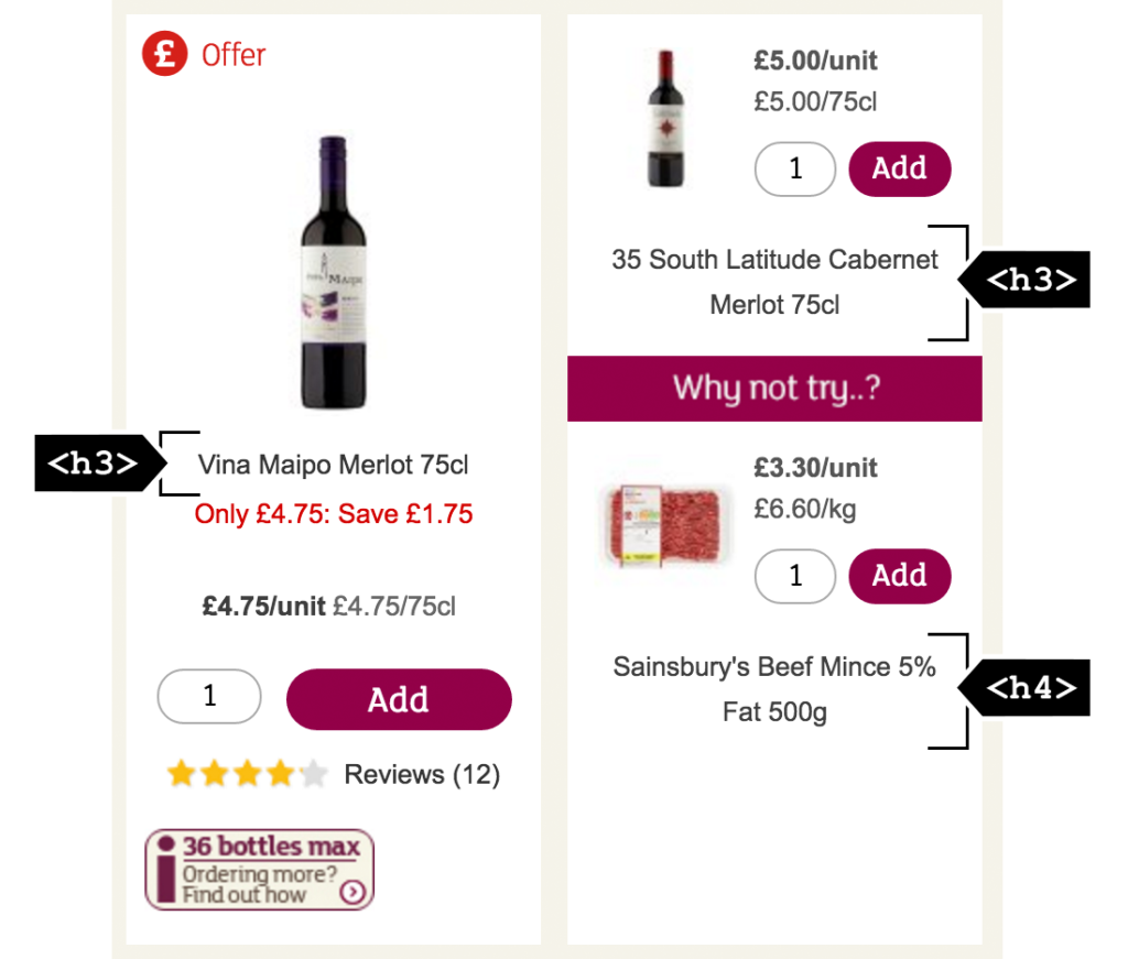
In line with our pattern, we used a h3 for the product name. We also used a h4 for the recommended product name, just to associate it with the product it was recommended with.
Unfortunately, we wrote our HTML for this in the order it was displayed:
- Heading level 3: Product one name
- Product one price
- Product one “Add to basket” button
- Product two price
- Product two “Add to basket” button
- Heading level 3: Product two name
- Recommended product price
- Recommended product “Add to basket” button
- Heading level 4: Recommended product name
What was the result of this? Customers using a screen reader were adding the wrong products into their baskets. Queue the facepalm.
This was happening because they were, quite rightly, using headings to find all the products on the page. So when they reached product two, they read on from that point and used the next add to basket button they came across. Unfortunately for them it was the add to basket button for the recommended product.
Sure enough, we received feedback about the problem pretty quickly. Thankfully, the majority of customers reviewed the contents of their basket before checkout and spotted the problem.
To fix it we took the h3 and h4 off of the product names that were being displayed, and placed a visually hidden heading containing the product name before the price of the original and recommended products. This duplication of content was far from ideal, but it was necessary to fix the issue. In hindsight, we should have pressed for a design with a more logical reading order, which would have avoided a suboptimal hack.
Conclusion
Developing with the document in mind can help you make good choices in your use of HTML. We looked at the title and h1 to h6 HTML elements, and saw how making the right choices benefits those who use what we develop. We also saw how wrong choices have the opposite effect.
To develop with the document in mind you need to understand the content that’s going into the page. You can do this by asking yourself questions like:
- What is the page about?
- What are people expected to do with this page?
- What logical sections can I divide the content into?
- What types of content are going into the page? (e.g. tables, lists, images, etc.)
When you have answered these questions you can decide what HTML elements to use. Then learn how to get the most out of those elements. Now you can start writing your HTML … but with one exception: only write the HTML you need for the content, and nothing else.
Once you have done this you will have laid the foundation for an accessible document. You can now add what you need for styling and interactions. As long as the elements you have used and the order they appear in remain unchanged, that foundation will remain intact.
That doesn’t mean to say nothing can go wrong, but if you develop with the document in mind you will be off to a very good start.
Lupe says:
Thank you for sharing these articles! The Sainsbury’s case study was awesome — I just rewrote a product detail page currently in-development to take into account possible heading structure pitfalls. So helpful; thank you for breaking it down for us devs. <3
Anthony Jeffery says:
You’re most welcome. Really glad you found it helpful.
There’s so much info that can go into a product detail page, so really pleased you’re looking at the heading structure for this.