When we look at disability as a spectrum instead of a binary, we can see that a lot more people struggle to use our stuff than we might think. The good news is that making things accessible helps even more people than we might realise. In the best case we take something from can’t use to can use. In the worst case, we make something a little easier for everyone to use. That means more, happier, humans using our stuff. Yay!
Take a moment to think about a project that you’re working at the moment. What’s your next ticket / issue / TODO item? Keep that in mind as you read on …
Switch it up
Maybe we think of a person either having or not having a disability. Like a switch that can be turned on or off.
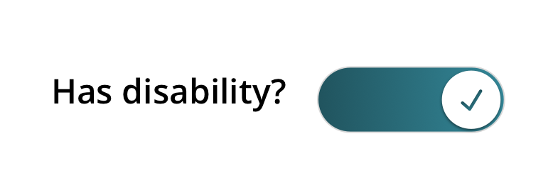
That seems to make sense at first glance. But hang on, let’s clarify: what do we mean by disability?
We think this social definition of disability (that we first saw in the excellent book A Web for Everyone by By Sarah Horton & Whitney Quesenbery) is a good match for the real world.
Ouch. A barrier created by the product? That means a barrier created by us. That’s kinda awkward to read, but totally fair. We haven’t done our jobs properly if someone can’t use our stuff.
What might cause a barrier for someone? Here are just a few examples.
- Having a learning disability and struggling to read dense, jargon-heavy, content.
- Having arthritis and not being able to click on a tiny Call To Action button.
- Being colour blind and not being able to tell when something’s changed because the information is only presented in colour.
Seems like our on / off switch for disability is not as simple as we thought. Maybe it’s several switches? Let’s split it up into cognitive, physical, and visual. There are many other types, for sure, but let’s stick with these three for now.
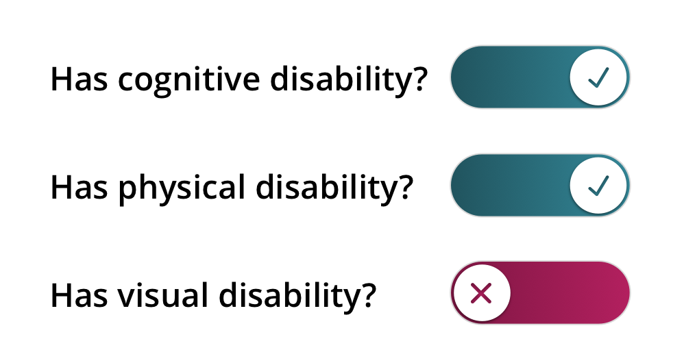
That seems better. It’s a bit more like the real world. There are many types of disability. And now it helps us see that someone might have more than one disability at a time. Something’s still not quite right, though. Time to get your pens (or fingers) out!
Activity 1: abilities and barriers board
Have a look at this board, which explores the “Ability + Barrier = Disability” equation bit.
| Types of disability | Cognitive | Physical | Visual |
|---|---|---|---|
| Someone’s functional capability could be affected by: | having autism, dyslexia, or a learning disability | having a condition like arthritis, cerebral palsy, fibromyalgia, or lupus | being blind |
| being tired, stressed, or depressed | having an injury | being colour blind (color vision deficiency) | |
| reading something that’s not in their first language | having decreased and less precise motor control (perhaps from old age) | having low vision or poor eyesight (perhaps from old age) | |
| being distracted or in a rush | being in a moving vehicle like a bus or train | being outside on a sunny day with a shiny screen |
Who do you know that matches one of the descriptions in the boxes? A friend, a parent, a colleague, yourself? You might find matches for a few, or for them all. Go on and write down your matches. But maybe don’t draw on your screen with a pen!
How does your Abilities and Barriers card look? If it’s like ours, probably quite full. Here’s the thing: this is what the world is like. All sorts of people, with all sorts of abilities. Maybe our three on / off switches aren’t quite the right way of looking at it either.
So what’s going on there? Let’s look at our three types of disabilities (cognitive, physical, visual) in more detail.
Activity 2: dots and dashes
- Pick one of the three types of disability (cognitive, physical, visual). Write down which one you’re going to think about.
- What’s the most severe version of this disability? If the on / off switch was in the “on” position, what would it represent? If you’re having trouble thinking of something, peek back at the bingo card.
- What’s the opposite? If the on / off switch was in the “off” position, what would it represent?
- Now for the tricky bit. What’s something between those two? It might be near one end or the other, but it’s different from either. If you can’t think of something near the “on” switch, try thinking about something near the “off” switch.
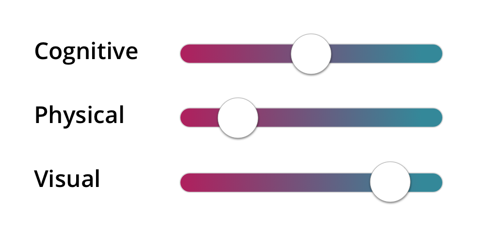
Well, if we can find a spot between the two ends for this one type of disability, we can probably find one for other types too. Maybe our on / off switches are more like sliders or faders or dimmers or an <input type="range">. Maybe disability is in fact a spectrum and not a binary!
You’re helping more people than you think
With this (disability is a spectrum) idea in mind, we can start to see how changes we make for accessibility purposes can help more people than we think.
- Making sure that the language is plain and simple, jargon-free, certainly helps people with cognitive disabilities. It also helps people who are tired, distracted, or just in a rush. It also helps anyone who’s reading content that’s not in their first language. Here are some tools that can help.
- Hemingway app gives you a bunch of stats on readability.
- Readability Analyzer gives you bunch of metrics like Flesch Reading Ease and Fog Scale Level.
- Expresso app has readability and editing metrics.
- Making sure that everything is keyboard accessible certainly helps screen reader users. It also helps power users: people in specialised jobs (like developers!) often keep their hands on the keyboard to speed things up. It also helps people who don’t use a mouse due to a physical impairment like arthritis. You don’t need any special tools to check this: just don’t use a mouse or trackpad! (We recommend unplugging your mouse or covering your trackpad!). Here are some things to watch out for.
- Can you see where you are on the page? Look for a visible :focus indicator as you tab through.
- Can you interact with every element on the page?
- Can you use functionality (like tooltips) that you usually see on a hover action?
- Making sure the colour contrast meets WCAG 2.1 Level AA helps makes sure that people with colour vision deficiency can see all the information that’s being displayed. It also helps people with low vision or poor eyesight, which often comes with old age. Here are some tips for checking the contrast.
- We use Lea Verou’s Contrast Ratio often. It gives you the contrast ratio and the pass or fail level for WCAG 2.0.
- Use the High Contrast display mode of your computer.
- Windows: Use High Contrast mode. Press
left Alt + left Shift + Print Screen, or: Ease of Access button on the sign-in screen > High Contrast. - Mac OS: System Preferences > Accessibility > Display. Select Invert Colours or Use Grayscale.
- Windows: Use High Contrast mode. Press
- If you’re using iOS and Mac OS you can use the Sim Daltonism app.
- If you’re using Chrome, check out the Funkify extension. You can use Color Carl or Sunshine Sue to check your contrast levels.
Go be a superhero
We think it’s pretty clear that disability is a spectrum, not a binary. That makes things complicated, but there’s good news! The changes we make will help more people than we think. We’ll make our stuff a little easier to use for some people: that’s good. We’ll turn it from unusable to usable for some others: that’s great! That’s a win-win situation. A double-win. Two wins for the price of one! Much win.
Maybe this sounds like a lot of work. Well, it is. But! We keep coming back to a great quote from Leonie Watson:
“It doesn’t have to be perfect. Just a little bit better than yesterday.“
This is great news. Small changes are easier to do. Small changes are easier to sell to the bosses and the clients. Small changes add up over time.
Activity 3: a little bit better
Remember we asked you at the start of the article about what you’re working on? What’s your next ticket / issue / TODO item? Grab that and go back to the Activity 2: Dots and Dashes. activity. Apply that to your next ticket. What’s that dot somewhere in the middle? Who else will you help by doing this bit of work in an accessible way? Take the ticket and give it a tiny shove. Make it just a little bit better than yesterday.
If you can’t start work on it right now, make a note-to-self. Be as detailed as you can: the more detail you add, the more likely you’ll be to remember it and do it later. We like to use 5W’s and 1H (Who, What, Where, When, Why, and How) to help ourselves figure out the specifics of things. If you’re feeling really frisky, share what you’ll do with someone.
Keep in mind that disability is a spectrum, not a binary, and you’ll get yourself more, happier, people using your stuff!