Long live the modern browser!
Browsers are getting better these days. We seem to be in a golden age where there’s a never-ending stream of new features added for the benefit of the users accessing the page, and really great tools for those creating the page. It hasn’t always been the case, though. Earlier versions of today’s browsers had limited features, and we had to consider how to work with — or around— those when designing and developing our sites. Static and adaptive layouts were commonplace, and our sites were designed to pixel perfection. Of course there was a distinct amount of pixel pushing gymnastics involved, though, when implementing our layouts within the constraints the browsers provided.
As browser features matured, and techniques like Fluid Grids became more commonplace, the way we coded our sites evolved into a whole new paradigm. We switched from defining and coding our units of measurement in pixels, and began using relative CSS units and unitless values more consistently in our CSS to meet the needs of ever-changing viewport sizes.
Fast forward to the present, and browser vendors have added in more features to allow us to create flexible and robust designs in a straightforward manner. Take for example, browser zooming. When the user zooms the page in a modern browser, everything scales up — or down — proportionally, depending on the user’s preference. Well, at least it should.
Why is browser zoom a big deal, anyway?
Allowing the user to control their web browsing experience isn’t a new concept, in fact it’s something that’s been written about in the web’s early days. Lately, that concept seems to have been forgotten as the browser features have improved.
The most important reason for using responsive and unitless values in our CSS is for supporting our users that rely on zooming. If you read the Web Content Accessibility Guidelines, our users need to be able to zoom the viewport without loss of content or functionality, or restrictions imposed by CSS values or viewport scaling settings. In particular, there are a some success criteria to be met:
- WCAG 1.4.4: Users must be able to resize text without assistive technology up to 200 percent, without loss of content or functionality. (Level AA)
- WCAG 1.4.8: Ideally, we should provide appropriate spacing between lines and paragraphs, and we shouldn’t be requiring the user to scroll horizontally to read a line of text on a full-screen window. (Level AAA)
- WCAG 1.4.10: Users must be able to resize text without being forced to scroll both horizontally and vertically to read that content. (Level AA)
Design systems and threads of consistency
As someone who works on the O’Reilly Media Design System, weaving threads of consistency across brand, style, and UI components is a top priority. Consistency across a system empowers designers and developers to craft great app experiences for the end user. That said, the most important thread that connects all elements of a design system tapestry is established accessibility best practices — for colors, typography, components, patterns.
In the case of defining a system’s typography styles, standards are established for things like visual hierarchy and rhythm of typography. Oftentimes a designer will begin layouts in Sketch or another design-based program, and specify font sizing and line-height values for typography in pixels. This approach can work well for static layout purposes, but there’s a catch. A pixel-based typography approach will not work as a CSS strategy, though, when browsers — and specifically browser zooming — enter the picture.
The browser zoom debate
At this point in the design system development process, a debate can ensue. In fact, our team had a very spirited debate about this when our design system was being rebooted — and I noticed that our typography CSS styles were using px-based line-height values as defined in Sketch by our designer.
Some of the arguments for using pixels in CSS were: “Browsers handle all the font zooming for us, so we don’t have to convert our typography to relative units in CSS. Users don’t bother to adjust the font display settings in the browser, our work is done here!” <dusts off hands> Some of the rebuttals for using relative CSS units were: “Yes, browsers handle page zoom for us, yet there’s a difference between how the UI appears when the page is zoomed, depending on whether the default browser size has been adjusted as well. Users do bother to adjust the font display settings in the browser so we need to account for that in our CSS declarations.”
And so the research began. When I first started looking up recommendations on whether or not using pixels in CSS in general is a good idea, I’d find conflicting opinions on the subject, such as articles like this one describing why you should just use pixels or should stop using pixels in CSS. Articles about responsive sizing in media queries. Even a good article about Accessibility in Resizing Text about the behavior of older browsers.
There wasn’t much mention — or consideration — that users really do dig into the advanced browser settings to change their default font size. Thankfully, I ran across a mention of it in the MDN docs, a really good article by Evan Minto that dives into the user data, and section in Every Layout’s page on rudimentary units.
Those last three articles were especially interesting, yet even with the amount of information provided, the one thing that had been missing in all of this was a side-by-side example. In particular, an example of what a block of text using pixel values versus a block of text using relative or unitless values looks like in a browser zoom scenario. Especially if the user changes the default font setting under the hood.
What do you mean by default font setting, though?
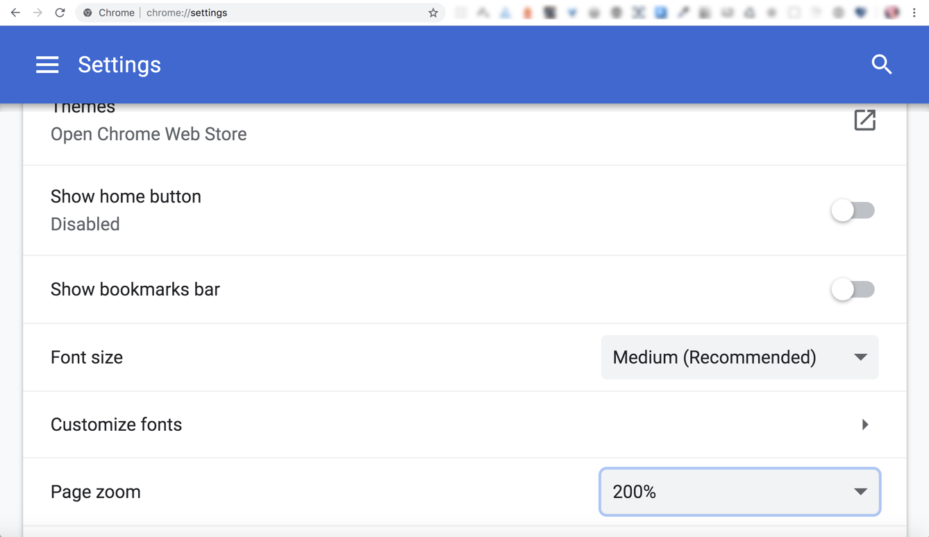
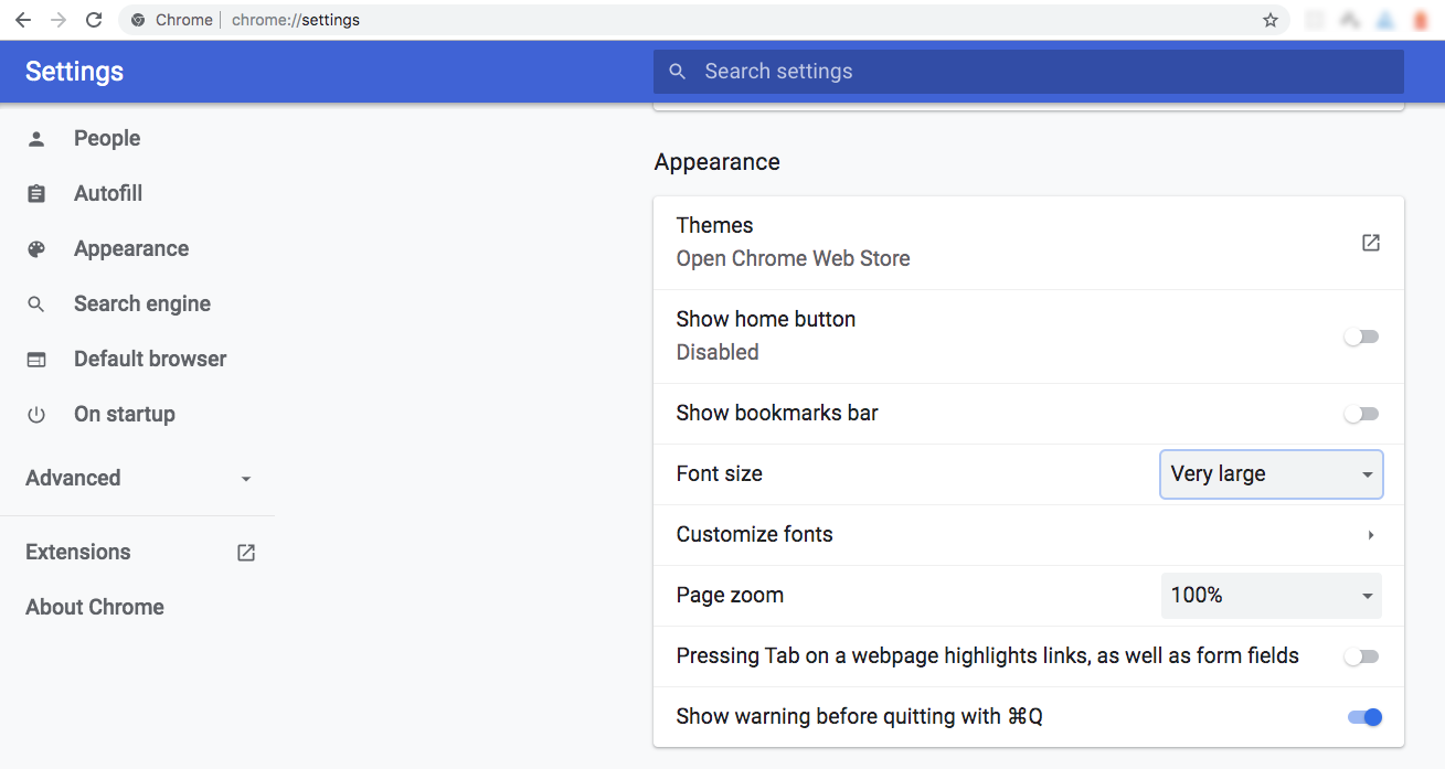
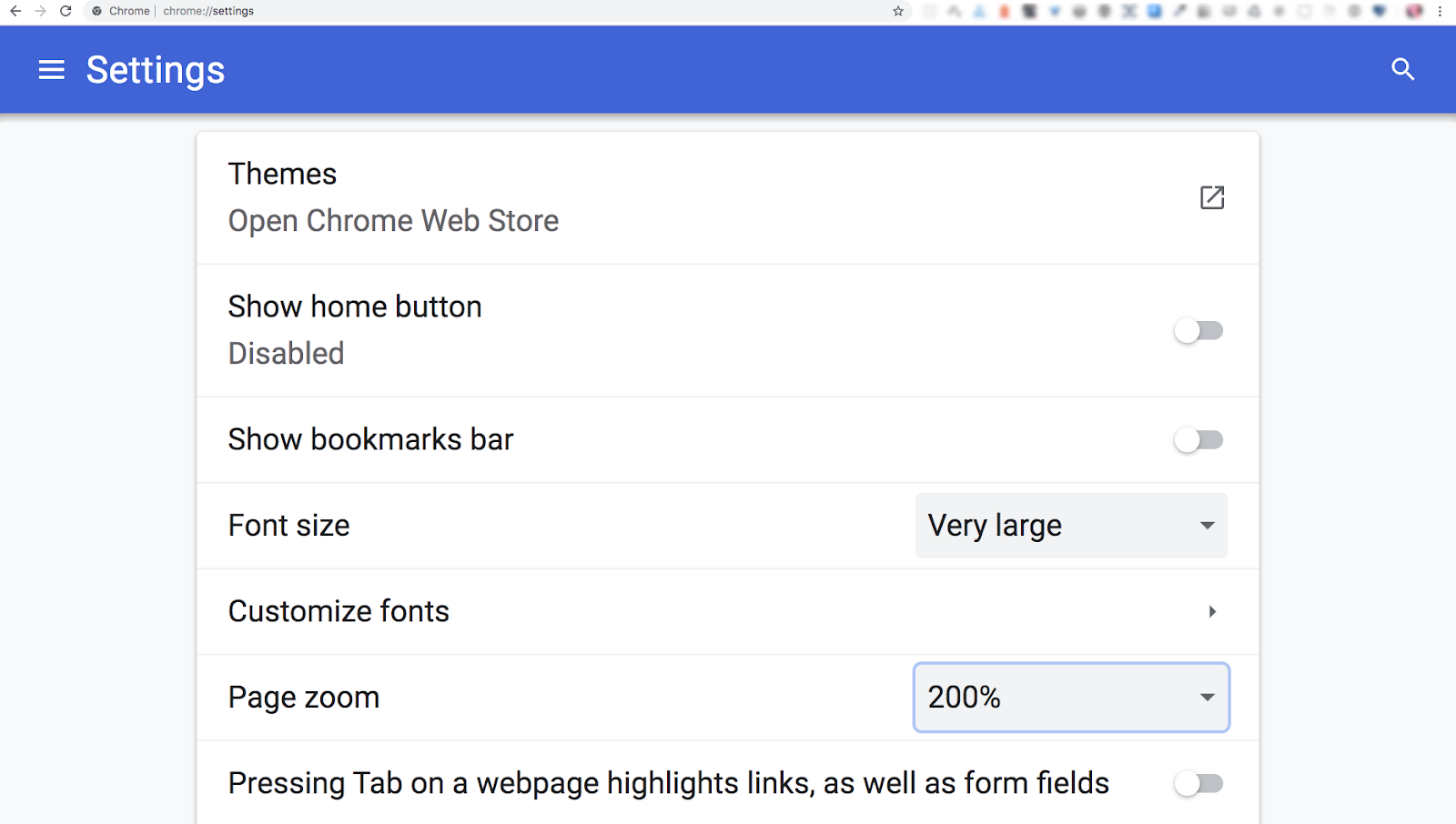
You may be familiar with a browser’s page zoom setting, which scales up all the contents on the page proportionally. A lesser known feature of most browsers, though, is the option to adjust your preferred font size. This feature operates independently from the page zoom feature. For example, these are the options used for the font size drop-down menu in Chrome’s appearance settings — ranging from the very small (9px) through very large (24px) — with the recommended default of medium set at 16px.
If you change one of those settings in your browser, ideally all your fonts will scale up (or down) proportionately in reference to the size of that font setting. Ideally, that is, if you’re using relative CSS units. This browser font size adjustment won’t have any effect on typography that uses pixels for font-size and/or the line-height. This brings us to the much-needed example.
The side-by-side comparison
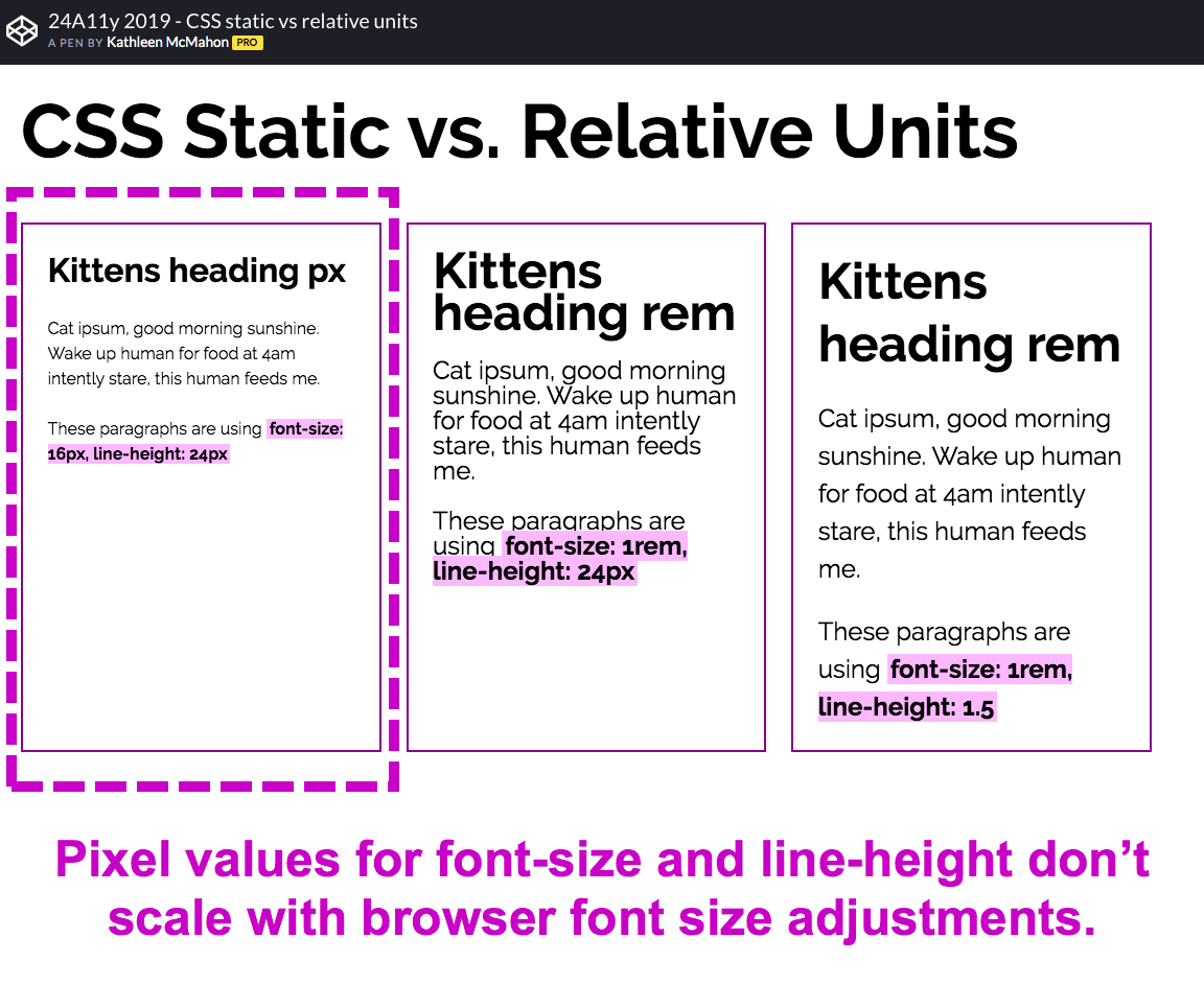
Let’s take a look at how a block of text appears in the browser when zoomed in to 200% using different settings for page zoom, and default font size.
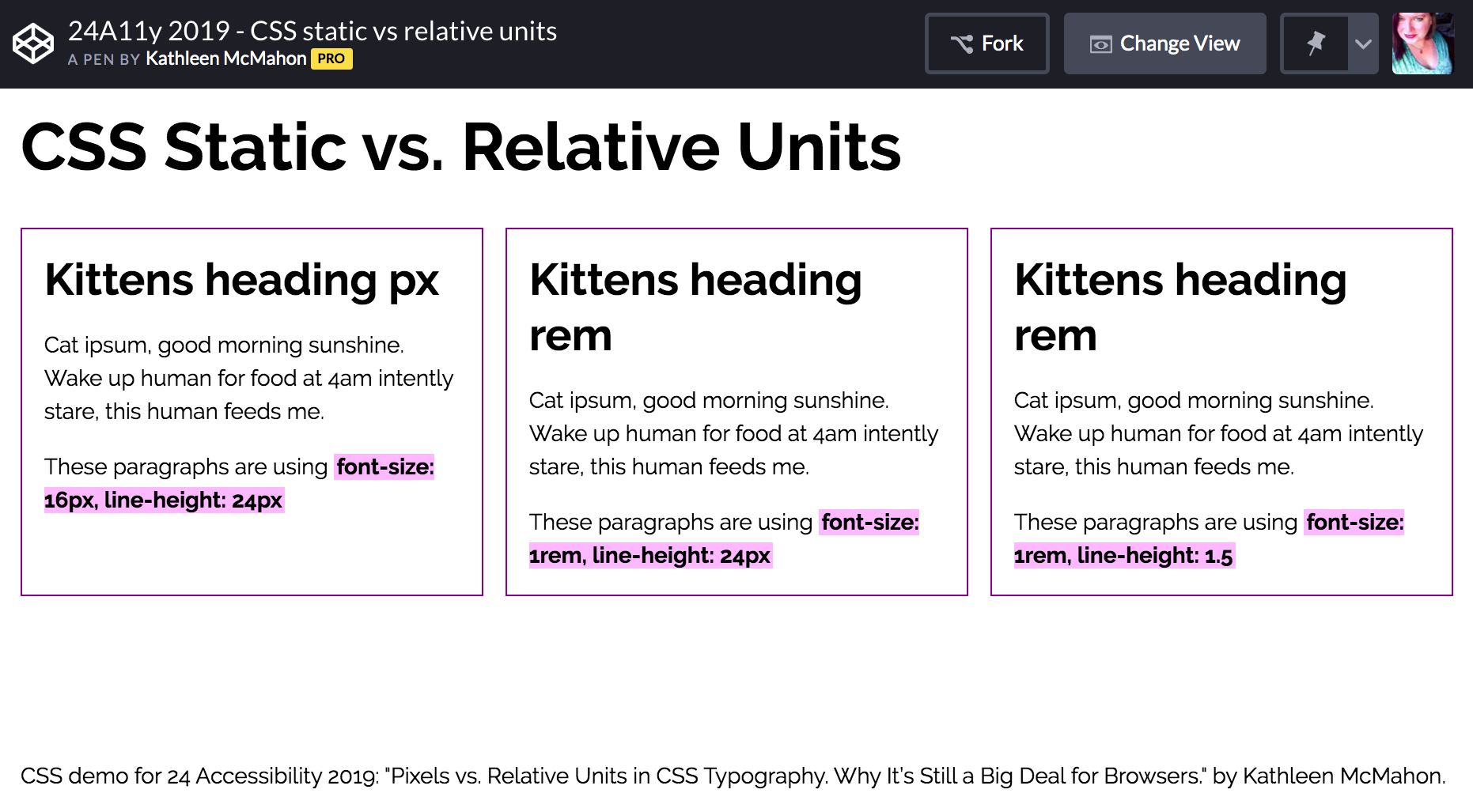
This Codepen displays three containers of text at a page zoom setting of 100% and a browser default font size at the recommended setting of medium (16px).
See the Pen by resource11 on CodePen.
light
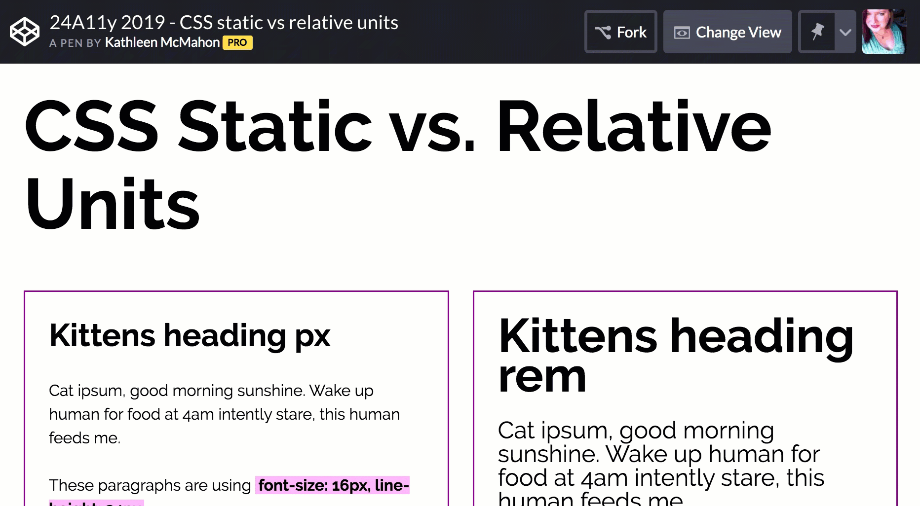
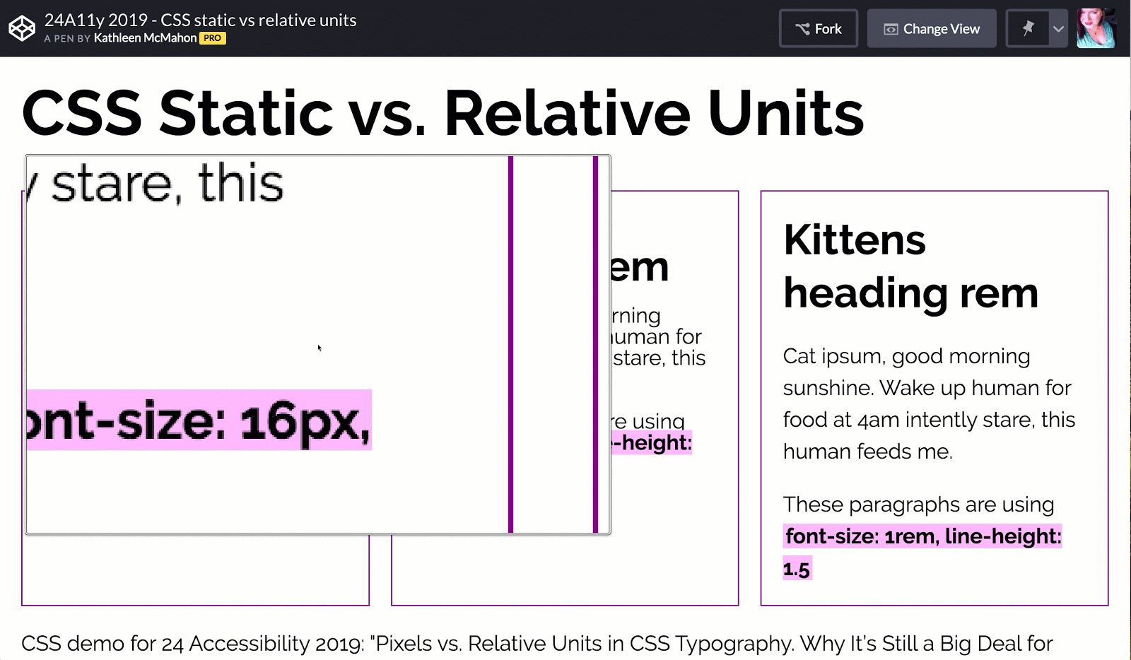
The size of the fonts and line-height values are the same, yet use different units of measurement.
- The left container uses pixels for both font-size and line-height.
- The middle container uses rems for font-size and pixels for line-height.
- The right container uses rems for font-size and unitless values for line-height.
If you adjust the page zoom setting of 200% and keep the browser font size at the default medium (16), there won’t be perceivable differences between the containers.
Users may set the browser font size without touching page zoom, so let’s adjust the page zoom setting back to 100% and change your browser’s font size to very large to see if anything changes.
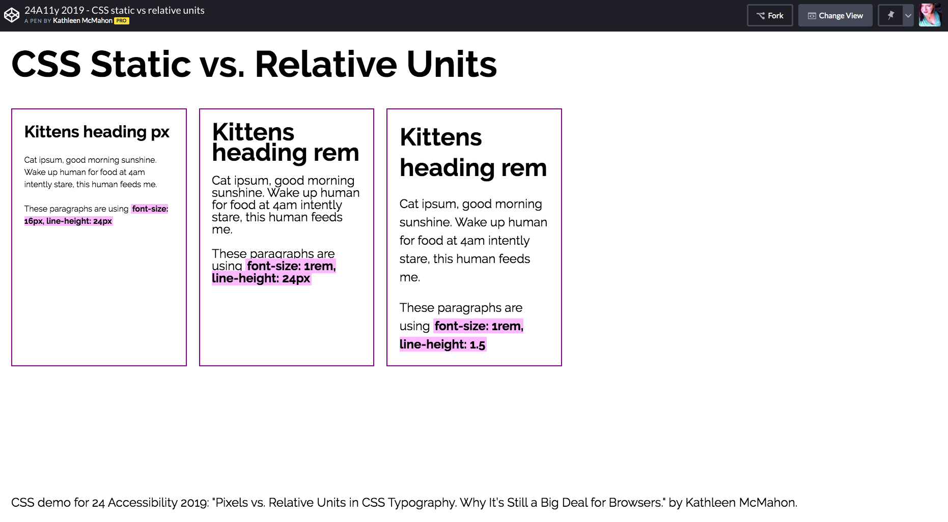
Notice how the text in the middle and right examples that use rems for font-size scale up to a multiple of the root level font size — which is 1.5 times the size of the default font size (16) — yet the example on the left remains the same, because the font’s value is still static (using pixels) rather than responsive (using rems).
Although both the middle and right examples are scaling up the font size properly, notice the line spacing in the block of text in the middle example looks very compressed.
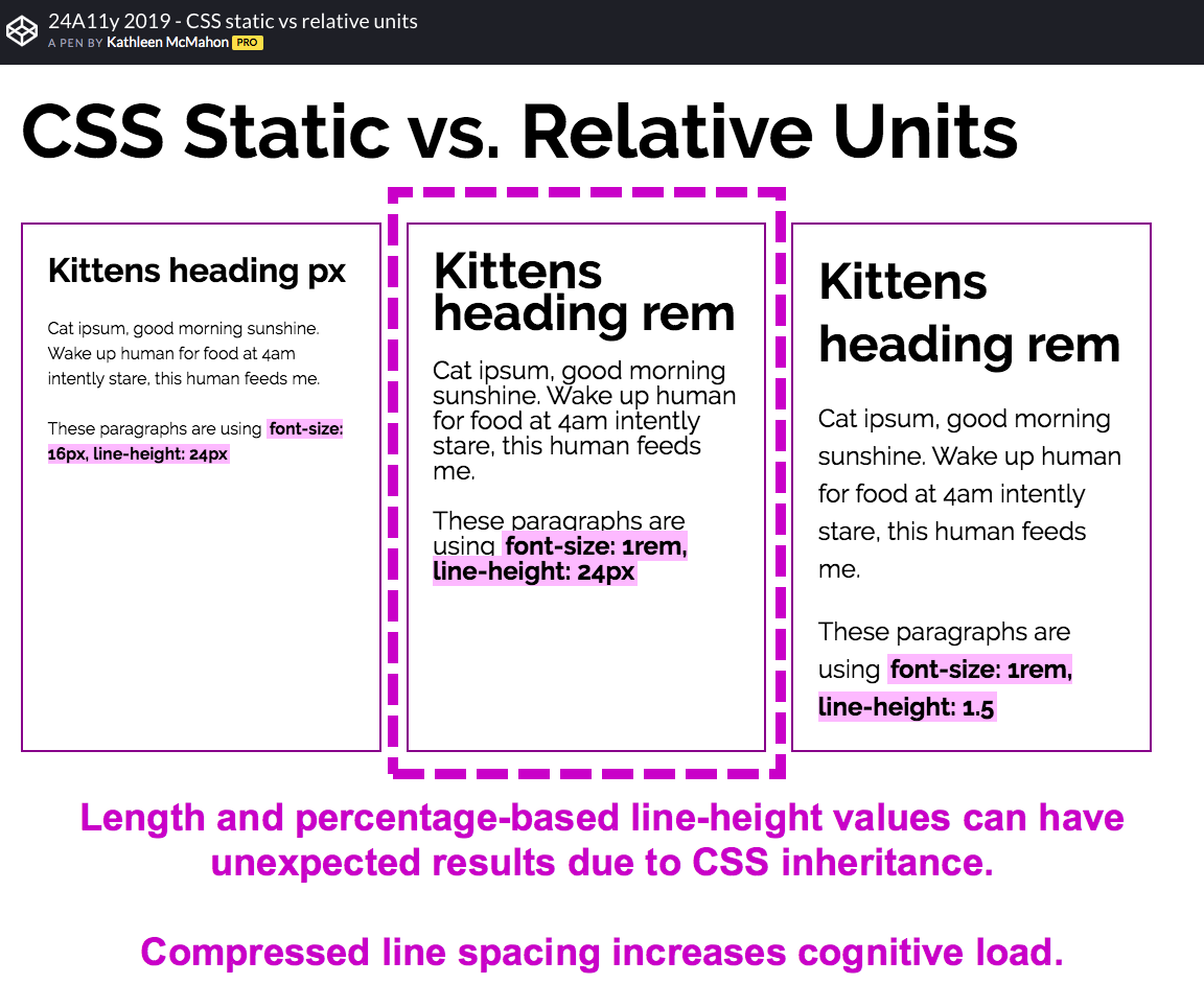
This compressed line spacing is occurring because that center example uses a line-height value set in an absolute length value (pixels) rather than a relative value. That said, it’s noteworthy to mention that setting a length-based or even a percentage-based value for line-height have poor CSS inheritance behavior and can cause unexpected results, like this compressed line spacing in the middle example. Tight line spacing can be tough to parse if you have a cognitive disability, so it’s not recommended to use length-based or even a percentage-based value for line-height, especially if you’re using relative units for font-sizing.
Which brings us back to the left example for a moment. While the left example also uses a length-based value line-height values in combination with its length-based font-size, our goal is to support users that need to change the default font size of their browser. Choosing length-based values for the font-size and line-height in that left example may be solving the compressed line spacing issue, yet isn’t solving the user’s need to display text according to their personal browser font size setting, so using length-based values for line-height isn’t a recommended approach.
The example on the right, however, displays with a comfortable amount of line spacing because it’s using a relative value rather than an absolute value for line-height. Additionally, this value is unitless rather than length-based, which is the recommended best practice for line-height. The unitless line-height value is calculated by dividing the container’s line-height value in pixels by the font-size in pixels. In this case, our initial font-size is 16px and initial line-height value is 24px as represented in the example on the left. When you divide the line-height by font-size 24px/16px, the result is 1.5, a unitless value.
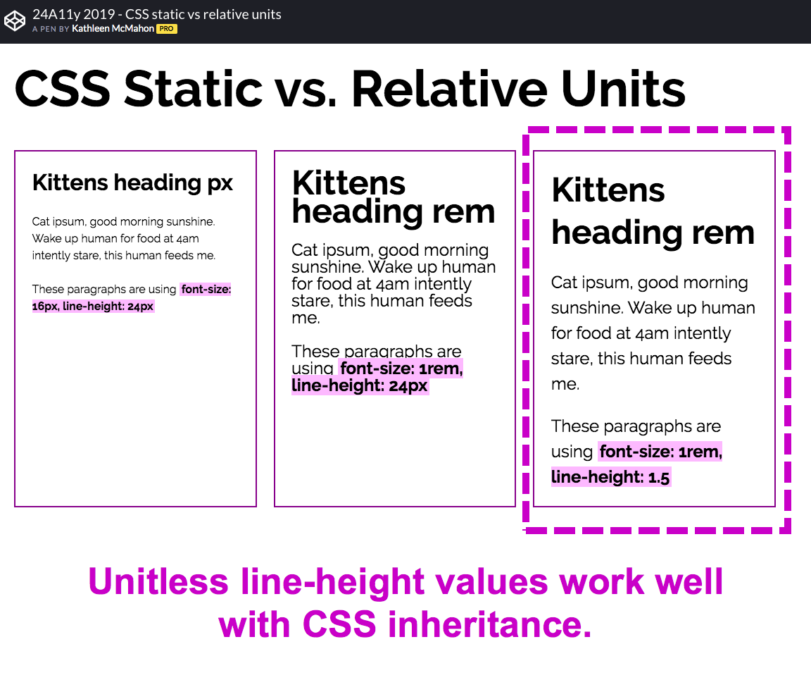
Using that unitless value on the right example rather than using a length-based value allows the line spacing of the container to scale up in proportion to the rem-based font size, while avoiding CSS inheritance issues. The end effect is a more comfortable reading experience for users that choose to zoom in on the page and adjust their default browser font size to their personal preference.
Remember, though, we’re still at a page zoom setting of 100% with the browser font size set to very large. Users may also need to set their page zoom higher while at a very large browser font size. For example, if the user selects a very large browser font size and sets the page zoom to 200%,
this added flexibility can create an even more comfortable reading experience when zoomed in.
If the user also happens to use one of the operating system accessibility settings like the macOS Picture-in-Picture Zoom feature,
using relative CSS units rather than relying solely on pixels really bumps up the reading experience in a low vision scenario.
This additional flexibility gives that control of experience back to the user where it belongs.
Pixel conversion tools
If you haven’t converted pixels to relative units in CSS before, here are some good tools out there to help you get started.
- Here’s a great px to rem conversion reference table by Estelle Weyl.
- If you want an online calculator, pxtoem is a solid tool.
- Also, this YouTube video by Jen Simmons of the Mozilla Firefox Font Editor is an excellent way to learn about and play with relative units in CSS.
Wrapping up…
Remember, users really do change their settings under the hood, and we should be maintaining users’ control over their own browsing experience. If you use relative CSS units for your typography styles, you can maintain the fidelity of your layouts without negatively impacting the needs of your users.
Acknowledgements
Many thanks to the Twenty Four Accessibility team — Scott O’Hara, Liz Davis, and especially Sarah Higley and Carie Fisher — for their editorial expertise!
Jorge says:
Thanks for this great content! What about margin/paddings, there is any recommendation on the best unit?
Kathleen McMahon says:
I’m glad you enjoyed it, Jorge! In terms of recommendation for the best unit for margin/padding, the only recommendation I have is: use relative length units and steer clear of absolute length units.
Andrii Toniievych says:
The pixel is also a relative size unit.
The physical size of a CSS pixel (or reference pixel) depends on the particular device and system scale.
If you set the system scale to 150%, for example, all the browsers and other apps will use this scale by default. In this case two CSS pixels will be displayed using three physical.
It is much more convenient approach in terms if accessibility. There’s no sense to make the text larger having all other elements small.
That’s why all the modern browsers since IE7 are switching from the font-based zoom to a more convenient whole page scaling.
Kathleen McMahon says:
I think you’re conflating CSS pixels versus device pixels here?
The CSS pixel is an absolute length unit, and absolute length units represent a physical measurement when the physical properties of the output medium are known. In low-resolution screen scenarios, that physical measurement represents one device pixel. In higher screen resolutions, it’s implied that one CSS pixel equals multiple device pixels.
In terms of convenience of approach in terms of accessibility, the goal here is to support and give the control of the browsing experience back to the end user. If we steer clear from using pixels for sizing, we have made the experience much more convenient for the end user.
Andrii Toniievych says:
The user already has a control over the browsing experience using the scale/zoom setting in browser or operating system.
It works exactly the same way as the scaling using the default font size on pages styled with the em/rem units.
If we change the base font size from 16 to 20 pixels, it is equivalent to 125% zoom.
Yes, it is the only option to scale the pages in IE6, but who uses it in 2019?
Kathleen McMahon says:
As stated in the article, if you set the font size in pixels in your CSS (that includes base font size), the end user will not have control over their browsing experience should they choose to change their default font size setting in the browser.
The page may zoom, however the fonts will not scale up relatively to the browser default font size setting. Therefore, the end user experience is being impacted by the developer’s choice to use pixels for fonts. I’m not sure what you’re speaking of in terms of “convenience of approach” here in terms of accessibility in your first reply… convenience for whom? I sure hope it’s for the end user, since that is the goal for any well-implemented page, if one thinks of inclusivity.
Volodymyr Hrebnov says:
“the end user will not have control over their browsing experience should they choose to change their default font size setting in the browser.”
The main idea is that real users do not use this legacy feature.
Andrii Toniievych says:
The user does have control over the browsing experience using the scale setting. He can change scale globally for his operating system, for the browser, and for the particular site.
The fonts in pixels do scale when you are changing the zoom. It is the way all modern browser works.
You can try to set the font-size for your comment to 20px using developer tools, for example, and scale the page using Ctrl and +/-. On a 200% scale, it will be twice bigger.
There’s no sense to change only the font size in terms of accessibility. The pages are not only the text; there’re usually a lot of other control elements and forms, which should also scale to be accessible.
mgol says:
Yes, that’s what I’m not getting here either. From the first example in the blog post it seems like the advantage of relative font units is the user may make just the fonts bigger without enlarging all the UI pieces. However, I see in one of your comments you advise to make everything relative. If that’s the case, those three scenarios will make the page lay out identically:
1. font-size set in browser settings to 32px; the page uses relative units for everything.
2. font-size set in browser settings to 24px, page zoom set to 133%; the page uses relative units for everything.
3. font-size left at the default 16px, page zoom set to 200%; the page uses pixels for everything.
That would mean the main disadvantage of using pixels is the user won’t start with the desired element & text sizes from the start if they set the browser-level font-size and they’ll have to zoom in the page first (unless they set the default page zoom in Chrome instead; then it works out of the box). After the first visit the browser will already remember the set page zoom.
On the other hand, as pointed out in one of the comments to the linked Medium article:
https://medium.com/@alastc/great-article-and-it-is-great-to-get-some-figures-on-this-sort-of-thing-f9595a9372af
it’s really hard to make a complex page work correctly if only font sizes are scaled. In other words, if you use relative font units you’d better use relative units for everything or the layout may break badly for people setting the browser font size to a big value. When third-party widgets are used, it’s sometimes hard to preserve this constraint for 100% of the code. On the other hand, if we use pixels, users needing bigger sizes will have to zoom at first but the page will still work correctly afterwards; if elements stop fitting on the screen, media queries will do their work.
Am I missing anything?
Lawrence Dol says:
@Volodymyr, @mgol,
I have good eyes, but a 4K monitor large enough that the O/S UI font’s are comfortable to read. But the 16px default in the browser is far too small to read large amounts of text comfortably. So my desktop browser’s fonts are all set to 22px/1.5. Images, et al, all display well next to this font. But my smaller laptop screen is set to 18px/1.5. I have always preferred a slightly larger text that the default, even before 4K, due to the fact the I speed-read; overly small fonts make reading harder.
The most annoying thing for me is the preponderance of web authors that don’t have the common decency to honor my choice of font size for the main body text which should be, wait for it, precisely and exactly what I have chosen.
When I zoom these sites the most common anomaly is that images are oversized. This is certainly true in Firefox, and Brave (the browsers I use for daily browsing).
So, yes, you are missing something. Just use 1rem for the body text and size every other piece of text relative to that. Period. End of story. Think of it as honoring the users’ choice. Do the same for the font family — if I wanted to read your article text without serifs, I would have chosen a sans-serif font.
mgol says:
@Lawrence Dol
Is your advice then to use rems for fonts and pixels etc. for other parts of the site like images? Because that’s opposite what the author of this post suggests in her another comment where she advised to use relative units for everything:
https://www.24a11y.com/2019/pixels-vs-relative-units-in-css-why-its-still-a-big-deal/#comment-1658
dakur says:
Hello,
thank you for sharing your struggling, research and useful links! I was curious what is current state of this zooming-problem and I’m happy to find an up-to-date article from someone who fights this as well. I have related problem which I would like to share as well.
I quite often come into a problem with images, for example icons, but it can be whatever image. I want to set width using `em`s as well to scale up with `font-size` of a link which the icon belongs to, but it renders blurry sometimes because it computes to a value like 12.15245px. So I am forced to set it in pixel value so it is not blurred but then it would not scale up when font-size through browser setting is increased/decreased.
some link
.link {

  font-size: 2em;

  display: flex;

  align-items: center;

}

.link::before {

  content: "";

  width: 1.2em;

  height: 1.2em;

  background-image: url("icon.svg");

  background-size: auto 100%;

}
Did you come into this as well and have some recommendation?
Thank you very much,
dakur
Nils Binder says:
Hey Dakur,
I know your problem. My solution to this is to simply ignore that icons can get a little blurry. I think as monitors tend to get better and better it will not be a big problem. In my opinion, the icons don’t get too blurry and you can still recognize them for what they are. I chose accessibility over designer-friendly sharp edge icons.
I also like to play around with the font size on the HTML element for better readability on larger screens (something like
html: { font-size: 125%; }) and when doing so I have absolutely no idea what pixel size my fonts and icons have … and I think that is a good thing.See this in action here.
Thurstan says:
I was trying to look for a pure css way of doing this. It could be possible I just haven’t found out if one of the maths commands is available. It is however possible to round off numbers in js such as shown here.
https://stackoverflow.com/questions/37756372/using-css-to-round-off-number-and-show-numbers-in-red-or-green-color
Alternatively you could look into the rendering of the svg and if changing that gives a better result
https://css-tricks.com/almanac/properties/i/image-rendering/
Hardi says:
I’ve had great success by embedding SVG icons directly, not using them as background images. No browser issues and I can also change icon colours on the fly if necessary.
Nils Binder says:
Hey Kathleen. Thank you very much for this article. It’s nice to see other people fighting for relative units. I’m on this for some years now and there are some topics, where I still get confusing answers to. So I’d love to hear, what you think about it.
1. I like to use relative units for everything (except 1px borders…). For very large screens I then like to blow up the font size for the HTML tag to let’s say 125% so the whole page grows and it gets a little easier to read and you can sit back a little. Some people tell me it is a bad accessibility practice to change the font size on the HTML like this, but I can not see why. What is your opinion on this?
2. On landingpages today it is quite common to use very large typography. (See the headline in this pen as an example) Mostly when it comes to accessibility we talk about fonts being too small to be read. Do you know if a font size too large could be a problem, too?
3. What is your opinion of mixing viewport units with relative units? Something like
font-size: calc(1em + 1vw);. (Example can also be found in this pen)IOIIOOIO says:
I was wondering what your recommendations would be for the increasingly popular fluid-type (based on viewport units)? Is it bad practice for accessibility?
JakoD says:
One huge advantage in my opinion is that you can provide the user with in-page settings for increasing the font size when you use rem (mostly) and em (only locally within “components”).
This works even on static pages without the need to load alternative style sheets, 50 tons of CSS variables (they don’t work in IE), or CSS-bloat when using classes for toggling different sets of font sizes.
You simply set the CSS class for the appropriate font size choice for the root (
) element; the CSS style being something simple as.font-size-adjust--large {font-size: 1.25rem; }(actual values may vary).The reasoning why one might consider this is simple: Not in every use case the user is on his own pc with font size settings already in place, and worse its not always possible to set the font size via the settings (e.g. kiosk mode sites).
However make sure your layout still works with the largest provided font-size increase.
As for padding/margin:
You might want to have inline (usually horizontal) values still be absolute units or a combination of absolute and relative units via
calc()to prevent overflows and scrolling in the inline direction.Block direction (usually vertical) padding/margin is fine with relative units as scrolling is expected there anyway and overflow is usually non-existant.
Olle Brickarp says:
Regarding calculating rem units – if you’re using Sass you can setup a function to handle this:
$rem: 16;//font-size on :root

@function rem($val) {

  @return ($val/$rem)+rem;

}
The function is then referenced with rem(value) and can be used anywhere.
h1 {

  font-size: rem(64);

  line-height: rem(72);

  margin-bottom: rem(32);

}
/* Output */
h1 {
font-size: 4rem;
line-height: 4.5rem;
margin-bottom: 2rem;
}
This technique is also useful when calculating vw units, in that case based on a screen size.
Thomas Higginbotham says:
I’m surprised by the number of comments advocating for px units for font sizes. It may be true that most people don’t change the browser font size settings, but the fact that they haven’t been removed from any major browser means that the browser vendors have reason to believe they are being used. I would like to see a study on how many user with disabilities change their browser’s font settings. I imagine it’s higher than people think.
Additionally, if you want to be WCAG AA compliant, you must use relative units for font sizes. WCAG 1.4.4 and 1.4.10 (mentioned in the article) will not pass validation if you are using px font sizes. You are effectively disabling a browser feature designed for accessibility. When the leading web accessibility group disagrees with you, and you don’t provide sources for why you believe px should be used, your position doesn’t carry much weight.
Konstantin says:
Interesting article, as for px to em/rem converter, I made my converter almost 2 years ago and have been using it since then.
http://remconverter.konrud.com/
AlastairC says:
I’ve been back and forth on this one a lot (e.g. https://alastairc.uk/2018/08/pixels-vs-ems-commentary/), there are a few factual points to keep in mind:
– All units are relative to something, and CSS px are relative to an angle: https://www.w3.org/TR/css-values-3/#anchor-unit Across different sized devices, having a unit relative to viewing distance is a good thing. (Also note that the physical size of EM/REMs is based on css px because it is the arbiter unit between device pixels and the intended size of things on screen.) E.g. a CSS pixel on a TV is way bigger than a CSS pixel on a phone, due to viewing distance.
– The worst problems come from badly mixed units, like your example line-height in px and font-size in rem, or having something relative to the viewport (%) and content blocks with width set in rem or px.
– A lot of (flexible) layout problems come from text being sized differently to the layout, so text expands out of its containers. This is easily triggered when a user adjusts the default text size and a site has used mixed units in sizing & layout.
– As a user, setting a default zoom level instead of default text-size will work even when a site gets it wrong (i.e. mixes units badly).
My more opinion based points are:
– If you follow the logic of making sure that users’ adjustments to default text-size are catered for, you have to go down the path of sizing everything in font-relative units, e.g. rems. (Unless the site is very simple, but I’m generalising.)
– If everything is sized in rems, it is functionally identical to sizing everything in px (or any unit not relative to viewport) and using zoom. (See https://www.theguardian.com/uk as an example, switch between zoom methods and nothing changes.)
To be clear, I’m not saying we shouldn’t cater to people adjusting their default text size, I’d just like to really stress that bad mixes of units is the big issue, not whether something is in px or not.
Also, if I could wave a magic wand, I’d standardise on zoom rather than having two methods of adjusting sizing.
Alastair Campbell says:
> if you want to be WCAG AA compliant, you must use relative units for font sizes. WCAG 1.4.4 and 1.4.10 (mentioned in the article) will not pass validation if you are using px font sizes.
This is not correct, the requirement is that users are able to increase the size of text, it does not specify a mechanism. Zoom is a valid method so long as users have a user-agent that supports zoom, which in general they do. (You could get into a discussion about conformance claims scope, but that’s not helpful for a general discussion.)