Last year I attended JS Conf Budapest and I watched many great talks but “YES! Your site can (and should) be accessible” by Laura Carvajal was the most thought-provoking talk for me. Laura explained how the Financial Times made accessibility a core part of their development process and she shared several lessons she and her team had learned. In her third lesson Throw away your mouse, Laura mentioned that just testing with the keyboard wasn’t enough and that only going keyboard-only all the time made a difference.

I was intrigued by the idea of going all-in and I wanted to try it myself. Charlie Owen was sitting next to me during the talk and her presence inspired me to also share my findings, since she did a similar thing in A day without JavaScript.
But you know how it goes, I didn’t find the time, I was too lazy or another interesting thing caught my attention, and I let it slide. Then, fast-forward a few months, Chris Ashton published I Used The Web For A Day With Just A Keyboard. He did pretty much the same thing I initially intended to do, which, in hindsight, is great because I realized that there is a need for deeper exploration. Chris does a great job explaining why some things don’t work and how to fix them. I highly suggest you read his article if keyboard navigation on the web is new to you.
There’s just one important question his article didn’t answer for me: “Would the web be usable and accessible to me if I wasn’t able to use a mouse today?” You need way more time and data in order to answer that question. So, I continued my idea from last year but this time I decided to dig deeper. I surfed the web only by using the keyboard for several weeks. I kept track of all the pages I visited and the good and the bad things I came across.
Disclaimer
Before I share my findings, there are a few very important things I want to clarify.
- This is neither an academic paper nor did I perform professional audits. The tests have been carried out from my point of view.
- Some of the metrics and valuations are simple and highly subjective.
- I only tested the pages and parts of pages I’ve used, not whole sites.
- The results are not representative for the whole web due to the fact that they’re only based on pages I have used in a relatively short period of time.
- I don’t want to blame or shame anyone with this article, I just want to educate and help people improve their HTML and CSS skills in order to make better products.
Methodology
Documentation
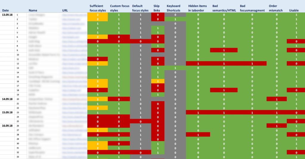
I began my little experiment by creating a spreadsheet with the following columns:
- Date – The day I visited the page.
- Name – The name of the site.
- URL – URL of the tested page.
- Sufficient focus styles – Are focus styles good enough?
- Custom styles – Does the page have custom focus styles?
- Default styles – Does the page rely on default focus styles?
- Skip links – Are skip links present?
- Keyboard shortcuts – Does the page provide additional keyboard shortcuts?
- Hidden items in tab order – Are tabbable items present that are not visible in the viewport?
- Bad semantics/HTML – Have HTML elements been used where others would be more appropriate?
- Bad focus management – Is focus always where it’s supposed to be.
- Order disconnect – Does the visual order match DOM order?
- Usable? – Is the page usable?
- webdev related – Are the contents of the website related to web development.
- a11y related – Are the contents of the website related to web accessibility.
I’ll go into some of those things a little bit more later but I won’t explain the basic concepts behind them. If you want to learn more about keyboard navigation, check out these links:
- I Used The Web For A Day With Just A Keyboard
- Writing JS with Accessibility in Mind
- Managing Focus – A11ycasts #22
- Does reordering content affect accessibility? – A11ycasts #21
- “Skip Navigation” Links
Hard- and Software
I tested most of the pages on large screens on macOS High Sierra on an iMac (27-inch, Late 2012) and macOS Sierra on a MacBook Pro (13-inch, 2016). I interchangeably used Firefox and Chrome.
Results
I tested a total of 200 different pages.
Focus styles
The first thing I checked was if focus styles were present on the page. I’ve documented 3 things:
- Does the page have custom focus styles.
- Does it have default focus styles.
- Are the styles provided good enough to use the page with the keyboard without extra effort and without getting lost too easily.
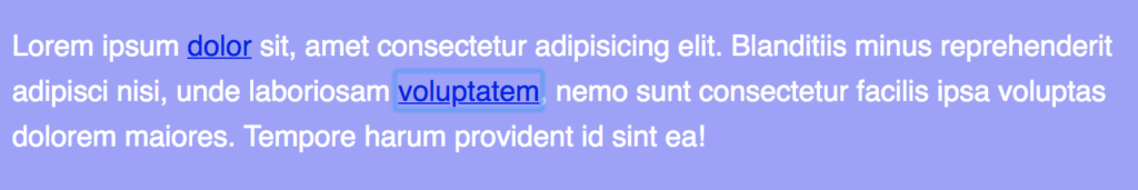
48% of pages have at least some custom focus styles.
Having custom focus styles is good and important but the fact alone that they’re present doesn’t mean that they’re great. Sometimes only minor differences, like a font color that changed slightly, were visible on focus.

38% of pages only use default styles and have no custom styles.
Default focus styles are very different across browsers and operating systems. Whether they’re visible enough to be helpful depends on the colors used in the design of the specific pages, and how the default styles pair against those colors.
Relying only on defaults is too dangerous, we should avoid default browser focus styles.
16.50% have good focus styles.
While almost half of the tested pages provide custom focus styles, only 16.50% of all pages provide clearly visible and distinguishable styles. Of course, this is just my personal judgment. What didn’t work for me might have worked for someone else.
Best practices
Most of the pages with really good focus styles are using the :focus-visible polyfill or a similar technique to create specific focus styles for keyboard users.
14% of pages have no focus styles at all.
The pessimist in me thought that the number of pages with no focus styles would be much higher. Nonetheless, we have to put that number into perspective considering that most tested pages that have focus styles don’t highlight focusable elements sufficiently.
Skip links
19.57% of pages provide skip links.
I was surprised by this very low percentage because skip links are easy to implement and some CMS provide them by default. They are arguably one of the most important tools for keyboard users and useful for screen reader users, as well. Some pages weren’t usable because I had to tab through the same global navigation links each time I went to a new page.
It’s worth mentioning that I’ve only documented the use of skip links on those pages where it would’ve made sense to implement them. I’ve excluded pages from the results where skip links would’ve been superfluous due to a low number of focusable elements between the beginning of the document and important sections in the page.
Broken skip links
On some pages, I was able to locate skip links that were present but didn’t work due to bugs or wrong implementations. Here a few examples:
Wrong href-attribute
The example below is actually correct, although you could improve it by applying the id directly to the main element and avoiding the empty link. The problem is that it points to an anchor that doesn’t exist. This happened on several tested pages.
<a href="#page-start">Jump to content</a><main>
<a id="main"></a>
</main>
Not all properties reset
In another example, the skip link wasn’t visible on focus because clip-path, a property that was used for hiding the skip link, wasn’t reset on focus.
.screen-reader-text {
    ...
    clip: rect(1px, 1px, 1px, 1px);
    clip-path: inset(50%);
    ...
}

.screen-reader-text:focus {
    ...
    clip: auto !important;
    ...
}
clip was set to auto !important on focus but clip-path, which has pretty good support in most browsers, wasn’t. Therefore the skip link didn’t show in browsers that supported clip-path.
Screen reader only skip links
Another page provided a skip link but it used a div wrapper, which by default isn’t focusable, to hide it. The link doesn’t show on focus, it’s accessible to screen reader but not to keyboard users.
<div class="screen_reader_text"><a href="#content">Skip to content</a></div>
.screen_reader_text {
    position: absolute;
    left: -9999px;
}
Best practices
Most skip link implementations are very similar, they usually offer a link to skip to the main content or to the main navigation. Sometimes you’ll find an additional link that brings you directly to the search bar, which is very convenient. If and how many skip links you need depends on the size of your page in terms of the number of focusable items and main sections.
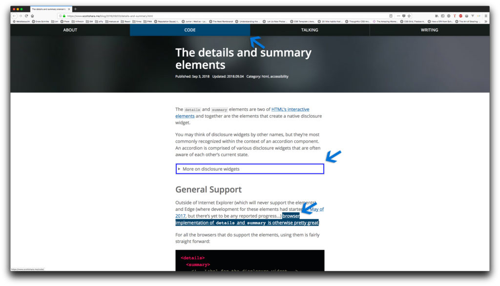
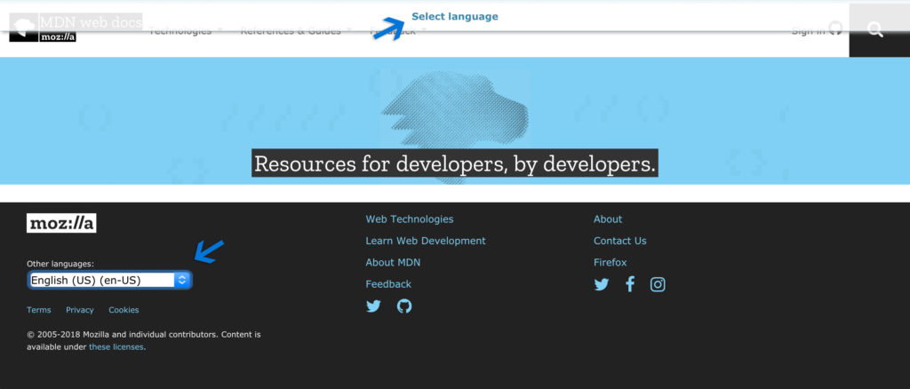
Three pages stood out for me. MDN has a Select language link that will bring you directly to the language selection in the footer of the page, which in their case makes a lot of sense.
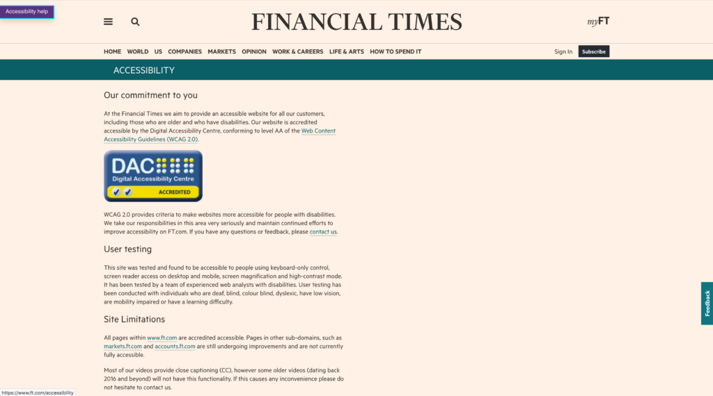
FT.com offers an additional Accessibility Help link in their skip links that will bring users to an accessibility info page where they inform users about the sites limitations, how they tested it, how to get in touch and when the page was updated the last time.
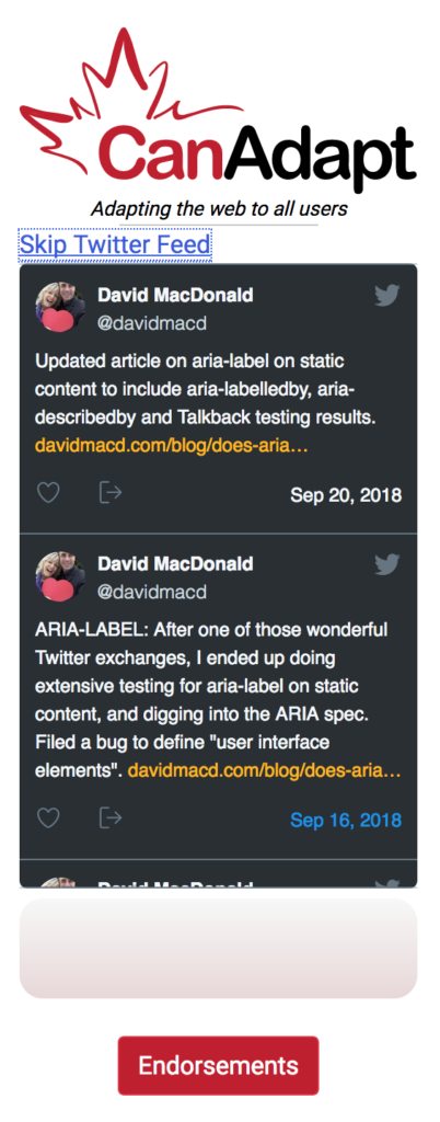
The majority of websites have site-wide skip links which are usually one of the first items in the DOM. David MacDonald’s website has an in-page skip link in the sidebar right before a twitter feed widget which contain several focusable items. A skip link at this position is convenient because it allows users to skip the many focusable items within the widget.
Keyboard shortcuts
9 websites have keyboard shortcuts.
Additional keyboard shortcuts aren’t a must have but they can be very handy, especially for power users.
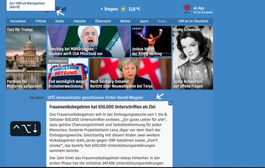
orf.at
In addition to skip links, orf.at provides access keys. The concept of access keys is interesting but there are several accessibility concerns with the attribute.
Another nice little feature is that you can browse expanded news teasers by pressing control + option + up/down arrow.
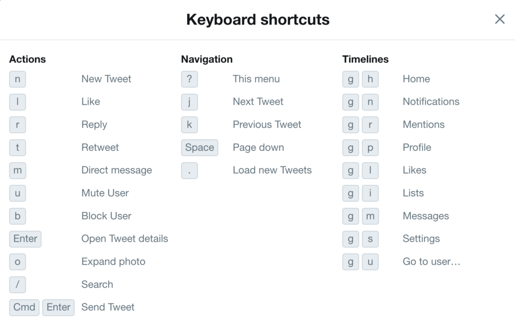
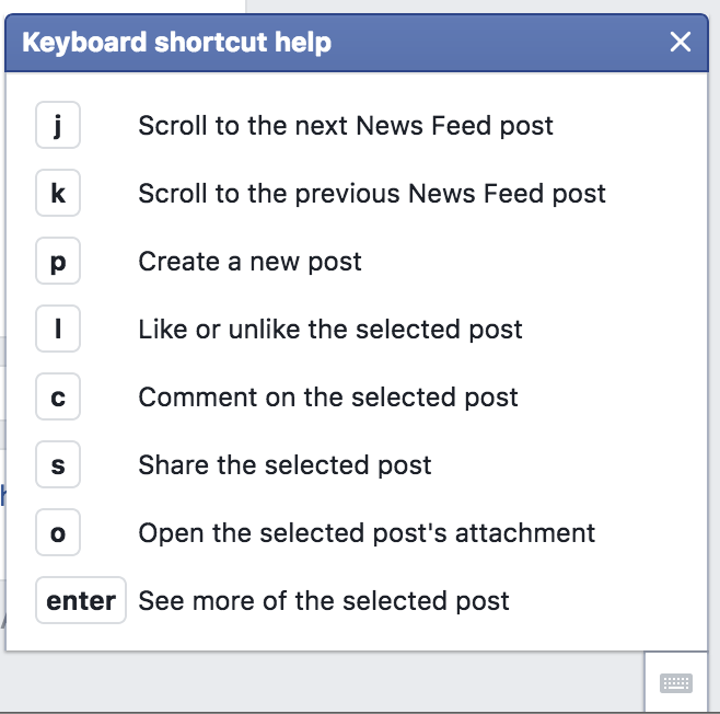
After I found out that you can use shortcuts on twitter I started browsing tweets by pressing J and K, liking by pressing L and composing new tweets by pressing N. A nice accessibility feature and great for power users, as well. You can open the keyboard shortcuts cheat sheet by pressing ?.
Tip: Some shortcuts conflict with Firefox’ default settings. You have to untick the Search for text when you start typing checkbox in about:preferences.
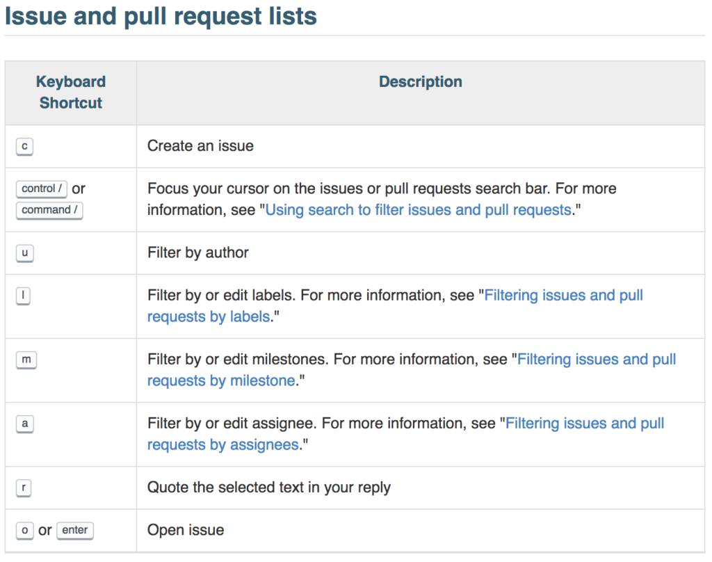
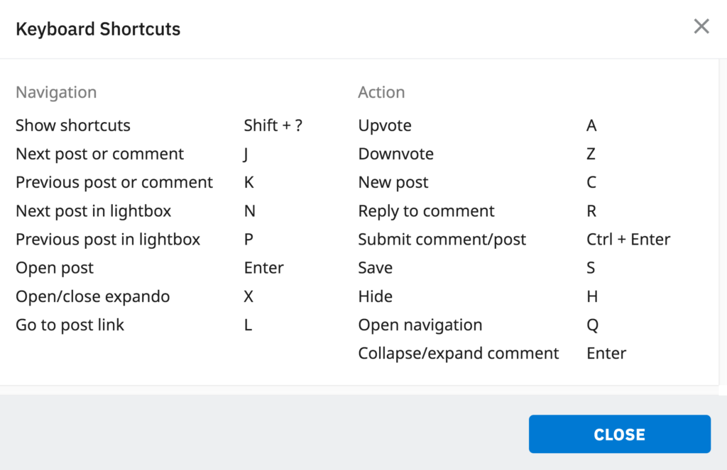
GitHub
GitHub has even more shortcuts for nearly every page.
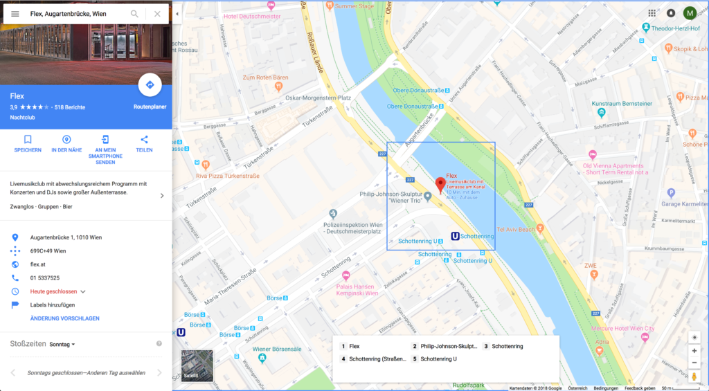
Google Maps
Google Maps provides great UX for keyboard users. If you tab into the map, you can use the arrow keys to navigate, + and - to zoom in and out and numbers associated with places to show details.
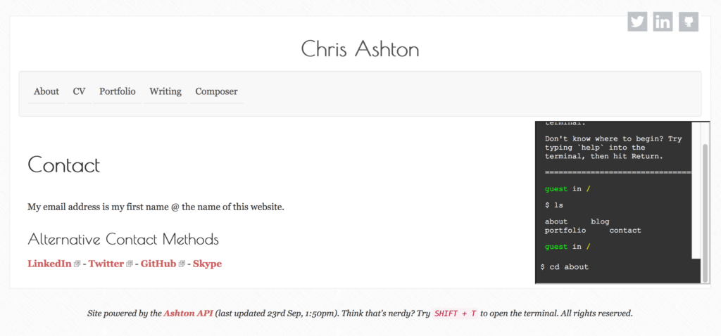
Chris Ashton
Chris Ashton has no keyboard shortcuts on his website, like the other sites in this list, but if you press Shift + T a little terminal pops up. You can list all pages by typing ls and navigate to a page by typing cd [slug].
Other sites with keyboard shortcuts are youtube.com, reddit.com and facebook.com.
Accessibility concerns
Single-key shortcuts like j or k might be appropriate and efficient for many keyboard users but they’re disastrous for speech users. If only a single key is used to fire a command, a spoken word can become a collection of single-key commands that fire at once.
Saying the word “James” on twitter with speech control enabled scrolls the page down (j), opens the message dialog (m) and enters the letters e and s in the auto focused input field.
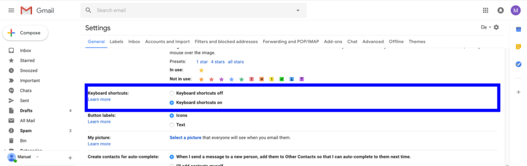
If you’re using single key commands, make sure to either provide a mechanism to turn shortcuts off or to remap them. Gmail, for example, gives users both options.
I’d love to see more websites that provide keyboard shortcuts. Please let me now via email or Twitter if you know good examples.
Hidden focusable items
18.50% of pages have hidden focusable items
In certain patterns elements are hidden by default and only visible on hover or when a button is clicked (e.g. in a fly-out navigation). It’s important that these items are hidden correctly, for example by using the hidden attribute or setting display to none. If this is not the case, it may happen that they’re not visible but still can be reached with the keyboard. This can cause a lot of confusion for users because it might seem like nothing is happening when they’re pressing the Tab key while in reality focus is moving but its just not visible in the viewport.
Bad example #1
Using transform alone isn’t enough for hiding items. You can test that yourself by tabbing through this page (see code).
.nav {
  position: fixed;
  top: 0;
  left: 0;

  transform: translateX(-100%);
}

.nav--open {
  transform: translateX(0);
}
Other pages used similar patterns which aren’t accessible either.
Bad example #2
Elements are still focusable if their parent container has height: 0.
.nav {
  height: 0;
}

.nav--open {
  height: auto;
}
Bad example #3
Moving an item out of the viewport and reducing its opacity doesn’t hide it for keyboard users either.
.nav {
  position: absolute;
  left: -100%;
  opacity: 0;
}

.nav--open {
  left: 0;
  opacity: 1;
}
Another issue is dropdown navigations. On several pages sub links of main navigation items were only visible on hover, which makes the page unusable for keyboard users because you only get to navigate to the first few visible links.
Some pages, though, get it right and provide a great experience.

I stumbled upon visibility issue in almost every fifth page, which is bad because hidden focusable items are a show-stopper.
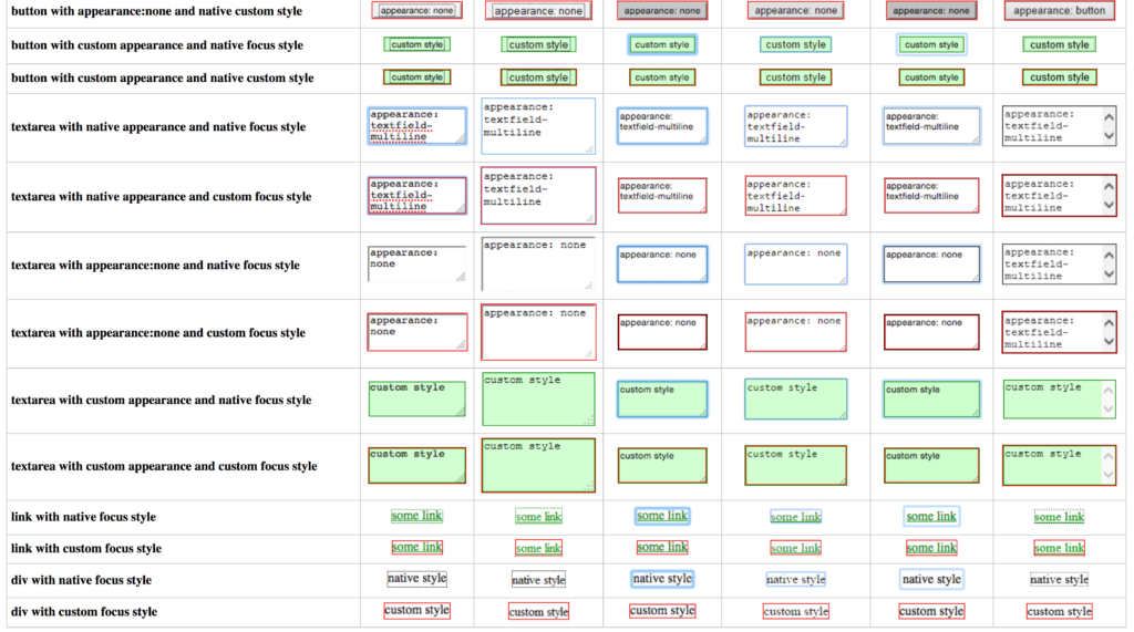
Bad semantics/HTML
It’s important to note here that I didn’t validate the source code on each page and I didn’t check the whole page. I just took a look under the hood if I found something that made me suspicious. For example, when I was trying to focus a button but wasn’t able to do so.
28.50% of pages don’t use HTML correctly.
Many focus issues could’ve been avoided simply by using the semantically appropriate HTML element. The especially wrong markup for links and buttons was an issue since the correct usage of these elements is vital for keyboard users.
No href-attribute
Links must have an href attribute with a proper value if they point to an anchor or any other resource. If the attribute is omitted and the navigation is handled with JavaScript, links aren’t focusable, you can’t apply hover and focus styles and they’re inaccessible to screen reader users.
Wrong link markup
<li tabindex="0">
  <a>Merch</a>
</li>
Correct
<li>
  <a href="/merch">Merch</a>
</li>
span/div instead of button
span, div or li elements aren’t focusable by default, they don’t have key events attached and they’re not announced as buttons to screen readers. They’re lacking everything a button has, so please just use a button.
Wrong button markup
<span class="dialog-link">Open Modal</span>
Correct
<button class="dialog-link">Open Modal</button>
link instead of button
If you don’t need an item to navigate to another page, don’t use a link use a button.
Wrong button markup
<a class="dropdown">Austria</a>
Correct
<button class="dropdown">Austria</button>
Button added via CSS
Buttons added via CSS pseudo elements aren’t focusable and have various other accessibility issues. Content isn’t separated from design, the button text is inaccessible for some screen readers and can’t consistently be translated by translation tools. These CSS buttons will not convey state or their role to screen readers, merely being announced as text.

<form>
  <input placeholder="Search" aria-label="Search" type="search">
  <input value="Search" type="submit" style="display: none">
</form>
form::before {
  position: absolute;
  content: "Search" !important;
  background-color: #01CB81;
  padding: .87em 1.4em;
  color: #fff;
  right: 0;
}
Instead of hiding the button element it’s better to remove the pseudo element selector and apply its styling to the button.
Bad focus management
Focus is managed badly on 18% percent of pages.
This number as well is too high considering that bad focus management often means that certain parts of a page can’t be reached at all or only in a very inconvenient way.
A common issue are modal windows. If you open them by pressing the Enter or Space key, focus stays where it is instead of moving to the content within the modal window. Take a look at this inaccessible example to see it in action and then compare it to the accessible version.
Another issue I encountered on several pages were inaccessible flyout navigations where it was possible to open the navigation but the content within wasn’t accessible. Links in those examples either still had a negative tabindex or wherein the wrong DOM order.
<ul class="menu menu--open">
  <li><a href="about.html" tabindex="-1" aria-hidden="false">About</a></li>
  ...
</ul>
aria-hidden is set to false when the navigation is open but tabindex stays at -1 which makes the links inaccessible to keyboard users.
The flyout menu on YouTube is completely inaccessible to keyboard users. Even if you tried to tab through the rest of the content to reach the navigation, it wouldn’t work because YouTube will load more videos as soon as you reach the end of the page.
Visual and DOM order mismatch
Tab order as well as the order in which screen readers announce content follow DOM order. If we change the visual order of content in our pages we get an order mismatch which might make websites inaccessible or at least hard to use.
There was an order mismatch on 10% percent of pages.
Honestly, I thought that this number would be way higher because, after missing focus styles, this is the issue you hear people mention the most. There were instances where tab order didn’t match visual order but if focus styles were good enough it was still possible to use the page without getting lost.
Visual order doesn’t match DOM order in the header on derstandard.at but the page is still usable. The much larger issues here are missing skip links and bad focus styles (I’ve added the huge pink border in the video).
Even though the number of pages where the order was an issue in my tests is relatively low it doesn’t mean that this is a topic that we can neglect. With Flexbox and especially CSS Grid Layout it’s incredibly easy to change order and I expect it to become a much bigger issue as more sites start using Grid. Also, I assume that this number would be much higher if I tested pages on mobile devices and compared small screens to larger screens.
Changing taborder with tabindex
Interestingly, CSS isn’t what causes the most problems. It’s HTML, or more specifically the tabindex attribute.
There were a few pages that included a social media sharing widget that puts tabindex="1" on each link. If there are no other elements with tabindex present on that page, it means that those links a the very first thing in focus on every page you visit.
<div>
  <a role="button" tabindex="1">
    <span class="visually-hidden">Share to Twitter</span>
    <svg>...</svg>
  </a>

  <a role="button" tabindex="1">
    <span class="visually-hidden">Share to Facebook</span>
    <svg>...</svg>
  </a>
  ...
</div>
There was only one page where the experience was exceptionally bad. Due to extensive usage of tabindex focus would interchangeably jump from the main navigation in the header to the same navigation in the footer to another navigation in the footer and back.
I’ve replaced text and images with dummy content in this example.
It’s hardly surprising that using values higher than 0 for tabindex is a considered a bad practice.
Usable pages
The most important question I wanted to find an answer to was if the web would be usable and accessible to me if I wasn’t able to use a mouse. To me, usable means that I was able to access content without exceptions and that I didn’t need additional plugins or settings to use the page.
According to my tests and my personal judgment only 58% of all 200 pages were usable.
58% of all tested pages are usable.
On top of that I wanted to know if the number differs a lot if I exclude web development (95 of 200) and accessibility related (22 of 200) pages, assuming that the accessibility must be better on those pages.
67.37% of web development and 100% of accessibility-related pages are usable.
I’m a front-end developer, which means that I spend a lot of time on websites that focus on web development. According to my tests, these pages provide better accessibility than others although the percentage of usable pages is sadly still quite low.
Gladly, all accessibility-related pages are usable and take care of most of keyboard related user experience and accessibility concerns.
Conclusion
Keyboard and screen reader users benefit a lot from semantic HTML and additional ways of navigating, like skip links. If we want an inclusive web, it’s important to get keyboard navigation right for people who cannot use a mouse permanently or temporarily. The big advantage of keyboard accessibility is that it improves the user experience for all users and it makes websites resilient and future-proof. Technologies like voice control will probably find its way into browsers very soon and become the primary way of navigation in the web for many people. I suppose that the foundation for an voice-usable site will be semantic HTML.
With this little experiment I tried to answer the question if the web would be usable and accessible to me if I wasn’t able to use a mouse today.
The answer is no, not really. I just found myself way too often looking at the status bar or opening dev tools to remove :focus { outline: none; }. Order wasn’t as big of a problem as I thought it would be but there are other more severe issues like bad focus management or hidden elements. Unfortunately, the worst problems, missing focus styles and missing skip links, were also the most common ones. A site without or with very bad focus styles is simply unusable without additional tools or browser settings. Having to tab through 20+ links before you get to the main content is tedious, especially when you’re trying to get information quickly.
Versatility is what makes the world wide web such an exciting place. We are not limited to building the same type of website with a specific design that only works with certain hard- and software. As developers and designers, we have a lot of options when it comes to choosing the right tools for creating web content, and our users get to pick the hard- and software they like the most or that fits into their budget. It’s our job to make sure that our websites are consumable no matter the device, input method, browser, and operating system. In order to achieve that we first have to understand and internalize that our users and the tools they are using are very diverse. Secondly, we have to know our craft, which for a front-end developer also means learning HTML and CSS and using it properly.
Appreciating our user’s diversity and knowing how to build websites for their needs results in a better user experience and accessibility for everyone.
Birkir Gunnarsson says:
Fantastic article, one of the best written on the topic of key board accessibility. I especially like the videos and code snippets. I will definitely be sharing this article with my team.
Manuel Matuzovic says:
Thank you very much, Birkir. I’m glad to read that :).
Matt King says:
Hi Manuel, this is a fabulous piece of work! The investment you made to compile information for so many sites is impressive.
I especially appreciate the commentary on visual design. As a screen reader user who also works as an accessibility engineer, I’ve always been amazed at how secretive all UI designs on all platforms have been about keyboard affordances. Windows probably does the most to make keyboard interfaces perceivable, but its keyboard interface is still a relative secret when compared to the mouse. I think a root cause of the horrific state of keyboard accessibility is the fact that visual design treats keyboard interfaces as second class and makes them unnecessarily difficult to discover and learn. Even the simple step of including consistently high-quality focus indicators would be a huge step forward, but much more could be done.
There is one really fundamental aspect of building user-friendly and efficient keyboard interfaces that I am surprised didn’t show up in your article — exploiting standard navigation keys, especially arrow keys, enter, space, and escape.
Over reliance on Tab as the only navigation key has uniquely plagued the web since its inception. As a platform initially optimized for serving static documents rather than serving GuIs, GUI development on the web has followed a somewhat bizarre evolutionary path. Unfortunately, supporting keyboard interfaces, while considered important within the accessibility world, has barely been an afterthought within the strongest forces moving web GUIs into the mainstream. So, web has the least mature and most inadequate keyboard interface conventions and infrastructure of any platform.
Because of the tab-only navigation paradigm prevalent across the web, it’s amazing how painful the web can be compared to native apps if you are a full-time keyboard only user. While screen readers have nice features that mitigate the pain, they are by no means simple to use. For new users, they are absurdly overwhelming.
Employing arrow key navigation inside menus, listviews, and grids of elements, etc., can dramatically improve ease of use on the web just as in native desktop apps. Of course, this is pointless if people do not think to use the arrow keys. So, to get the stunningly rich benefits that can be unlocked by intuitive multi-dimensional keyboard navigation, we need to not only implement multi-dimensional keyboard interfaces but also start complementing them with visual designs that make discovering and using keyboard navigation as easy to understand and learn as mouse interaction.
The design pattern library in the ARIA Authoring Practices Guide is helping provide templates for bringing common desktop keyboard navigation conventions to the web. And, in a few places, we are experimenting with ideas of how to make the keyboard affordances more readily perceivable. For instance, consider the pop-out tutorial that you get when you tab to the first example on the layout grid examples page. In that example, a set of six navigation links is collapsed into a single tab stop using a grid. See it here:
https://www.w3.org/TR/wai-aria-practices-1.1/examples/grid/LayoutGrids.html
I hope you find this helpful in your work to promote keyboard interfaces as first-class citizens of web UIs.
Matt King says:
Comment on:
https://www.24a11y.com/2018/i-threw-away-my-mouse/#comment-401
Hi Manuel, this is a fabulous piece of work! The investment you made to compile information for so many sites is impressive.
I especially appreciate the commentary on visual design. As a screen reader user who also works as an accessibility engineer, I’ve always been amazed at how secretive all UI designs on all platforms have been about keyboard affordances. Windows probably does the most to make keyboard interfaces perceivable, but its keyboard interface is still a relative secret when compared to the mouse. I think a root cause of the horrific state of keyboard accessibility is the fact that visual design treats keyboard interfaces as second class and makes them unnecessarily difficult to discover and learn. Even the simple step of including consistently high-quality focus indicators would be a huge step forward, but much more could be done.
There is one really fundamental aspect of building user-friendly and efficient keyboard interfaces that I am surprised didn’t show up in your article — exploiting standard navigation keys, especially arrow keys, enter, space, and escape.
Over reliance on Tab as the only navigation key has uniquely plagued the web since its inception. As a platform initially optimized for serving static documents rather than serving GuIs, GUI development on the web has followed a somewhat bizarre evolutionary path. Unfortunately, supporting keyboard interfaces, while considered important within the accessibility world, has barely been an afterthought within the strongest forces moving web GUIs into the mainstream. So, web has the least mature and most inadequate keyboard interface conventions and infrastructure of any platform.
Because of the tab-only navigation paradigm prevalent across the web, it’s amazing how painful the web can be compared to native apps if you are a full-time keyboard only user. While screen readers have nice features that mitigate the pain, they are by no means simple to use. For new users, they are absurdly overwhelming.
Employing arrow key navigation inside menus, listviews, and grids of elements, etc., can dramatically improve ease of use on the web just as in native desktop apps. Of course, this is pointless if people do not think to use the arrow keys. So, to get the stunningly rich benefits that can be unlocked by intuitive multi-dimensional keyboard navigation, we need to not only implement multi-dimensional keyboard interfaces but also start complementing them with visual designs that make discovering and using keyboard navigation as easy to understand and learn as mouse interaction.
The design pattern library in the ARIA Authoring Practices Guide is helping provide templates for bringing common desktop keyboard navigation conventions to the web. And, in a few places, we are experimenting with ideas of how to make the keyboard affordances more readily perceivable. For instance, consider the pop-out tutorial that you get when you tab to the first example on the layout grid examples page. In that example, a set of six navigation links is collapsed into a single tab stop using a grid. See it here:
https://www.w3.org/TR/wai-aria-practices-1.1/examples/grid/LayoutGrids.html
I hope you find this helpful in your work to promote keyboard interfaces as first-class citizens of web UIs.
Manuel Matuzovic says:
Hi Matt!
Thank you very much for the great feedback.
I absolutely agree with you. Often the reason for that isn’t ignorance but lack of knowledge. Many designers, developers, product managers, etc. don’t even know that there are keyboard users and that keyboard usage is also a part of UX. In 8 years as a freelance frontend developer, I’ve only had a single client who provided me with focus styles in their designs.
The selection of things I’ve tested in this post is based on my experience, my knowledge, and assumptions. For example, I knew about focus styles and I assumed that they might be an issue on some sites. Since I’m primarily a mouse user I don’t have to much experience using the keyboard. I know about the ARIA Authoring Practices but usually, I rely on third-party components I trust when I have to use a tab component for example. This is probably why I didn’t consider additional navigation keys.
Your comment is helpful indeed. I’m already thinking about how to explore the WAI ARIA Practices even more and share my knowledge. Thanks, Matt!
James says:
This is a great article and a great comment. Matt–I’m curious about your opinion on using the aria menu role (and the corresponding arrow key navigation) for navigation menus. I’ve seen a lot of literature and opinions saying it shouldn’t be done (since it was never intended for this purpose), but I also hear users advocating it because it’s easier to navigate than pressing tab fifty times. I’m guessing you’re in favor of the menu approach?
James says:
Great post, and thanks for taking the time to do it.
A workaround for the YouTube problem is to shift-tab back through the page in reverse order. This gets you into the menu while avoiding the infinite scroll problem. Just sharing in case it helps any keyboard users out there while we wait for YouTube to fix it.